我想制作一个matplotlib折线图,其中显示了两个变量,分别在两个独立的y轴上,并且具有匹配的网格线。这很简单,除了匹配的网格线部分。以下是一些可重现的代码片段,包括我的最佳尝试。完整的代码片段可以在最后找到。
使用初始图形创建可重现的数据框
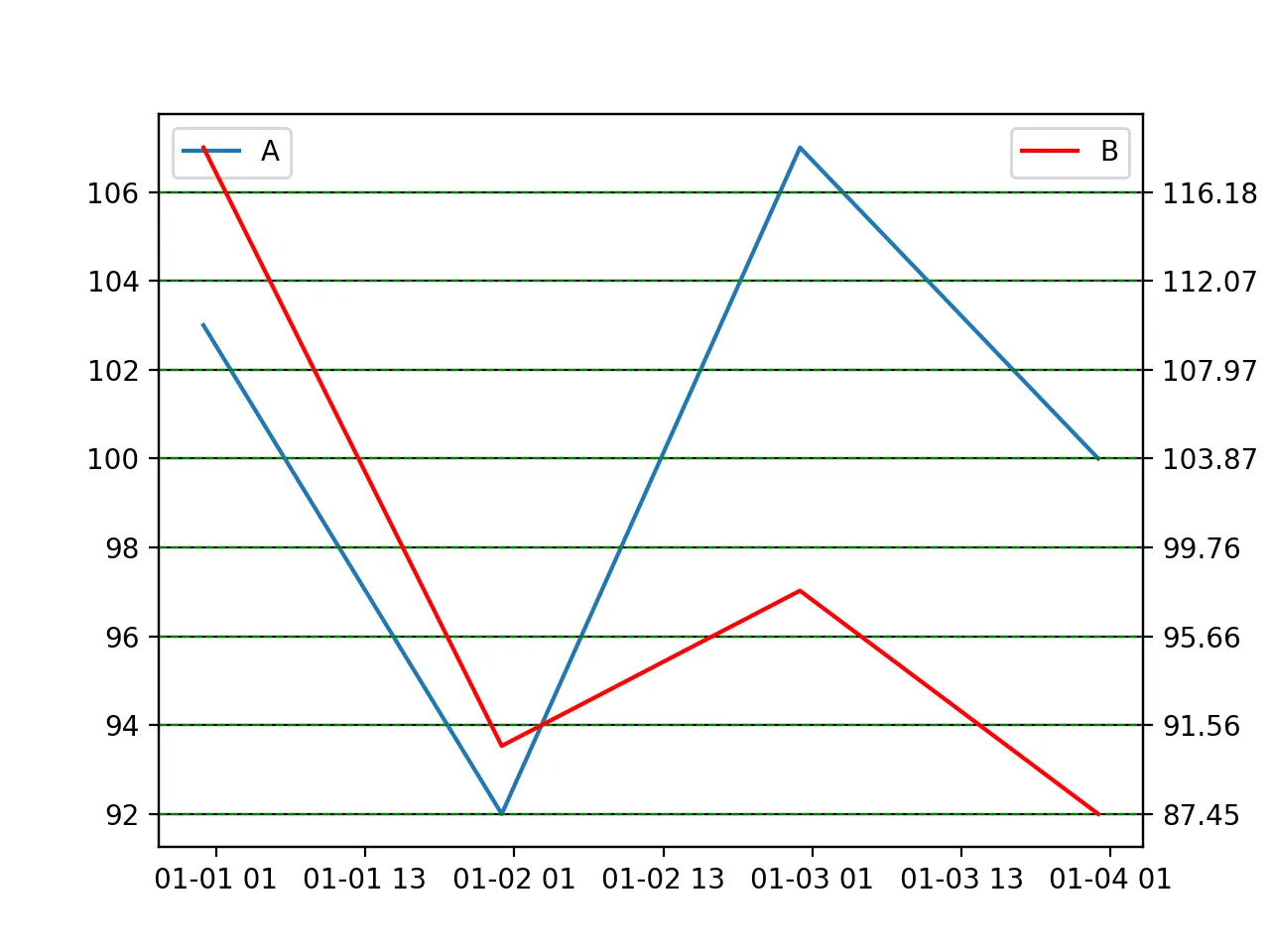
按照在matplotlib中为次要y轴添加y轴标签的建议,我能够制作出这个图形:
import pandas as pd
import numpy as np
import matplotlib.pyplot as plt


# Dataframe with some random numbers
np.random.seed(123)
rows = 4
df = pd.DataFrame(np.random.randint(90,110,size=(rows, 2)), columns=list('AB'))
datelist = pd.date_range(pd.datetime(2017, 1, 1).strftime('%Y-%m-%d'), periods=rows).tolist()
df['dates'] = datelist
df = df.set_index(['dates'])
df.index = pd.to_datetime(df.index)
df['B'] = df['A'] * np.random.uniform(0.6,1.4, size = 4)

# Plot 1
fig, ax = plt.subplots()
t = df.index
ax.plot(t, df['A'])
ax2 = ax.twinx()
ax2.plot(t, df['B'], color='red')
ax2.yaxis.grid(which="major", color='green', linestyle='--')

ax.legend(loc='upper left')
ax2.legend(loc='upper right')
plt.show()
情节 1
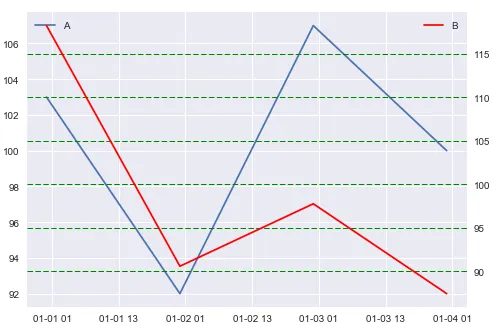
# Plot 2
fig, ax = plt.subplots()
t = df.index
ax.plot(t, df['A'])
ax2 = ax.twinx()
ax2.plot(t, df['B'], color='red')
#--
ax2.set_ylim(ax.get_ylim())

ax2.yaxis.grid(which="major", color='green', linestyle='--')
ax.legend(loc='upper left')
ax2.legend(loc='upper right')
plt.show()
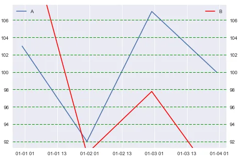
ax2int = ax2.get_ylim()[1] - ax2.get_ylim()[0]检索次要y轴的间隔,并将其除以主轴上网格线的数量以使它们匹配。然后遵循在matplotlib中更改x或y轴上的“刻度频率”建议,使用np.arange(start, stop, steps)。但是我无法完全弄清楚如何完美地匹配间隔,如下所示:fig, ax = plt.subplots()
t = df.index
ax.plot(t, df['A'])
ax2 = ax.twinx()
ax2.plot(t, df['B'], color='red')
# The math
firstStep = ax.get_yticks()[1] - ax.get_yticks()[0]
ax2int = ax2.get_ylim()[1] - ax2.get_ylim()[0]
axSteps = len(ax.get_yticks())
newIntervals = ax2int / axSteps
# My best attempt
myticks = np.arange(min(df['B']), max(df['B']), newIntervals)
ax2.set(yticks=myticks)
ax2.yaxis.grid(which="major", color='green', linestyle='--')
ax.legend(loc='upper left')
ax2.legend(loc='upper right')
plt.show()
情节 3
这是整个内容,方便复制粘贴:
# Libraries
import pandas as pd
import numpy as np
import matplotlib.pyplot as plt
# Dataframe with some random numbers
np.random.seed(123)
rows = 4
df = pd.DataFrame(np.random.randint(90,110,size=(rows, 2)), columns=list('AB'))
datelist = pd.date_range(pd.datetime(2017, 1, 1).strftime('%Y-%m-%d'), periods=rows).tolist()
df['dates'] = datelist
df = df.set_index(['dates'])
df.index = pd.to_datetime(df.index)
df['B'] = df['A'] * np.random.uniform(0.6,1.4, size = 4)
# Plot 1
fig, ax = plt.subplots()
t = df.index
ax.plot(t, df['A'])
ax2 = ax.twinx()
ax2.plot(t, df['B'], color='red')
ax2.yaxis.grid(which="major", color='green', linestyle='--')
ax.legend(loc='upper left')
ax2.legend(loc='upper right')
plt.show()
#%%
# Plot 2
fig, ax = plt.subplots()
t = df.index
ax.plot(t, df['A'])
ax2 = ax.twinx()
ax2.plot(t, df['B'], color='red')
#--
ax2.set_ylim(ax.get_ylim())
ax2.yaxis.grid(which="major", color='green', linestyle='--')
ax.legend(loc='upper left')
ax2.legend(loc='upper right')
plt.show()
#%%
# Plot 3
fig, ax = plt.subplots()
t = df.index
ax.plot(t, df['A'])
ax2 = ax.twinx()
ax2.plot(t, df['B'], color='red')

# The math
firstStep = ax.get_yticks()[1] - ax.get_yticks()[0]
ax2int = ax2.get_ylim()[1] - ax2.get_ylim()[0]
axSteps = len(ax.get_yticks())
newIntervals = ax2int / axSteps

# My best attempt
myticks = np.arange(min(df['B']), max(df['B']), newIntervals)
ax2.set(yticks=myticks)
ax2.yaxis.grid(which="major", color='green', linestyle='--')
ax.legend(loc='upper left')
ax2.legend(loc='upper right')

plt.show()