1个回答
5
开胃菜
注释代码
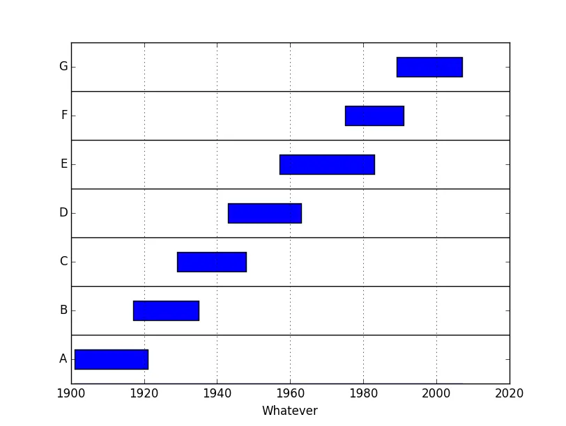
据我所知,实现你想要的最直接的方法需要使用 matplotlib 的 patches 模块在 matplotlib 画布上直接绘制矩形。
下面是一个简单的实现:
import matplotlib.pyplot as plt
import matplotlib.patches as patches
def plot_rect(data, delta=0.4):
"""data is a dictionary, {"Label":(low,hi), ... }
return a drawing that you can manipulate, show, save etc"""
yspan = len(data)
yplaces = [.5+i for i in range(yspan)]
ylabels = sorted(data.keys())
fig = plt.figure()
ax = fig.add_subplot(111)
ax.set_yticks(yplaces)
ax.set_yticklabels(ylabels)
ax.set_ylim((0,yspan))
# later we'll need the min and max in the union of intervals
low, hi = data[ylabels[0]]
for pos, label in zip(yplaces,ylabels):
start, end = data[label]
ax.add_patch(patches.Rectangle((start,pos-delta/2.0),end-start,delta))
if start<low : low=start
if end>hi : hi=end
# little small trick, draw an invisible line so that the x axis
# limits are automatically adjusted...
ax.plot((low,hi),(0,0))
# now get the limits as automatically computed
xmin, xmax = ax.get_xlim()
# and use them to draw the hlines in your example
ax.hlines(range(1,yspan),xmin,xmax)
# the vlines are simply the x grid lines
ax.grid(axis='x')
# eventually return what we have done
return ax
# this is the main script, note that we have imported pyplot as plt
# the data, inspired by your example,
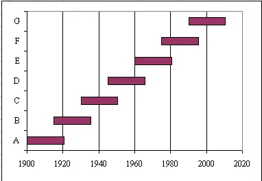
data = {'A':(1901,1921),
'B':(1917,1935),
'C':(1929,1948),
'D':(1943,1963),
'E':(1957,1983),
'F':(1975,1991),
'G':(1989,2007)}
# call the function and give its result a name
ax = plot_rect(data)
# so that we can further manipulate it using the `axes` methods, e.g.
ax.set_xlabel('Whatever')
# finally save or show what we have
plt.show()
我们的痛苦所带来的结果已在本文第一段中展现...
附录
假设你认为蓝色是一种非常沉闷的颜色...
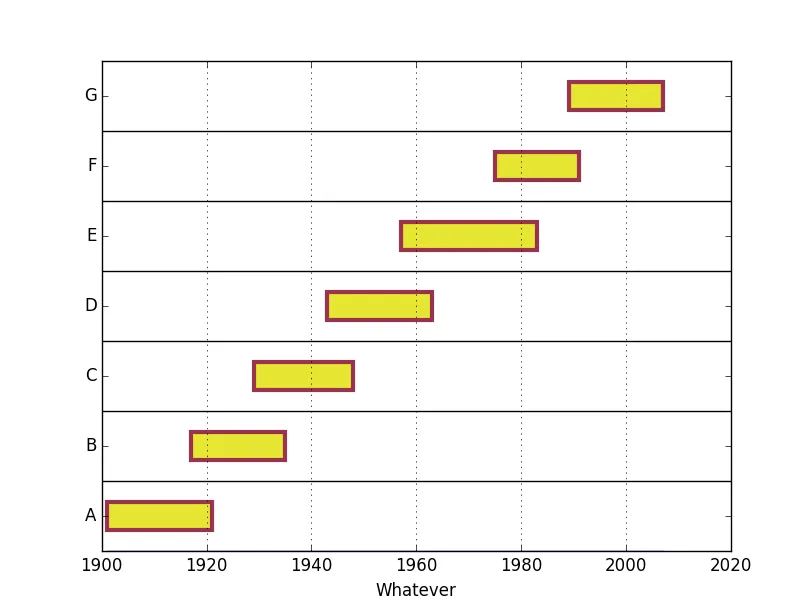
你在图中放置的补丁可以作为绘图的属性(恰当地命名为“补丁”...)访问和修改,例如,
ax = plot_rect(data)
ax.set_xlabel('Whatever')
for rect in ax.patches:
    rect.set(facecolor=(0.9,0.9,0.2,1.0), # a tuple, RGBA
          edgecolor=(0.6,0.2,0.3,1.0),
          linewidth=3.0)
plt.show()
在我看来,自定义绘图函数应该尽可能少地进行必要的特征描述,因为这种后期处理通常在matplotlib中非常容易实现。
- gboffi
1
谢谢!这对我帮助很大 :) - Foaly
网页内容由stack overflow 提供, 点击上面的可以查看英文原文,
原文链接
原文链接
matplotlib解决此问题的方法。我可以请您将问题标题更改为更具可搜索性的标题吗?例如,从您自己的标题中进行词干分析,“在Matplotlib中使用适当的绘图绘制范围条形图?”或者更直接的“使用Matplotlib绘制范围条形图”...感谢您的考虑, - gboffi