go.Indicator 是一个仪表盘图表,具有特殊属性domain,可以通过在[0, 1]之间指定x和y来将指示器放置在图形对象内。查看Python中的指示器以获取此示例:
绘图
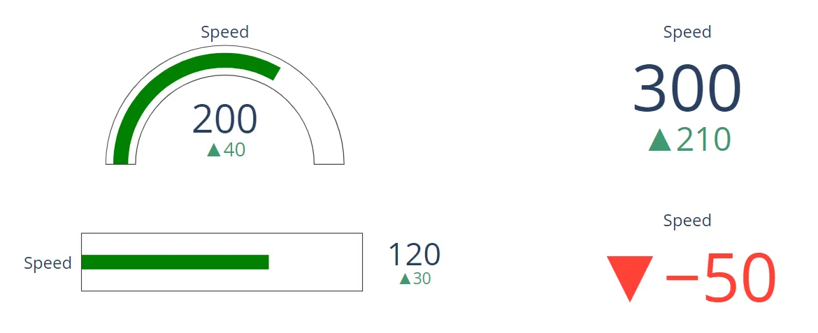
完整代码:
import plotly.graph_objects as go

fig = go.Figure()

fig.add_trace(go.Indicator(
    value = 200,
    delta = {'reference': 160},
    gauge = {
        'axis': {'visible': False}},
    domain = {'row': 0, 'column': 0}))

fig.add_trace(go.Indicator(
    value = 120,
    gauge = {
        'shape': "bullet",
        'axis' : {'visible': False}},
    domain = {'x': [0.05, 0.5], 'y': [0.15, 0.35]}))

fig.add_trace(go.Indicator(
    mode = "number+delta",
    value = 300,
    domain = {'row': 0, 'column': 1}))

fig.add_trace(go.Indicator(
    mode = "delta",
    value = 40,
    domain = {'row': 1, 'column': 1}))

fig.update_layout(
    grid = {'rows': 2, 'columns': 2, 'pattern': "independent"},
    template = {'data' : {'indicator': [{
        'title': {'text': "Speed"},
        'mode' : "number+delta+gauge",
        'delta' : {'reference': 90}}]
                         }})
对于那些喜欢详细研究这些内容的人:
|“domain”属性是Domain的一个实例,可以指定为:| - :class:plotly.graph_objs.indicator.Domain的实例 | - 传递给Domain构造函数的字符串/值属性的字典|支持的字典属性:|
| column | 如果有布局网格,请在此列中使用该域进行此指标跟踪。| row | 如果有布局网格,请在此行中使用该域进行此指标跟踪。| x | 设置此指标跟踪的水平域(以绘图分数表示)。| y | 设置此指标跟踪的垂直域(以绘图分数表示)。