如何在散点图中添加最佳拟合线

21
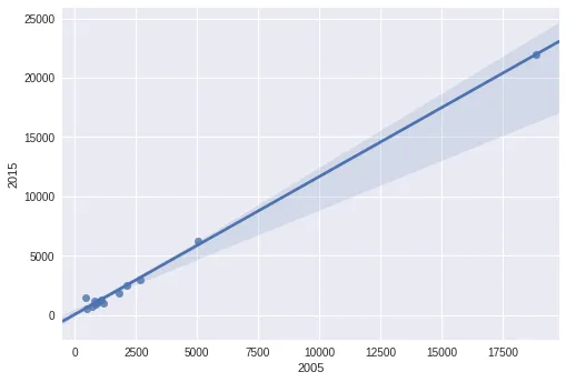
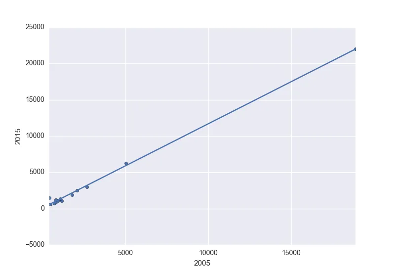
我目前正在使用Pandas和matplotlib进行一些数据可视化工作,我想在散点图上添加一条最佳拟合线。
这是我的代码:
import matplotlib
import matplotlib.pyplot as plt
import pandas as panda
import numpy as np

def PCA_scatter(filename):

   matplotlib.style.use('ggplot')

   data = panda.read_csv(filename)
   data_reduced = data[['2005', '2015']]

   data_reduced.plot(kind='scatter', x='2005', y='2015')
   plt.show()

PCA_scatter('file.csv')

怎么做呢?

这个回答是否解决了你的问题?Python中用于散点图最佳拟合直线的代码 - Samer Ayoub
6个回答

35

您可以使用Seaborn一步完成整个拟合和绘图。

import pandas as pd
import seaborn as sns
data_reduced= pd.read_csv('fake.txt',sep='\s+')
sns.regplot(data_reduced['2005'],data_reduced['2015'])

回归图


7
但我想要使用matplotlib! :( - NoName
1
这个解决方案是多么简单美妙啊!非常感谢你! - embulldogs99
1
如果您想在循环和创建多个图表时逐个查看图表,则仍需要使用matplotlib的plt.show()。 - embulldogs99

16

您可以使用np.polyfit()np.poly1d()。使用相同的x值估算一次多项式,并将其添加到.scatter()图形创建的ax对象中。以下是一个示例:

import numpy as np

     2005   2015
0   18882  21979
1    1161   1044
2     482    558
3    2105   2471
4     427   1467
5    2688   2964
6    1806   1865
7     711    738
8     928   1096
9    1084   1309
10    854    901
11    827   1210
12   5034   6253

估算一次多项式:

z = np.polyfit(x=df.loc[:, 2005], y=df.loc[:, 2015], deg=1)
p = np.poly1d(z)
df['trendline'] = p(df.loc[:, 2005])

     2005   2015     trendline
0   18882  21979  21989.829486
1    1161   1044   1418.214712
2     482    558    629.990208
3    2105   2471   2514.067336
4     427   1467    566.142863
5    2688   2964   3190.849200
6    1806   1865   2166.969948
7     711    738    895.827339
8     928   1096   1147.734139
9    1084   1309   1328.828428
10    854    901   1061.830437
11    827   1210   1030.487195
12   5034   6253   5914.228708

以及情节:

ax = df.plot.scatter(x=2005, y=2015)
df.set_index(2005, inplace=True)
df.trendline.sort_index(ascending=False).plot(ax=ax)
plt.gca().invert_xaxis()

获取:

enter image description here

同时提供直线方程:

'y={0:.2f} x + {1:.2f}'.format(z[0],z[1])

y=1.16 x + 70.46

1
trendline.plot(ax=ax) 这行代码给我报了一个无效语法错误。 - JavascriptLoser
这行代码 z = np.polyfit(x=data_reduced[['2005']], y=data_reduced[['2015']], 1)会导致"positional argument follows keyword argument"错误。 - JavascriptLoser
抱歉,需要在“=1”之前添加“deg”以表示“度数”,请参见更新。 - Stefan
1
需要使用.loc[],这样单个列才能变成pd.Series。用[[]]选择会将单个列保留为DataFrame,因此会出现维度警告。更新后,下一行同样适用。我的错,时间有点晚了... - Stefan
现在这个功能工作得很好,只是它反转了数据的方向... http://i.imgur.com/k2Wy9in.jpg - JavascriptLoser
显示剩余4条评论

5
另一种选项(使用np.linalg.lstsq):
# generate some fake data
N = 50
x = np.random.randn(N, 1)
y = x*2.2 + np.random.randn(N, 1)*0.4 - 1.8
plt.axhline(0, color='r', zorder=-1)
plt.axvline(0, color='r', zorder=-1)
plt.scatter(x, y)

# fit least-squares with an intercept
w = np.linalg.lstsq(np.hstack((x, np.ones((N,1)))), y)[0]
xx = np.linspace(*plt.gca().get_xlim()).T

# plot best-fit line
plt.plot(xx, w[0]*xx + w[1], '-k')

best-fit line


2
这是关于plotly方法的介绍。
#load the libraries

import pandas as pd
import numpy as np
import plotly.express as px
import plotly.graph_objects as go

# create the data
N = 50
x = pd.Series(np.random.randn(N))
y = x*2.2 - 1.8

# plot the data as a scatter plot
fig = px.scatter(x=x, y=y) 

# fit a linear model 
m, c = fit_line(x = x, 
                y = y)

# add the linear fit on top
fig.add_trace(
    go.Scatter(
        x=x,
        y=m*x + c,
        mode="lines",
        line=go.scatter.Line(color="red"),
        showlegend=False)
)
# optionally you can show the slop and the intercept 
mid_point = x.mean()

fig.update_layout(
    showlegend=False,
    annotations=[
        go.layout.Annotation(
            x=mid_point,
            y=m*mid_point + c,
            xref="x",
            yref="y",
            text=str(round(m, 2))+'x+'+str(round(c, 2)) ,
        )
    ]
)
fig.show()

其中fit_line是:

def fit_line(x, y):
    # given one dimensional x and y vectors - return x and y for fitting a line on top of the regression
    # inspired by the numpy manual - https://docs.scipy.org/doc/numpy/reference/generated/numpy.linalg.lstsq.html 
    x = x.to_numpy() # convert into numpy arrays
    y = y.to_numpy() # convert into numpy arrays

    A = np.vstack([x, np.ones(len(x))]).T # sent the design matrix using the intercepts
    m, c = np.linalg.lstsq(A, y, rcond=None)[0]

    return m, c

enter image description here


1

上面最佳答案使用了seaborn。 补充一下,如果您正在使用循环创建多个图表,则仍然可以使用matplotlib

    import pandas as pd
    import seaborn as sns
    import matplotlib.pyplot as plt

    data_reduced= pd.read_csv('fake.txt',sep='\s+')
    for x in data_reduced.columns:
        sns.regplot(data_reduced[x],data_reduced['2015'])
        plt.show()

plt.show()会暂停执行,以便您可以逐个查看绘图


0

只是为了补充(更新Robert Calhoun的答案)。如果您不指定x,y,则在较新版本的pandas中现在会收到Future Warning。

FutureWarning: Pass the following variables as keyword args: x, y. From version 0.12, the only valid positional argument will be `data`, and passing other arguments without an explicit keyword will result in an error or misinterpretation.

所以,它将会是这样的。

import pandas as pd
import seaborn as sns
data_reduced= pd.read_csv('fake.txt',sep='\s+')
sns.regplot(x=data_reduced['2005'],y=data_reduced['2015']) 

网页内容由stack overflow 提供, 点击上面的
可以查看英文原文,
原文链接