我在论文中有以下数据:
28 45
91 14
102 11
393 5
4492 1.77
我需要将曲线拟合到这个数据上。如果我绘制它,那么就会得到如下图所示。
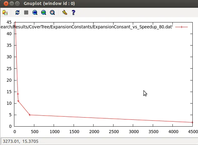
我认为某种指数曲线应该适合这些数据。我正在使用GNUplot。有人可以告诉我什么样的曲线适合这个数据以及我可以使用哪些初始参数吗?
我在论文中有以下数据:
28 45
91 14
102 11
393 5
4492 1.77
我需要将曲线拟合到这个数据上。如果我绘制它,那么就会得到如下图所示。
我认为某种指数曲线应该适合这些数据。我正在使用GNUplot。有人可以告诉我什么样的曲线适合这个数据以及我可以使用哪些初始参数吗?
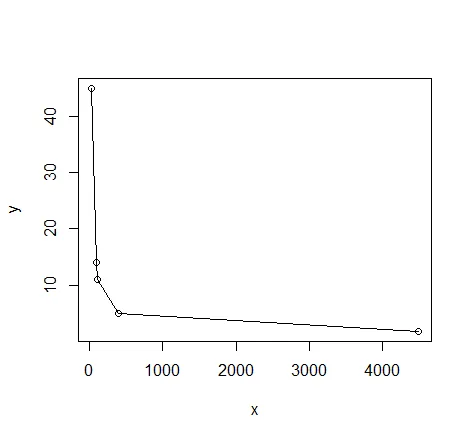
如果选项中有 R,以下是两种可能使用的方法草图:
这可能是最好的方法,因为它利用了您可能已经知道或期望的变量之间的关系。
# read in the data
dat <- read.table(text= "x y
28 45
91 14
102 11
393 5
4492 1.77", header = TRUE)

# quick visual inspection
plot(dat); lines(dat)
# a smattering of possible models... just made up on the spot
# with more effort some better candidates should be added
# a smattering of possible models...
models <- list(lm(y ~ x, data = dat),
               lm(y ~ I(1 / x), data = dat),
               lm(y ~ log(x), data = dat),
               nls(y ~ I(1 / x * a) + b * x, data = dat, start = list(a = 1, b = 1)),
               nls(y ~ (a + b * log(x)), data = dat, start = setNames(coef(lm(y ~ log(x), data = dat)), c("a", "b"))),
               nls(y ~ I(exp(1) ^ (a + b * x)), data = dat, start = list(a = 0,b = 0)),
               nls(y ~ I(1 / x * a) + b, data = dat, start = list(a = 1,b = 1))
)

# have a quick look at the visual fit of these models
library(ggplot2)
ggplot(dat, aes(x, y)) + geom_point(size = 5) +
    stat_smooth(method = lm, formula = as.formula(models[[1]]), size = 1, se = FALSE, color = "black") +
    stat_smooth(method = lm, formula = as.formula(models[[2]]), size = 1, se = FALSE, color = "blue") +
    stat_smooth(method = lm, formula = as.formula(models[[3]]), size = 1, se = FALSE, color = "yellow") +
    stat_smooth(method = nls, formula = as.formula(models[[4]]), data = dat, method.args = list(start = list(a = 0,b = 0)), size = 1, se = FALSE, color = "red", linetype = 2) +
    stat_smooth(method = nls, formula = as.formula(models[[5]]), data = dat, method.args = list(start = setNames(coef(lm(y ~ log(x), data = dat)), c("a", "b"))), size = 1, se = FALSE, color = "green", linetype = 2) +
    stat_smooth(method = nls, formula = as.formula(models[[6]]), data = dat, method.args = list(start = list(a = 0,b = 0)), size = 1, se = FALSE, color = "violet") +
    stat_smooth(method = nls, formula = as.formula(models[[7]]), data = dat, method.args = list(start = list(a = 0,b = 0)), size = 1, se = FALSE, color = "orange", linetype = 2)
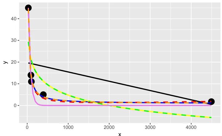
橙色曲线看起来很不错。我们来看看当我们测量这些模型的相对拟合优度时,它排名如何...
# calculate the AIC and AICc (for small samples) for each
# model to see which one is best, ie has the lowest AIC
library(AICcmodavg); library(plyr); library(stringr)
ldply(models, function(mod){ data.frame(AICc = AICc(mod), AIC = AIC(mod), model = deparse(formula(mod))) })

      AICc      AIC                     model
1 70.23024 46.23024                     y ~ x
2 44.37075 20.37075                y ~ I(1/x)
3 67.00075 43.00075                y ~ log(x)
4 43.82083 19.82083    y ~ I(1/x * a) + b * x
5 67.00075 43.00075      y ~ (a + b * log(x))
6 52.75748 28.75748 y ~ I(exp(1)^(a + b * x))
7 44.37075 20.37075        y ~ I(1/x * a) + b

# y ~ I(1/x * a) + b * x is the best model of those tried here for this curve
# it fits nicely on the plot and has the best goodness of fit statistic
# no doubt with a better understanding of nls and the data a better fitting
# function could be found. Perhaps the optimisation method here might be
# useful also: http://stats.stackexchange.com/a/21098/7744
这似乎是一种试图拟合曲线的胡乱尝试。虽然在开始时不必指定太多,但也许我做错了...
# symbolic regression using Genetic Programming
# http://rsymbolic.org/projects/rgp/wiki/Symbolic_Regression
library(rgp)
# this will probably take some time and throw
# a lot of warnings...
result1 <- symbolicRegression(y ~ x,
             data=dat, functionSet=mathFunctionSet,
             stopCondition=makeStepsStopCondition(2000))
# inspect results, they'll be different every time...
(symbreg <- result1$population[[which.min(sapply(result1$population, result1$fitnessFunction))]])

function (x)
tan((x - x + tan(x)) * x)
# quite bizarre...

# inspect visual fit
ggplot() + geom_point(data=dat, aes(x,y), size = 3) +
  geom_line(data=data.frame(symbx=dat$x, symby=sapply(dat$x, symbreg)), aes(symbx, symby), colour = "red")
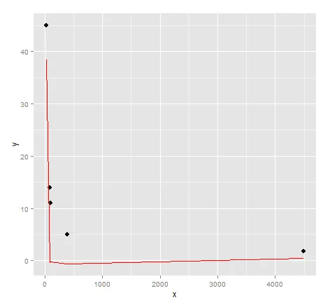
实际上,视觉上非常不匹配。也许需要更多的努力才能从遗传编程中获得优质结果...
致谢:G. Grothendieck 的 曲线拟合答案1,曲线拟合答案2。
poly(1/x,3)作为候选模型的? - Ben BolkerI() 是什么意思?例如:lm(y~I(1/x), data=dat)。 - Kristof Palhelp(I)应该可以让你理解。不过,这里是包括值1/x作为x的内容。 - Masclins您是否熟悉数据应遵循的一些分析函数?如果是,它可以帮助您选择函数形式以适应数据。
否则,由于数据看起来像指数衰减,可以尝试在gnuplot中使用类似以下代码,将一个具有两个自由参数的函数拟合到数据中:
 f(x) = exp(-x*c)*b
 fit f(x) "data.dat" u 1:2 via b,c
 plot "data.dat" w p, f(x)
Gnuplot会根据“via”子句后命名的参数进行最佳拟合。统计信息将打印到stdout,以及一个名为“fit.log”的文件,位于当前工作目录中。
c变量将确定曲率(衰减),而b变量将线性缩放所有值,以获得数据的正确大小。
有关更多信息,请参见Gnuplot文档中的曲线拟合部分。