我已经探索了关于这个主题的类似问题,但是在我的直方图上产生一个漂亮的曲线有些困难。我知道有些人可能认为这是重复的,但我目前没有找到任何可以帮助解决我的问题的东西。
虽然这里看不到数据,但以下是我正在使用的一些变量,这样你就可以在下面的代码中看到它们代表什么。
Differences <- subset(Score_Differences, select = Difference, drop = T)
m = mean(Differences)
std = sqrt(var(Differences))
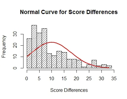
这是我生成的第一条曲线(代码看起来最常见且易于生成,但曲线本身并不很适合)。
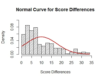
hist(Differences, density = 15, breaks = 15, probability = TRUE, xlab = "Score Differences", ylim = c(0,.1), main = "Normal Curve for Score Differences")
curve(dnorm(x,m,std),col = "Red", lwd = 2, add = TRUE)
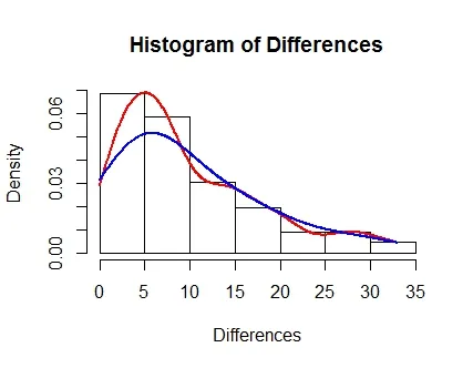
hist(Differences, probability = TRUE)
lines(density(Differences), col = "Red", lwd = 2)
lines(density(Differences, adjust = 2), lwd = 2, col = "Blue")
h = hist(Differences, density = 15, breaks = 15, xlab = "Score Differences", main = "Normal Curve for Score Differences")
xfit = seq(min(Differences),max(Differences))
yfit = dnorm(xfit,m,std)
yfit = yfit*diff(h$mids[1:2])*length(Differences)
lines(xfit, yfit, col = "Red", lwd = 2)
尝试了另一种方法,但仍没有成功。可能是因为在明显不正常的数据情况下使用了qnorm,曲线再次向负方向倾斜。
sample_x = seq(qnorm(.001, m, std), qnorm(.999, m, std), length.out = l)
binwidth = 3
breaks = seq(floor(min(Differences)), ceiling(max(Differences)), binwidth)
hist(Differences, breaks)
lines(sample_x, l*dnorm(sample_x, m, std)*binwidth, col = "Red")
我的问题是:“在直方图上放置曲线是否有“标准方法”?”这些数据显然不是正常的。我在这里介绍的3种程序都来自类似的帖子,但我显然遇到了一些问题。我觉得拟合曲线的所有方法都取决于你正在处理的数据。
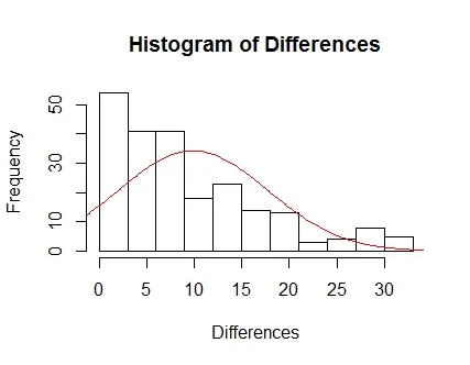
解决方案更新
感谢Zheyuan Li和其他人!我会将此保留作为自己的参考,也希望能对其他人有所帮助。
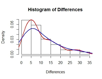
hist(Differences, probability = TRUE)
lines(density(Differences, cut = 0), col = "Red", lwd = 2)
lines(density(Differences, adjust = 2, cut = 0), lwd = 2, col = "Blue")