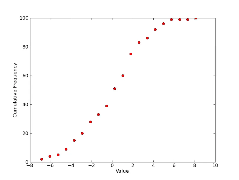
你需要“概率”图。对于单个图,你需要如下内容。
import scipy.stats
import numpy as np
import matplotlib.pyplot as plt
data = 3.0 * np.random.randn(100) + 0.5
counts, start, dx, _ = scipy.stats.cumfreq(data, numbins=20)
x = np.arange(counts.size) * dx + start
plt.plot(x, counts, 'ro')
plt.xlabel('Value')
plt.ylabel('Cumulative Frequency')
plt.show()
如果您想绘制一个分布图,并且已经知道它,那么请将其定义为一个函数,并按如下方式绘制:
import numpy as np
from matplotlib import pyplot as plt

def my_dist(x):
    return np.exp(-x ** 2)

x = np.arange(-100, 100)
p = my_dist(x)
plt.plot(x, p)
plt.show()
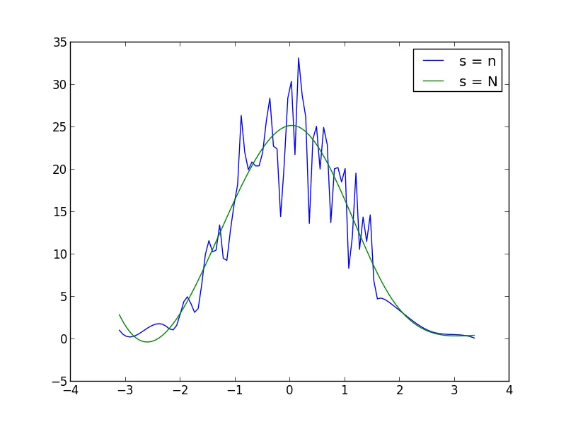
如果您没有精确的分布函数,可以生成大样本,绘制直方图并对数据进行平滑处理:
import numpy as np
from scipy.interpolate import UnivariateSpline
from matplotlib import pyplot as plt
N = 1000
n = N/10
s = np.random.normal(size=N)
p, x = np.histogram(s, bins=n)
x = x[:-1] + (x[1] - x[0])/2
f = UnivariateSpline(x, p, s=n)
plt.plot(x, f(x))
plt.show()
你可以在UnivariateSpline函数调用中增加或减少s(平滑系数)以增加或减少平滑程度。例如,使用以下两个值:
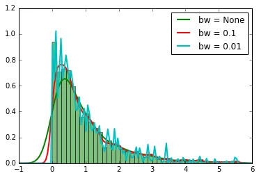
事件到达时间的概率密度函数(PDF)。
import numpy as np
import scipy.stats
data = scipy.stats.expon.rvs(loc=0, scale=1, size=1000, random_state=123)
可以通过简单调用获取内核密度估计。
scipy.stats.gaussian_kde(data,bw_method=bw)
其中bw是估计过程的(可选)参数。对于此数据集,考虑三个bw值,拟合结果如下所示。
bw_values = [None, 0.1, 0.01]
kde = [scipy.stats.gaussian_kde(data,bw_method=bw) for bw in bw_values]
import matplotlib.pyplot as plt
plt.hist(data, 50, normed=1, facecolor='green', alpha=0.5);
t_range = np.linspace(-2,8,200)
for i, bw in enumerate(bw_values):
plt.plot(t_range,kde[i](t_range),lw=2, label='bw = '+str(bw))
plt.xlim(-1,6)
plt.legend(loc='best')
参考资料:
Python: Matplotlib - 多个数据集的概率图
如何绘制事件间隔的概率密度函数(PDF)?