有人对如何在绘图上呈现重叠的线条有建议吗?我有很多这样的线条,我的想法是在它们不重叠的地方使用不同颜色的实线,在它们重叠的地方使用虚线,以便所有颜色都可见,重叠的颜色也可以看到。
但是,我该如何做到呢?
有人对如何在绘图上呈现重叠的线条有建议吗?我有很多这样的线条,我的想法是在它们不重叠的地方使用不同颜色的实线,在它们重叠的地方使用虚线,以便所有颜色都可见,重叠的颜色也可以看到。
但是,我该如何做到呢?
在一个离散度很高的图上,我遇到了同样的问题。
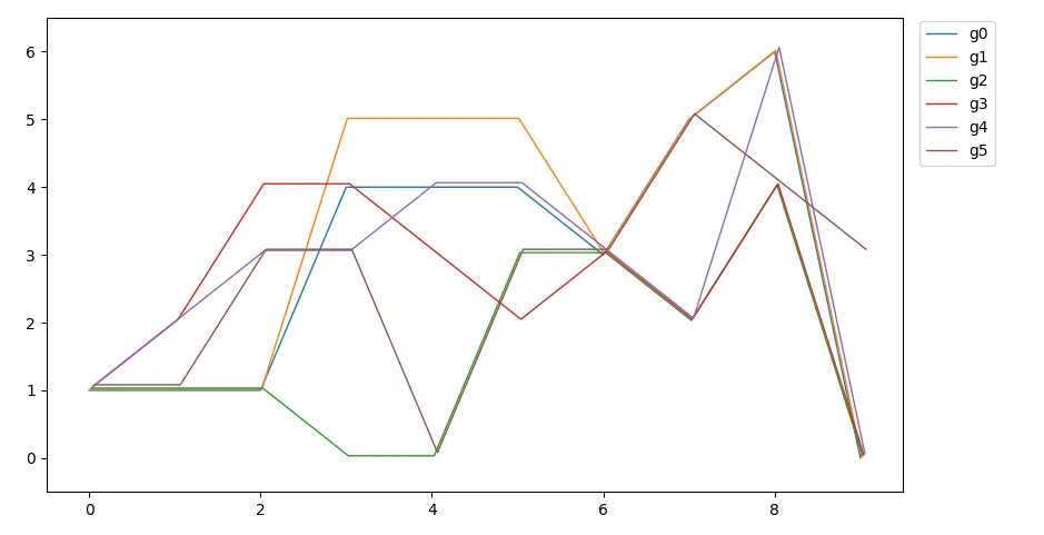
这里是起始情况:
import matplotlib.pyplot as plt
grid=[x for x in range(10)]
graphs=[
        [1,1,1,4,4,4,3,5,6,0],
        [1,1,1,5,5,5,3,5,6,0],
        [1,1,1,0,0,3,3,2,4,0],
        [1,2,4,4,3,2,3,2,4,0],
        [1,2,3,3,4,4,3,2,6,0],
        [1,1,3,3,0,3,3,5,4,3],
        ]

for gg,graph in enumerate(graphs):
    plt.plot(grid,graph,label='g'+str(gg))

plt.legend(loc=3,bbox_to_anchor=(1,0))
plt.show()
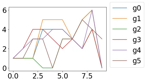
没有人能准确地说出绿线和蓝线的具体走向。
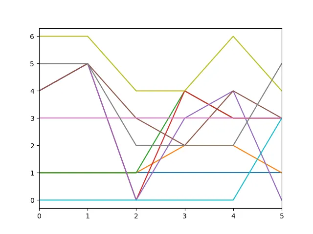
以及我的“解决方案”
import matplotlib.pyplot as plt
grid=[x for x in range(10)]
graphs=[
        [1,1,1,4,4,4,3,5,6,0],
        [1,1,1,5,5,5,3,5,6,0],
        [1,1,1,0,0,3,3,2,4,0],
        [1,2,4,4,3,2,3,2,4,0],
        [1,2,3,3,4,4,3,2,6,0],
        [1,1,3,3,0,3,3,5,4,3],
        ]

for gg,graph in enumerate(graphs):
    lw=10-8*gg/len(graphs)
    ls=['-','--','-.',':'][gg%4]
    plt.plot(grid,graph,label='g'+str(gg), linestyle=ls, linewidth=lw)

plt.legend(loc=3,bbox_to_anchor=(1,0))
plt.show()
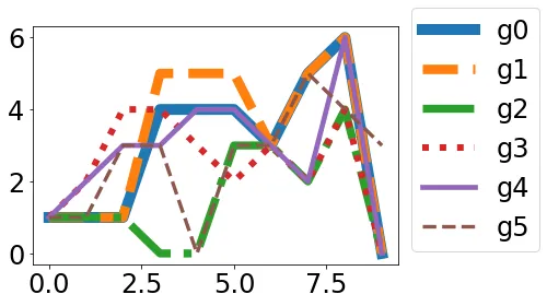
非常感谢改进建议!
只需降低线条的不透明度,使其透明可见。您可以使用alpha变量来实现这一点。例如:
plt.plot(x, y, alpha=0.7)
其中alpha的取值范围为0-1,0表示不可见。
假设你的panda数据框命名为response_times,那么你可以使用alpha来为图表设置不同的透明度。在使用alpha之前和之后可以查看图片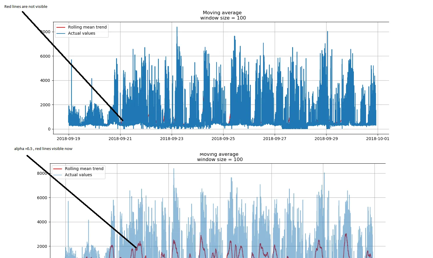
plt.figure(figsize=(15, 7))
plt.plot(respone_times,alpha=0.5)
plt.title('a sample title')
plt.grid(True)
plt.show()
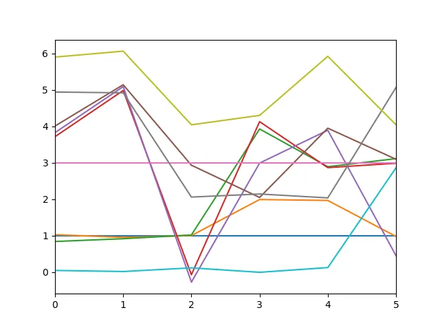
不要使用随机抖动,可以将线条稍微偏移一点,从而创建出分层的外观:
import matplotlib.pyplot as plt
from matplotlib.transforms import offset_copy

grid = list(range(10))
graphs = [[1, 1, 1, 4, 4, 4, 3, 5, 6, 0],
          [1, 1, 1, 5, 5, 5, 3, 5, 6, 0],
          [1, 1, 1, 0, 0, 3, 3, 2, 4, 0],
          [1, 2, 4, 4, 3, 2, 3, 2, 4, 0],
          [1, 2, 3, 3, 4, 4, 3, 2, 6, 0],
          [1, 1, 3, 3, 0, 3, 3, 5, 4, 3]]

fig, ax = plt.subplots()

lw = 1
for gg, graph in enumerate(graphs):
    trans_offset = offset_copy(ax.transData, fig=fig, x=lw * gg, y=lw * gg, units='dots')
    ax.plot(grid, graph, lw=lw, transform=trans_offset, label='g' + str(gg))

ax.legend(loc='upper left', bbox_to_anchor=(1.01, 1.01))
# manually set the axes limits, because the transform doesn't set them automatically
ax.set_xlim(grid[0] - .5, grid[-1] + .5)
ax.set_ylim(min([min(g) for g in graphs]) - .5, max([max(g) for g in graphs]) + .5)
plt.tight_layout()
plt.show()
from numpy.random import default_rng
import pandas as pd

rng = default_rng()

def jitter_df(df: pd.DataFrame, std_ratio: float) -> pd.DataFrame:
    """
    Add jitter to a DataFrame.

    Adds normal distributed jitter with mean 0 to each of the
    DataFrame's columns. The jitter's std is the column's std times
    `std_ratio`.

    Returns the jittered DataFrame.
    """
    std = df.std().values * std_ratio
    jitter = pd.DataFrame(
        std * rng.standard_normal(df.shape),
        index=df.index,
        columns=df.columns,
    )
    return df + jitter
这是抖动版本,其中std_ratio设置为0.1:
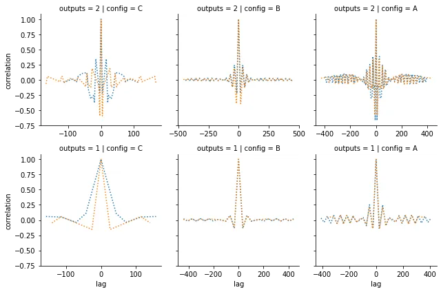
用点或破折号替换实线也可以起到同样的效果
g = sns.FacetGrid(data, col='config', row='outputs', sharex=False)
g.map_dataframe(sns.lineplot, x='lag',y='correlation',hue='card', linestyle='dotted')