我希望能够创建两个不同数据集的图表,类似于这个答案中呈现的。
在我的问题中,我必须绘制类似的图形,但x轴上有一些分类数据:
在我的问题中,我必须绘制类似的图形,但x轴上有一些分类数据:
您有没有关于如何使用分类变量在x轴上轻微移动第二个数据集的误差条的想法?我希望避免柱状图之间的重叠,以便更容易地进行可视化。
您有没有关于如何使用分类变量在x轴上轻微移动第二个数据集的误差条的想法?我希望避免柱状图之间的重叠,以便更容易地进行可视化。
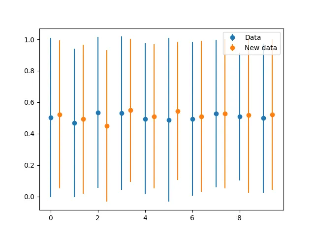
errorbar和fill_between,并设置非零透明度:import random
import matplotlib.pyplot as plt
# create sample data
N = 8
data_1 = {
'x': list(range(N)),
'y': [10. + random.random() for dummy in range(N)],
'yerr': [.25 + random.random() for dummy in range(N)]}
data_2 = {
'x': list(range(N)),
'y': [10.25 + .5 * random.random() for dummy in range(N)],
'yerr': [.5 * random.random() for dummy in range(N)]}
# plot
plt.figure()
# only errorbar
plt.subplot(211)
for data in [data_1, data_2]:
plt.errorbar(**data, fmt='o')
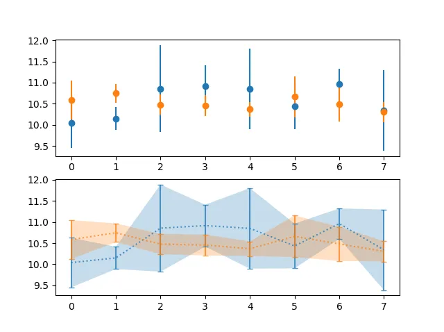
# errorbar + fill_between
plt.subplot(212)
for data in [data_1, data_2]:
plt.errorbar(**data, alpha=.75, fmt=':', capsize=3, capthick=1)
data = {
'x': data['x'],
'y1': [y - e for y, e in zip(data['y'], data['yerr'])],
'y2': [y + e for y, e in zip(data['y'], data['yerr'])]}
plt.fill_between(**data, alpha=.25)
结果:
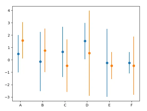
您可以通过将默认数据转换添加到数据空间中的先前翻译来翻译每个误差条。当知道类别通常相距一个数据单位时,这是可能的。
import numpy as np; np.random.seed(42)
import matplotlib.pyplot as plt
from matplotlib.transforms import Affine2D

x = list("ABCDEF")
y1, y2 = np.random.randn(2, len(x))
yerr1, yerr2 = np.random.rand(2, len(x))*4+0.3

fig, ax = plt.subplots()

trans1 = Affine2D().translate(-0.1, 0.0) + ax.transData
trans2 = Affine2D().translate(+0.1, 0.0) + ax.transData
er1 = ax.errorbar(x, y1, yerr=yerr1, marker="o", linestyle="none", transform=trans1)
er2 = ax.errorbar(x, y2, yerr=yerr2, marker="o", linestyle="none", transform=trans2)

plt.show()
或者,您可以在应用数据变换后翻译误差条,从而将它们移动到点的单位。
import numpy as np; np.random.seed(42)
import matplotlib.pyplot as plt
from matplotlib.transforms import ScaledTranslation

x = list("ABCDEF")
y1, y2 = np.random.randn(2, len(x))
yerr1, yerr2 = np.random.rand(2, len(x))*4+0.3

fig, ax = plt.subplots()

trans1 = ax.transData + ScaledTranslation(-5/72, 0, fig.dpi_scale_trans)
trans2 = ax.transData + ScaledTranslation(+5/72, 0, fig.dpi_scale_trans)
er1 = ax.errorbar(x, y1, yerr=yerr1, marker="o", linestyle="none", transform=trans1)
er2 = ax.errorbar(x, y2, yerr=yerr2, marker="o", linestyle="none", transform=trans2)

plt.show()
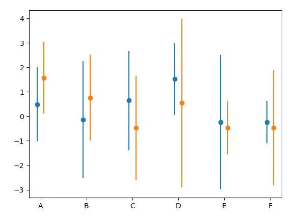
虽然两种情况下的结果看起来相似,但它们在根本上是不同的。当交互式缩放轴或更改图形大小时,您将观察到这种差异。
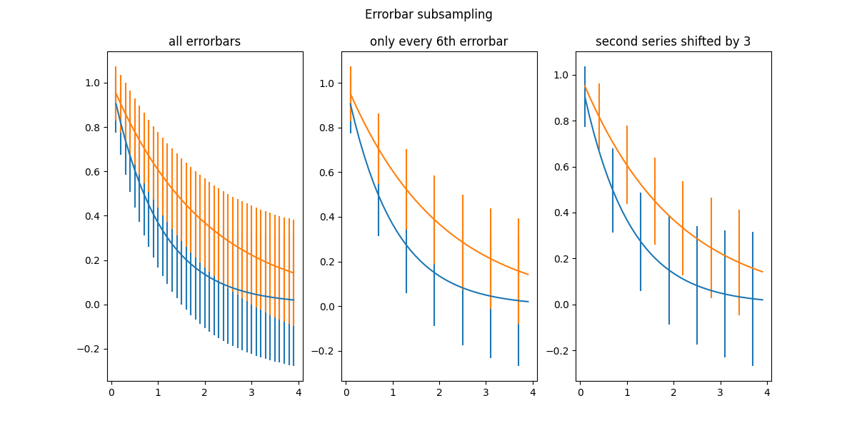
在库站点上有一个示例:https://matplotlib.org/stable/gallery/lines_bars_and_markers/errorbar_subsample.html 输入图像说明
你需要使用参数errorevery=(m, n), 其中n表示多少次绘制错误线,而m表示在0到n范围内进行的偏移
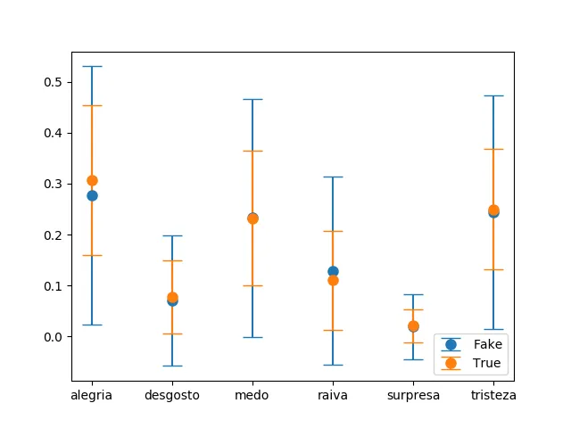
N个单词-alegria,desgosto等替换list(range(N))。那很容易。 - user10325516