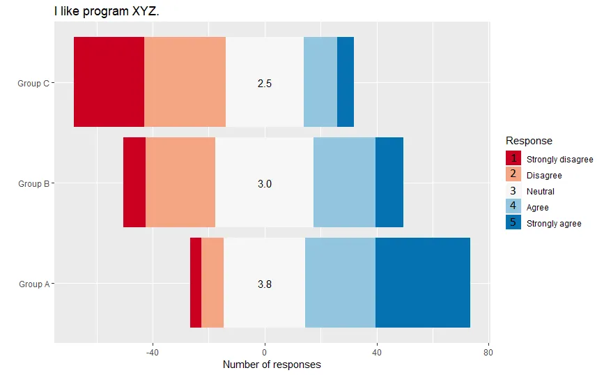
我正在制作一个分散条形图来展示Likert数据(类似于 这些)。客户要求每个组的“平均响应”,将Likert响应视为连续整数(“强烈不同意”= 1,“不同意”= 2等); 这些平均值显示在条形图的“中性”区域的顶部。
为了透明,我想在图例中添加每个Likert响应的数字值。我可以将数字添加到标签中(例如,“强烈同意(5)”),但我更喜欢将其放在颜色框的顶部(例如,在“强烈同意”的蓝色正方形的顶部)。
下面是生成分散条形图的代码:
我知道我可以 自定义 图例符号 的形状, 但问题在于我想要两个东西:一个带颜色的正方形,和一个叠加在正方形上的黑色数字。
为了透明,我想在图例中添加每个Likert响应的数字值。我可以将数字添加到标签中(例如,“强烈同意(5)”),但我更喜欢将其放在颜色框的顶部(例如,在“强烈同意”的蓝色正方形的顶部)。
下面是生成分散条形图的代码:
library(dplyr)
library(ggplot2)
library(RColorBrewer)
# The data.
df = structure(list(group = structure(c(1L, 2L, 3L, 1L, 2L, 3L, 1L, 2L, 3L, 1L, 2L, 3L, 1L, 2L, 3L),
                                  .Label = c("Group A", "Group B", "Group C"),
                                  class = "factor"),
                response = c(1L, 1L, 1L, 2L, 2L, 2L, 3L, 3L, 3L, 4L, 4L, 4L, 5L, 5L, 5L),
                n = c(4, 8, 25, 8, 25, 29, 29, 35, 28, 25, 22, 12, 34, 10, 6),
                mean.response = c(3.8, 3, 2.5, 3.8, 3, 2.5, 3.8, 3, 2.5, 3.8, 3, 2.5, 3.8, 3, 2.5),
                response.fill = c("#CA0020", "#CA0020", "#CA0020",
                                  "#F4A582", "#F4A582", "#F4A582",
                                  "#F7F7F7", "#F7F7F7", "#F7F7F7",
                                  "#92C5DE", "#92C5DE", "#92C5DE",
                                  "#0571B0", "#0571B0", "#0571B0"),
                n.to.plot = c(4, 8, 25, 8, 25, 29, 14.5, 17.5, 14, 25, 22, 12, 34, 10, 6)),
           class = c("grouped_df", "tbl_df", "tbl", "data.frame"),
           row.names = c(NA, -15L),
           groups = structure(list(group = structure(1:3, .Label = c("Group A", "Group B", "Group C"),
                                                     class = "factor"),
                                   .rows = list(c(1L, 4L, 7L, 10L, 13L),
                                                c(2L, 5L, 8L, 11L, 14L),
                                                c(3L, 6L, 9L, 12L, 15L))),
                              row.names = c(NA, -3L),
                              class = c("tbl_df", "tbl", "data.frame"),
                              .drop = TRUE))
# Groups, responses, and colors.
n.groups = 3
groups = paste("Group", LETTERS[1:n.groups])
likert.responses = c("Strongly disagree", "Disagree", "Neutral", "Agree", "Strongly agree")
pal = brewer.pal(length(likert.responses), "RdBu")
# Make the plot.
ggplot(data = df, aes(x = group, y = n.to.plot, fill = response.fill)) +
  # Start with the "agree" responses.
  geom_bar(data = df %>% filter(response >= 3),
           stat = "identity") +
  # Add the "disagree" responses going the opposite way.
  geom_bar(data = df %>%
             filter(response <= 3) %>%
             mutate(n.to.plot = n.to.plot * -1),
           stat = "identity") +
  # Add text labels with the mean response for each group.
  geom_text(data = df %>%
              dplyr::select(group, mean.response) %>%
              distinct(),
            aes(x = group, y = 0,
                label = format(mean.response, nsmall = 1),
                fill = NA)) +
  # Specify fill colors.
  scale_fill_identity("Response", breaks = pal, labels = likert.responses,
                      guide = "legend") +
  # Adjust axis labels.
  scale_x_discrete("") +
  scale_y_continuous("Number of responses") +
  # Swap x and y axes.
  coord_flip() +
  # Add the prompt text as the title.
  ggtitle("I like program XYZ.")

这是我期望的输出:
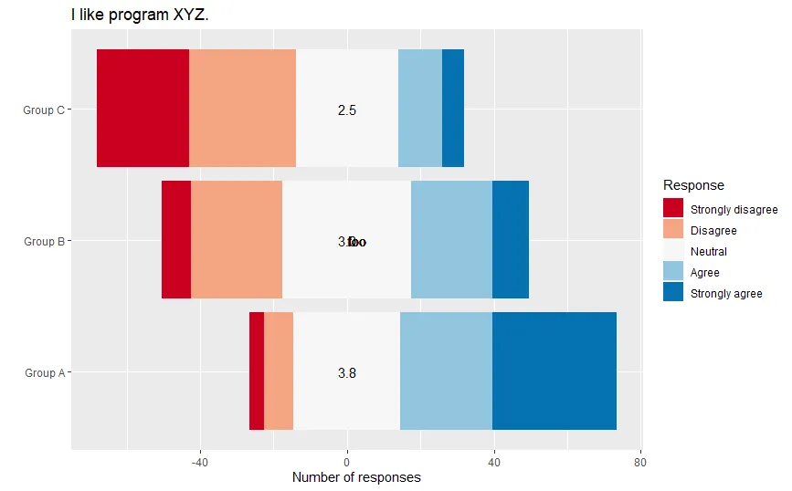
label美学应用于填充图例,但没有效果:+ guides(fill = guide_legend(override.aes = list(label = "foo")))
我知道我可以 自定义 图例符号 的形状, 但问题在于我想要两个东西:一个带颜色的正方形,和一个叠加在正方形上的黑色数字。
更新:自定义注释
@M-- 建议使用 annotation_custom,具体描述在 这里。为此,我需要找出图例中颜色方块的位置。这就是我卡住的地方;我可以找到这些方块的 grobs,但我不知道如何在它们上面放置文本。
根据this answer的指导,对于颜色框中的一个,使用已保存的图形g来进行粗略调整:
gt = ggplot_gtable(ggplot_build(g))
gb = which(gt$layout$name == "guide-box")
box.grob = gt$grobs[[gb]]$grobs[[1]]$grobs[[3]]
box.grob$x和box.grob$y都是0.5npc; 我尝试使用geom_text_npc添加标签,但标签位于绘图的正中间。 显然,我没有正确地确定颜色框的位置(或者我没有正确地将其转换为绘图坐标)。
library(ggpmisc)
g + geom_text_npc(aes(npcx = 0.5, npcy = 0.5, label = "foo"))

response.fill,而且pal对于breaks不足够!这一切都归结于提供一个可重现的示例。 - M--response.fill是df的一部分,而pal则是在df下面定义的。我现在意识到我忘记包括必需的库(RColorBrewer对于pal非常重要);我已经编辑了帖子以添加这些内容。 - A. S. K.