热力图 seaborn 中的日期轴

12

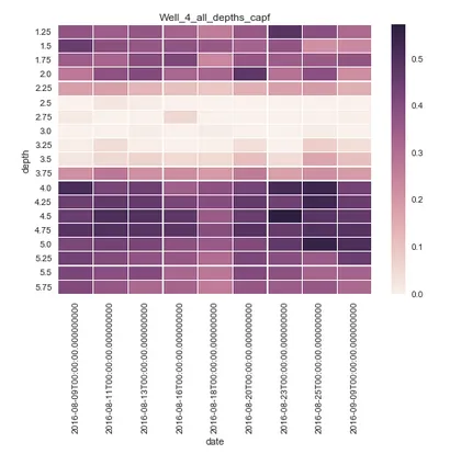
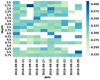
有点背景信息:我对编程非常新手,这是我的第一个脚本的一小部分。这个特定部分的目标是显示一个Seaborn热力图,其中y轴表示垂直深度,x轴表示时间,热函数表示科学测量的强度。

如果这个问题在其他地方已经得到了回答,我想道歉,因为我的搜索能力可能失败了。

sns.set()
nametag = 'Well_4_all_depths_capf'
Dp = D[D.well == 'well4']
print(Dp.date)


heat = Dp.pivot("depth",  "date", "capf")
### depth, date and capf are all columns of a pandas dataframe 

plt.title(nametag)

sns.heatmap(heat,  linewidths=.25)

plt.savefig('%s%s.png' % (pathheatcapf, nametag), dpi = 600)

这是从“print(Dp.date)”打印出来的内容,所以我相当确定数据框的格式符合我想要的格式,特别是年、日、月。

0    2016-08-09
1    2016-08-09
2    2016-08-09
3    2016-08-09
4    2016-08-09
5    2016-08-09
6    2016-08-09
         ...    

但是,当我运行它时,日期轴总是打印出空时间(00:00等),而我不想要这些时间。

有没有办法从日期轴中删除这些时间?

问题是在上面一个单元格中我使用了此函数来扫描文件名并创建具有日期的列吗?使用datetime而不是仅使用日期函数是错误的吗?

D['date']=pd.to_datetime(['%s-%s-%s' %(f[0:4],f[4:6],f[6:8]) for f in             
D['filename']])

输入图像描述

4个回答

11
你需要使用strftime函数来格式化数据帧的日期序列,以正确地绘制xtick标签。

你需要使用strftime函数来格式化数据帧的日期序列,以正确地绘制xtick标签。

import numpy as np
import pandas as pd
import matplotlib.pyplot as plt
import seaborn as sns
from datetime import datetime, timedelta
import random

dates = [datetime.today() - timedelta(days=x * random.getrandbits(1)) for x in xrange(25)]
df = pd.DataFrame({'depth': [0.1,0.05, 0.01, 0.005, 0.001, 0.1, 0.05, 0.01, 0.005, 0.001, 0.1, 0.05, 0.01, 0.005, 0.001, 0.1, 0.05, 0.01, 0.005, 0.001, 0.1, 0.05, 0.01, 0.005, 0.001],\
 'date': dates,\
 'value': [-4.1808639999999997, -9.1753490000000006, -11.408113999999999, -10.50245, -8.0274750000000008, -0.72260200000000008, -6.9963940000000004, -10.536339999999999, -9.5440649999999998, -7.1964070000000007, -0.39225599999999999, -6.6216390000000001, -9.5518009999999993, -9.2924690000000005, -6.7605589999999998, -0.65214700000000003, -6.8852289999999989, -9.4557760000000002, -8.9364629999999998, -6.4736289999999999, -0.96481800000000006, -6.051482, -9.7846860000000007, -8.5710630000000005, -6.1461209999999999]})
pivot = df.pivot(index='depth', columns='date', values='value')

sns.set()
ax = sns.heatmap(pivot)
ax.set_xticklabels(df['date'].dt.strftime('%d-%m-%Y'))
plt.xticks(rotation=-90)

plt.show()

输入图像描述


2
现在出现了ValueError: The number of FixedLocator locations (13), usually from a call to set_ticks, does not match the number of ticklabels (25).,所以不确定是否正确... - Chris Withers

4

标准热力图日期标签示例

import pandas as pd
import seaborn as sns

dates = pd.date_range('2019-01-01', '2020-12-01')

df = pd.DataFrame(np.random.randint(0, 100, size=(len(dates), 4)), index=dates)

sns.heatmap(df)

我们可以创建一些辅助类/函数,以获得更好的标签和位置。 AxTransformer 可以将数据坐标转换为刻度位置,set_date_ticks 允许在绘图中应用自定义日期范围。

standard_heatmap

import numpy as np
import pandas as pd
import matplotlib.pyplot as plt
from collections.abc import Iterable
from sklearn import linear_model

class AxTransformer:
    def __init__(self, datetime_vals=False):
        self.datetime_vals = datetime_vals
        self.lr = linear_model.LinearRegression()
        
        return
    
    def process_tick_vals(self, tick_vals):
        if not isinstance(tick_vals, Iterable) or isinstance(tick_vals, str):
            tick_vals = [tick_vals]
            
        if self.datetime_vals == True:
            tick_vals = pd.to_datetime(tick_vals).astype(int).values
            
        tick_vals = np.array(tick_vals)
            
        return tick_vals
    
    def fit(self, ax, axis='x'):
        axis = getattr(ax, f'get_{axis}axis')()
        
        tick_locs = axis.get_ticklocs()
        tick_vals = self.process_tick_vals([label._text for label in axis.get_ticklabels()])
        
        self.lr.fit(tick_vals.reshape(-1, 1), tick_locs)
        
        return
    
    def transform(self, tick_vals):        
        tick_vals = self.process_tick_vals(tick_vals)
        tick_locs = self.lr.predict(np.array(tick_vals).reshape(-1, 1))
        
        return tick_locs
    
def set_date_ticks(ax, start_date, end_date, axis='y', date_format='%Y-%m-%d', **date_range_kwargs):
    dt_rng = pd.date_range(start_date, end_date, **date_range_kwargs)

    ax_transformer = AxTransformer(datetime_vals=True)
    ax_transformer.fit(ax, axis=axis)
    
    getattr(ax, f'set_{axis}ticks')(ax_transformer.transform(dt_rng))
    getattr(ax, f'set_{axis}ticklabels')(dt_rng.strftime(date_format))

    ax.tick_params(axis=axis, which='both', bottom=True, top=False, labelbottom=True)
    
    return ax

这些为我们提供了很多灵活性,例如:

fig, ax = plt.subplots(dpi=150)

sns.heatmap(df, ax=ax)

set_date_ticks(ax, '2019-01-01', '2020-12-01', freq='3MS')

清理后的热图日期标签

或者如果你真的想搞怪,你可以做一些像这样的事情

fig, ax = plt.subplots(dpi=150)

sns.heatmap(df, ax=ax)

set_date_ticks(ax, '2019-06-01', '2020-06-01', freq='2MS', date_format='%b `%y')

奇怪的热力图日期标签

对于您的特定示例,您将需要将axis='x'传递给set_date_ticks


tick_vals = pd.to_datetime(tick_vals).astype("int64").values 导致警告:.astype 从 datetime64[ns] 到 int32 的行为已过时。请替换为 tick_vals = pd.to_datetime(tick_vals).astype("int64").values。 - marianoju

1
  • 首先,必须使用 pandas.to_datetime'date' 列转换为 datetime dtype
  • 如果期望的结果只是日期(没有时间),那么最简单的解决方案是使用 .dt accessor 提取 .date 组件。或者,使用 dt.strftime 设置特定的字符串格式。
    • strftime()strptime() 格式代码
    • df.date.dt.strftime('%H:%M') 将小时和分钟提取为字符串,例如 '14:29'
    • 在下面的示例中,提取的日期分配给相同的列,但该值也可以分配为新列。
  • pandas.DataFrame.pivot_table 用于聚合函数,如果每个 index 的列中有多个值,则应使用 pandas.DataFrame.pivot
    • 这比 .groupby 更好,因为数据框的形状正确,易于绘图。
  • python 3.8.11pandas 1.3.2matplotlib 3.4.3seaborn 0.11.2 中测试通过
import pandas as pd
import numpy as np
import seaborn as sns

# create sample data
dates = [f'2016-08-{d}T00:00:00.000000000' for d in range(9, 26, 2)] + ['2016-09-09T00:00:00.000000000']
depths = np.arange(1.25, 5.80, 0.25)
np.random.seed(365)
p1 = np.random.dirichlet(np.ones(10), size=1)[0]  # random probabilities for random.choice
p2 = np.random.dirichlet(np.ones(19), size=1)[0]  # random probabilities for random.choice
data = {'date': np.random.choice(dates, size=1000, p=p1), 'depth': np.random.choice(depths, size=1000, p=p2), 'capf': np.random.normal(0.3, 0.05, size=1000)}
df = pd.DataFrame(data)

# display(df.head())
                            date  depth      capf
0  2016-08-19T00:00:00.000000000   4.75  0.339233
1  2016-08-19T00:00:00.000000000   3.00  0.370395
2  2016-08-21T00:00:00.000000000   5.75  0.332895
3  2016-08-23T00:00:00.000000000   1.75  0.237543
4  2016-08-23T00:00:00.000000000   5.75  0.272067

# make sure the date column is converted to a datetime dtype
df.date = pd.to_datetime(df.date)

# extract only the date component of the date column
df.date = df.date.dt.date

# reshape the data for heatmap; if there's no need to aggregate a function, then use .pivot(...)
dfp = df.pivot_table(index='depth', columns='date', values='capf', aggfunc='mean')

# display(dfp.head())
date   2016-08-09  2016-08-11  2016-08-13  2016-08-15  2016-08-17  2016-08-19  2016-08-21  2016-08-23  2016-08-25  2016-09-09
depth                                                                                                                        
1.50     0.334661         NaN         NaN    0.302670    0.314186    0.325257    0.313645    0.263135         NaN         NaN
1.75     0.305488    0.303005    0.410124    0.299095    0.313899    0.280732    0.275758    0.260641         NaN    0.318099
2.00     0.322312    0.274105         NaN    0.319606    0.268984    0.368449    0.311517    0.309923         NaN    0.306162
2.25     0.289959    0.315081         NaN    0.302202    0.306286    0.339809    0.292546    0.314225    0.263875         NaN
2.50     0.314227    0.296968         NaN    0.312705    0.333797    0.299556    0.327187    0.326958         NaN         NaN

# plot
sns.heatmap(dfp, cmap='GnBu')

enter image description here


-3
我曾经遇到类似的问题,但是日期是索引。在绘图之前,我只需将日期转换为字符串(pandas 1.0),这对我有用。
heat['date'] = heat.date.astype('string')

网页内容由stack overflow 提供, 点击上面的
可以查看英文原文,
原文链接