The matplotlib scatter function has s and c parameters which would allow you to plot dots of different sizes and colors.
The Pandas DataFrame.plot method calls the matplotlib scatter function when you specify kind='scatter'. It also passes extra arguments along to the call to scatter so you could use something like
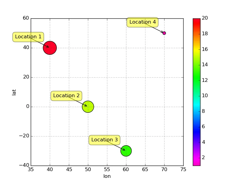
df.plot(kind='scatter', x='lon', y='lat', s=df['Total']*50, c=df['Total'], cmap=cmap)
to plot your points.
Annotating the points can be done with calls to plt.annotate.
The gist_rainbow colormap goes from red to orange to yellow ... to violet. gist_rainbow_r is the reversed colormap, which makes red correspond to the largest values.
例如,
import pandas as pd
import matplotlib.pyplot as plt

df = pd.DataFrame({'Total': [20,15,13,1],
                   'lat': [40,0,-30,50],
                   'lon': [40,50,60,70], },
                  index=['Location {}'.format(i) for i in range(1,5)])

cmap = plt.get_cmap('gist_rainbow_r')
df.plot(kind='scatter', x='lon', y='lat', s=df['Total']*50, c=df['Total'], cmap=cmap)

for idx, row in df.iterrows():
    x, y = row[['lon','lat']]
    plt.annotate(
        str(idx),
        xy = (x, y), xytext = (-20, 20),
        textcoords = 'offset points', ha = 'right', va = 'bottom',
        bbox = dict(boxstyle = 'round,pad=0.5', fc = 'yellow', alpha = 0.5),
        arrowprops = dict(arrowstyle = '->', connectionstyle = 'arc3,rad=0'))

plt.show()
产量
不要为每个数据点调用df.plot或plt.scatter。随着数据点数量的增加,这样做会变得非常缓慢。相反,将必要的数据(经度和纬度)收集到DataFrame中,以便可以通过对df.plot的一次调用绘制数据点:
longitudes, latitudes = [], []
for row_index, row in df.iterrows():
    x, y = db.getLocation(row_index)
    lat, lon = m(y, x)
    longitudes.append(lon)
    latitudes.append(lat)
    plt.annotate(
        str(row_index),
        xy = (x, y), xytext = (-20, 20),
        textcoords = 'offset points', ha = 'right', va = 'bottom',
        bbox = dict(boxstyle = 'round,pad=0.5', fc = 'yellow', alpha = 0.5),
        arrowprops = dict(arrowstyle = '->', connectionstyle = 'arc3,rad=0'))

df['lon'] = longitudes
df['lat'] = latitudes
cmap = plt.get_cmap('gist_rainbow_r')
ax = plt.gca()
df.plot(kind='scatter', x='lon', y='lat', s=df['Total']*50, c=df['Total'],
        cmap=cmap, ax=ax)
df.iterrows()之外,我无法访问纬度和经度。我必须从数据库中获取这些数据(正如您可能从我的示例代码中看到的:x, y = db.getLocation(row_index))。我可以在循环的每次迭代中使用plt.scatter来获得相同的结果吗? - JNevensplt.scatter。这样做对于数百个点可能会使脚本变得非常缓慢。相反,将lon和lat收集到列表或DataFrame中,以便可以通过一次调用df.plot或plt.scatter绘制点。我已经编辑了上面的帖子,展示了其中一种方法。 - unutbudf.plot默认创建一个新的轴,但是如果你将一个axis对象传递给它,那么就会使用该轴。因此ax = plt.gca()(获取当前轴),并且df.plot(..., ax=ax)就是修复方法。(我已经在上面进行了更正。) - unutbu