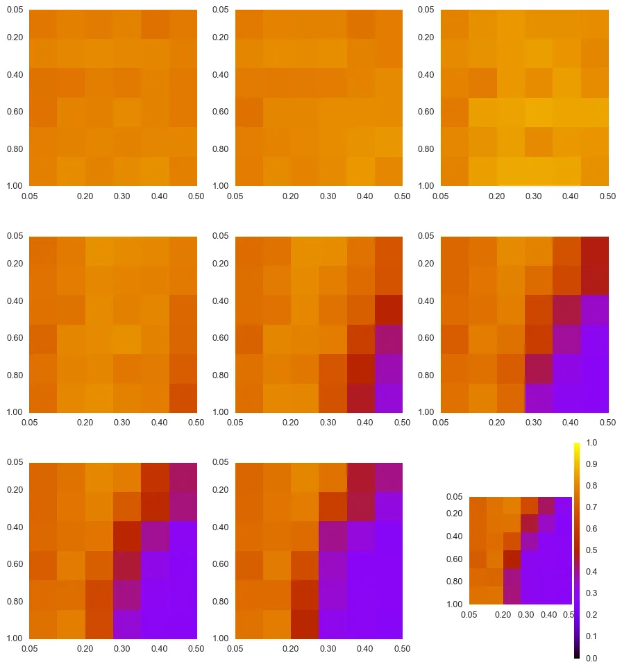
我正在使用以下步骤在子图中绘制不同的图表。
这是我得到的结果:
fig = figure(figsize=(10,11))
subplots_adjust(wspace=0.5,hspace=0.2)
iplot = 330
for i in range(9):
    iplot += 1
    ax = fig.add_subplot(iplot)
    ## Comparison Mreal - Real
    tmp = REAL[REAL.days==days[i]]
    tmp = tmp.score
    tmp = np.array(tmp)
    tmp = tmp.reshape(len(xv), len(br))
    im = plt.imshow(tmp, interpolation='nearest', cmap='gnuplot', vmin = 0, vmax = 1,  extent=[0.05,0.5,1,0.05],
              aspect=0.5)
    xtmp = [0.05, 0.2, 0.3, 0.4, 0.5]
    plt.xticks(xtmp)
    ytmp = [0.05, 0.2, 0.4, 0.6, 0.8, 1.0]
    plt.yticks(ytmp)
    ax.grid(False)
divider = make_axes_locatable(plt.gca())
cax = divider.append_axes("right", "5%", pad="3%")
plt.colorbar(im, cax=cax)
plt.tight_layout()
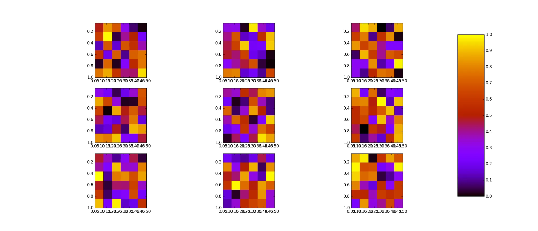
这是我得到的结果: