我正在进行二元分类,我的数据不平衡,我使用了svm权重来尝试减轻这种情况...如你所见,我已经计算并绘制了每个类别的roc曲线,并得到了以下图表: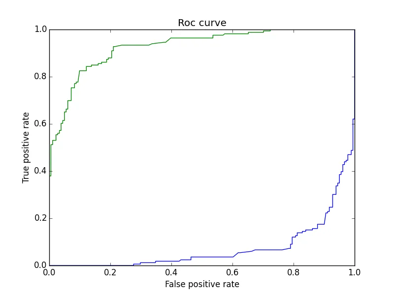 看起来两个类别合为一类...我不确定我是否做对了,因为这是我第一次画自己的roc曲线...我在使用Scikit learn绘图...单独绘制每个类别的图表是否正确...分类器是否在无法分类蓝色类别?
以下是我用来获取图表的代码:
看起来两个类别合为一类...我不确定我是否做对了,因为这是我第一次画自己的roc曲线...我在使用Scikit learn绘图...单独绘制每个类别的图表是否正确...分类器是否在无法分类蓝色类别?
以下是我用来获取图表的代码:
看起来两个类别合为一类...我不确定我是否做对了,因为这是我第一次画自己的roc曲线...我在使用Scikit learn绘图...单独绘制每个类别的图表是否正确...分类器是否在无法分类蓝色类别?
以下是我用来获取图表的代码:y_pred = clf.predict_proba(X_test)[:,0] # for calculating the probability of the first class
y_pred2 = clf.predict_proba(X_test)[:,1] # for calculating the probability of the second class
fpr, tpr, thresholds = metrics.roc_curve(y_test, y_pred)
auc=metrics.auc(fpr, tpr)
print "auc for the first class",auc
fpr2, tpr2, thresholds2 = metrics.roc_curve(y_test, y_pred2)
auc2=metrics.auc(fpr2, tpr2)
print "auc for the second class",auc2
# ploting the roc curve
plt.plot(fpr,tpr)
plt.plot(fpr2,tpr2)
plt.xlim([0.0,1.0])
plt.ylim([0.0,1.0])
plt.title('Roc curve')
plt.xlabel('False positive rate')
plt.ylabel('True positive rate')
plt.legend(loc="lower right")
plt.show()
我知道有更好的方法来编写字典,但我只是想先看看曲线。