我正在尝试将
下面是我提供的一个MWE以说明我的意思:
以下函数绘制ROC曲线:
sklearn的 ROC扩展到多类的思想应用于我的数据集。我的每个类别的ROC曲线看起来都像是一条直线,与sklearn示例中波动的曲线不同。下面是我提供的一个MWE以说明我的意思:
# all imports
import numpy as np
import matplotlib.pyplot as plt
from itertools import cycle
from sklearn import svm, datasets
from sklearn.metrics import roc_curve, auc
from sklearn.model_selection import train_test_split
from sklearn.preprocessing import label_binarize
from sklearn.datasets import  make_classification
from sklearn.ensemble import RandomForestClassifier
# dummy dataset
X, y = make_classification(10000, n_classes=5, n_informative=10, weights=[.04, .4, .12, .5, .04])
train, test, ytrain, ytest = train_test_split(X, y, test_size=.3, random_state=42)

# random forest model
model = RandomForestClassifier()
model.fit(train, ytrain)
yhat = model.predict(test)
以下函数绘制ROC曲线:
def plot_roc_curve(y_test, y_pred):

  n_classes = len(np.unique(y_test))
  y_test = label_binarize(y_test, classes=np.arange(n_classes))
  y_pred = label_binarize(y_pred, classes=np.arange(n_classes))

  # Compute ROC curve and ROC area for each class
  fpr = dict()
  tpr = dict()
  roc_auc = dict()
  for i in range(n_classes):
    fpr[i], tpr[i], _ = roc_curve(y_test[:, i], y_pred[:, i])
    roc_auc[i] = auc(fpr[i], tpr[i])

  # Compute micro-average ROC curve and ROC area
  fpr["micro"], tpr["micro"], _ = roc_curve(y_test.ravel(), y_pred.ravel())
  roc_auc["micro"] = auc(fpr["micro"], tpr["micro"])

  # First aggregate all false positive rates
  all_fpr = np.unique(np.concatenate([fpr[i] for i in range(n_classes)]))

  # Then interpolate all ROC curves at this points
  mean_tpr = np.zeros_like(all_fpr)
  for i in range(n_classes):
    mean_tpr += np.interp(all_fpr, fpr[i], tpr[i])

  # Finally average it and compute AUC
  mean_tpr /= n_classes

  fpr["macro"] = all_fpr
  tpr["macro"] = mean_tpr
  roc_auc["macro"] = auc(fpr["macro"], tpr["macro"])

  # Plot all ROC curves
  #plt.figure(figsize=(10,5))
  plt.figure(dpi=600)
  lw = 2
  plt.plot(fpr["micro"], tpr["micro"],
    label="micro-average ROC curve (area = {0:0.2f})".format(roc_auc["micro"]),
    color="deeppink", linestyle=":", linewidth=4,)

  plt.plot(fpr["macro"], tpr["macro"],
    label="macro-average ROC curve (area = {0:0.2f})".format(roc_auc["macro"]),
    color="navy", linestyle=":", linewidth=4,)

  colors = cycle(["aqua", "darkorange", "darkgreen", "yellow", "blue"])
  for i, color in zip(range(n_classes), colors):
    plt.plot(fpr[i], tpr[i], color=color, lw=lw,
        label="ROC curve of class {0} (area = {1:0.2f})".format(i, roc_auc[i]),)

  plt.plot([0, 1], [0, 1], "k--", lw=lw)
  plt.xlim([0.0, 1.0])
  plt.ylim([0.0, 1.05])
  plt.xlabel("False Positive Rate")
  plt.ylabel("True Positive Rate")
  plt.title("Receiver Operating Characteristic (ROC) curve")
  plt.legend()
输出:
plot_roc_curve(ytest, yhat)
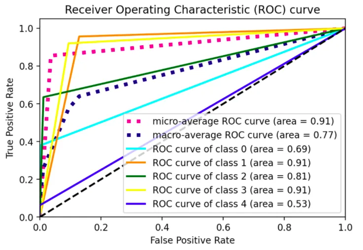
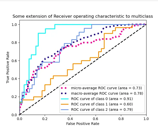
一条直线弯曲一次。我希望能够看到不同阈值下的模型表现,而不仅仅是一个阈值,类似于sklearn的示例中展示的3类情况的图形: