我正在尝试使用ggplot2和dplyr(而不是plyr)来复制Simpler population pyramid in ggplot2中的简单人口金字塔。
以下是使用plyr和种子的原始示例。
以下是使用plyr和种子的原始示例。
set.seed(321)
test <- data.frame(v=sample(1:20,1000,replace=T), g=c('M','F'))

require(ggplot2)
require(plyr)
ggplot(data=test,aes(x=as.factor(v),fill=g)) +
  geom_bar(subset=.(g=="F")) +
  geom_bar(subset=.(g=="M"),aes(y=..count..*(-1))) +
  scale_y_continuous(breaks=seq(-40,40,10),labels=abs(seq(-40,40,10))) +
  coord_flip()
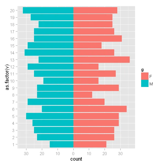
运行正常。
但我该如何使用 dplyr 生成相同的图形呢?示例中在 subset = .(g == 语句中使用了 plyr。
我尝试使用 dplyr::filter 进行以下操作,但出现错误:
require(dplyr)
ggplot(data=test,aes(x=as.factor(v),fill=g)) +
  geom_bar(dplyr::filter(test, g=="F")) +
  geom_bar(dplyr::filter(test, g=="M"),aes(y=..count..*(-1))) +
  scale_y_continuous(breaks=seq(-40,40,10),labels=abs(seq(-40,40,10))) +
  coord_flip()

Error in get(x, envir = this, inherits = inh)(this, ...) :
  Mapping should be a list of unevaluated mappings created by aes or aes_string
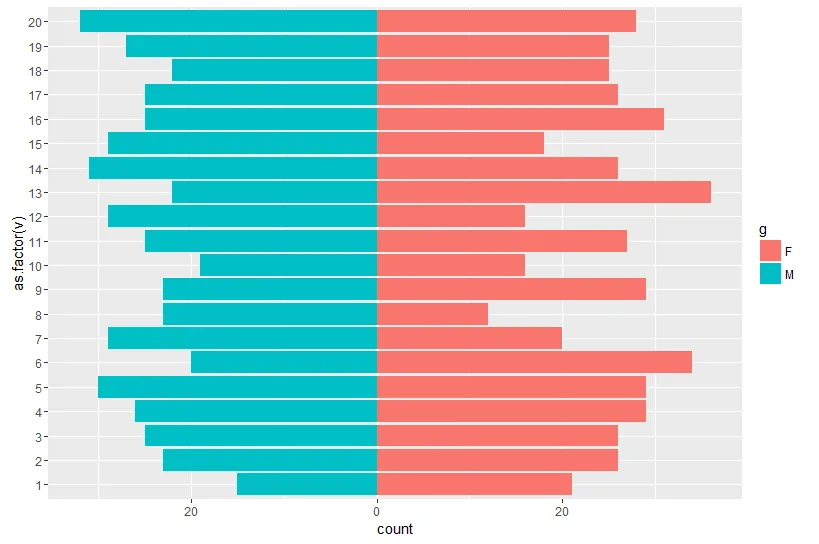
v替换as.factor(v)可以解决问题:现在它的顺序正确了。 - RockScience