在使用facet_wrap函数时如何混合log和常规比例尺来更改ggplot的y轴限制

3

我有一个数据集,其中一组的值范围很大。使用ggplot的facet_wrap函数,我要为其中一个组(值范围最广的组)绘制y轴的对数刻度,而为另一个组绘制普通坐标轴。

以下是可复制的示例:

set.seed(123)

FiveLetters <- LETTERS[1:2]

df <- data.frame(MonthlyCount = sample(1:10, 36, replace=TRUE),
CustName = factor(sample(FiveLetters,size=36, replace=TRUE)),
ServiceDate =  format(seq(ISOdate(2003,1,1), by='day', length=36), 
format='%Y-%m-%d'), stringsAsFactors = F)

df$ServiceDate <- as.Date(df$ServiceDate)

# replace some counts to really high numbers for group A

df$MonthlyCount[df$CustName =="A" & df$MonthlyCount >= 9 ] <-300

df

library(ggplot2)
library(scales)

ggplot(data = df, aes(x = ServiceDate, y = MonthlyCount))  +
geom_point() +  
facet_wrap(~ CustName, ncol = 1, scales = "free_y" ) +
scale_x_date("Date", 
               labels = date_format("%Y-%m-%d"), 
               breaks = date_breaks("1 week")) +
  theme(axis.text.x = element_text(colour = "black", 
                                   size = 16, 
                                   angle = 90, 
                                   vjust = .5))

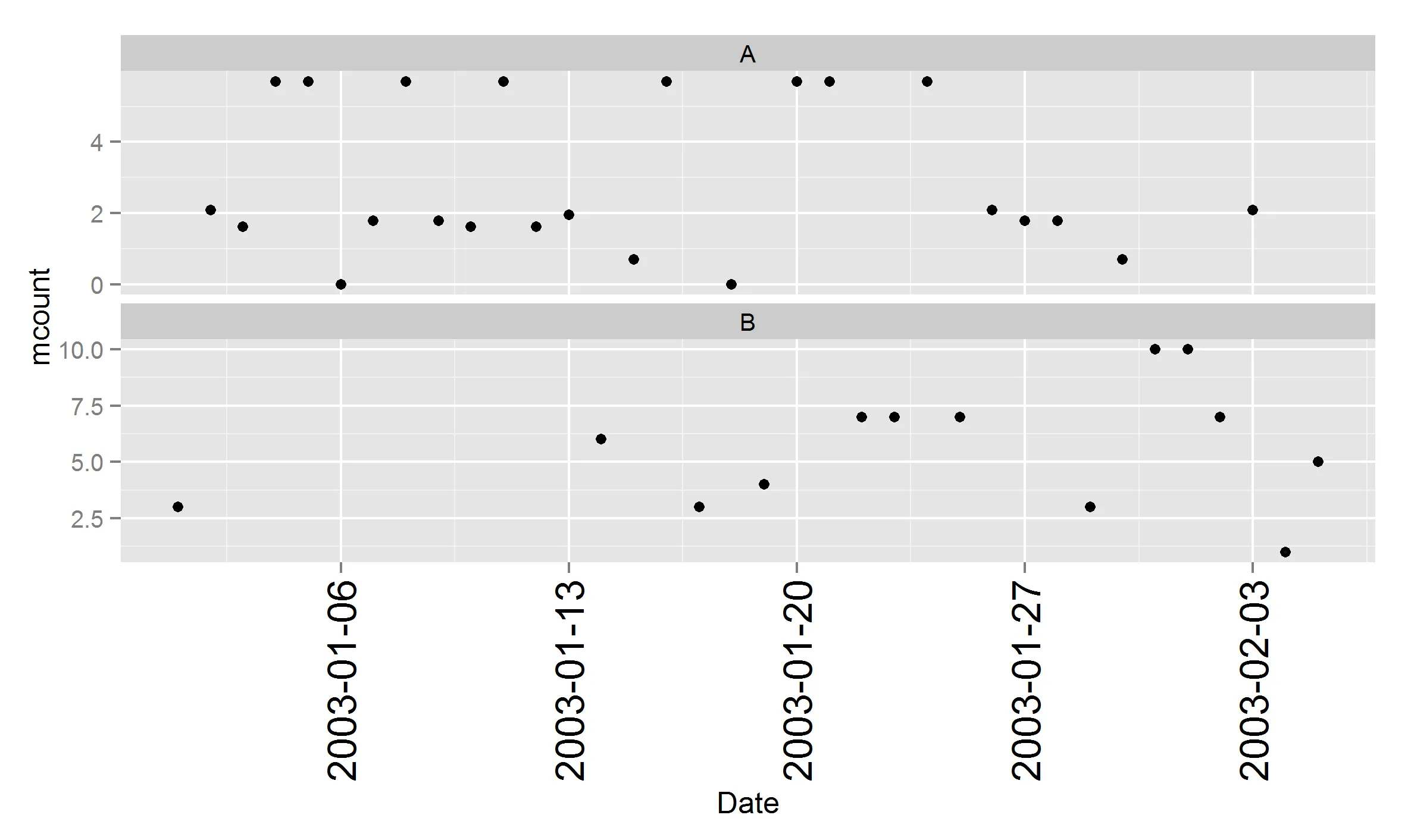
生成的图表有两个方面。A组的方面在图表的顶部和底部有点,这些点很难比较,而B组的方面更容易阅读。我想将A组的方面绘制在对数刻度上,并保留其他方面的“自由”。


1
到目前为止,最简单的方法是制作两个图并使用grid.arrange将它们粘在一起,而不是使用faceting。 - Gregor Thomas
2个回答

1
这个可以完成任务。
ggplot(data = df, aes(x = ServiceDate, y = MonthlyCount))  +
 geom_point() +  
 facet_wrap(~ CustName, ncol = 1, scales = "free_y" ) +
 scale_x_date("Date", 
           labels = date_format("%Y-%m-%d"), 
           breaks = date_breaks("1 week")) +
scale_y_continuous(trans=log_trans(), breaks=c(1,3,10,50,100,300),
                 labels = comma_format())+
 theme(axis.text.x = element_text(colour = "black", 
        size = 16, 
        angle = 90, 
        vjust = .5))

2
log_trans() 函数是做什么用的?在最新的 ggplot2 中运行时,该函数是未知的。 - ecoe
你尝试过指定范围 scales::log_trans() 吗? - Bernard Jesop
这不是记录一个轴并取消记录另一个轴:它只是将它们都放在合理(对数)刻度上。 - ben18785

0

您可以制作一个转换后的每月计数,并将其用作y轴。

## modify monthly count
df$mcount <- with(df, ifelse(CustName == "A", log(MonthlyCount), MonthlyCount))

ggplot(data = df, aes(x = ServiceDate, y = mcount))  +
  geom_point() +  
  facet_wrap(~ CustName, ncol = 1, scales = "free_y" ) +
  scale_x_date("Date", 
               labels = date_format("%Y-%m-%d"), 
               breaks = date_breaks("1 week")) +
  theme(axis.text.x = element_text(colour = "black", 
            size = 16, 
            angle = 90, 
            vjust = .5))

enter image description here


网页内容由stack overflow 提供, 点击上面的
可以查看英文原文,
原文链接