使用facet_wrap和geom_segment删除不必要的y轴点

3

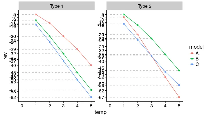
我正在使用geom_segment()将y轴点映射到x轴,并使用facet_wrap将数据分成两个图; 但是,y轴点出现在两个图中。

如何只显示每个facet_wrap相关的必要y轴点?

示例代码

dat <- structure(list(temp = c(1, 2, 3, 4, 5, 1, 2, 3, 4, 5, 1, 2, 3, 
4, 5, 1, 2, 3, 4, 5, 1, 2, 3, 4, 5, 1, 2, 3, 4, 5), rev = c(-5, 
-11, -20, -29, -40, -9, -20, -32, -45, -57, -12, -24, -37, -50, 
-62, -7, -20, -36, -52, -67, -5, -13, -23, -35, -47, -12, -24, 
-36, -48, -58), type = c("Type 1", "Type 1", "Type 1", "Type 1", 
"Type 1", "Type 1", "Type 1", "Type 1", "Type 1", "Type 1", "Type 1", 
"Type 1", "Type 1", "Type 1", "Type 1", "Type 2", "Type 2", "Type 2", 
"Type 2", "Type 2", "Type 2", "Type 2", "Type 2", "Type 2", "Type 2", 
"Type 2", "Type 2", "Type 2", "Type 2", "Type 2"), model = c("A", 
"A", "A", "A", "A", "B", "B", "B", "B", "B", "C", "C", "C", "C", 
"C", "A", "A", "A", "A", "A", "B", "B", "B", "B", "B", "C", "C", 
"C", "C", "C")), .Names = c("temp", "rev", "type", "model"), row.names = c(NA, 
-30L), class = "data.frame")

p1 <- ggplot(dat, aes(temp, rev, color = model)) + 
  geom_line() + geom_point() + geom_segment(aes(x = 0, xend = temp, yend = rev), linetype = "dashed", color = "grey") + 
  facet_wrap(~type, scales = "free") + scale_y_continuous(breaks = dat$rev)
p1

情节

图片描述

2个回答

4

我编造了一些虚拟数据,因为不知何故,将你的dput粘贴到我的控制台中会使其发生问题。

library(dplyr)

df <- expand.grid(temp = 1:5, model = LETTERS[1:3], type = 1:2) %>% 
  group_by(model, type) %>% 
  mutate(rev = -sort(sample.int(20, length(temp)))) 

# this is equivalent to your data as-is, structurewise

df.labeled <- df %>% 
  ungroup() %>% group_by(type, rev) %>% 
  mutate(label = c(rev[1], rep(NA, length(rev) - 1)))

在每个组面板中,我为每个出现的 y 值创建了一个分组。然后我创建了一个label列,该列由该 y 值的 1 次观察组成,用 NA填充。因此,如果一个面板有两个模型,每个模型的 rev都为 -5 ,那么现在它将是 -5,NA而不是 -5,-5。为什么我这样做会在下面变得更清楚。


ggplot(df.labeled, aes(temp, rev, color = model)) + 
  geom_segment(aes(xend = 0, yend = rev), linetype = "dashed", color = "grey") +
  geom_text(aes(label = label, x = -0.1), colour = "black", hjust = 1) +
  geom_vline(xintercept = 0) +
  geom_point() + geom_line() + facet_grid(~type) + 
  scale_y_continuous(breaks = NULL) + 
  scale_x_continuous(limits = c(-0.5, NA)) +
  theme_bw() + theme(panel.grid = element_blank())

在此输入图片描述

如果我将重复的内容保留下来(这里会是类型1和类型2分别为-7,-15和-11),那么geom_text 将会是一段混乱的无法辨认的粗体文本。在 ggplot2 中,重复的文本标签显示效果不佳。因此,我们在每个面板上制作一个假比例尺来避免这种情况。如果您不喜欢数字左侧有一条额外的 y 轴线,可以将其去除。

  ... + 
  theme(panel.grid = element_blank(),
        panel.border = element_blank(),
        axis.line.x = element_line())

enter image description here


非常好的回答。谢谢! - Vedda
这个方法很好用,但是如果我添加更多的模型,就会在y轴标签上出现重叠,从而使它们难以阅读。有没有一种方法可以使用这个方法,但是展开y轴以防止标签重叠? - Vedda
如果有这么多点,可能一个正常未修改的y轴最好;) 你可以尝试使用更高的宽高比:ggsave("file.png", width = 6, height = 8)。你也可以尝试使用ggrepel包来微调标签的位置。 - Brian

2
我们可以按照type将数据框拆分,创建单独的图形,然后使用gridExtra包中的grid.arrange将两个图形组合起来。
library(ggplot2)
library(gridExtra)

# Split the data
dat_list <- split(dat, dat$type)

# Use lapply to create plot for both subset
p_list <- lapply(dat_list, function(x){

  p1 <- ggplot(x, aes(temp, rev, color = model)) + 
    geom_line() + 
    geom_point() + 
    geom_segment(aes(x = 0, xend = temp, yend = rev), linetype = "dashed", color = "grey") + 
    scale_y_continuous(breaks = x$rev) +
    facet_wrap(~type, scales = "free")
  return(p1)
})

# Plot the data
grid.arrange(grobs = p_list, nrow = 1)

更新

另一个选择是使用cowplot包。这似乎是创建一个公共图例的方法。

library(cowplot)

# Get the common legend, p_list is from the previous example
legend_both <- get_legend(p_list[[1]])

# Plot the plots and the common legend together
# Use rel_widths to set the column width
plot_grid(p_list[[1]] + theme(legend.position = "none"),
          p_list[[2]] + theme(legend.position = "none"),
          legend_both, 
          nrow = 1,
          rel_widths = c(2, 2, 1))

1
这是我的第一个想法,但我希望有一种方法可以在ggplot中保持它而不必拆分数据。这样,y轴将对齐以显示模型和类型之间的关系。谢谢。 - Vedda
1
我知道。只使用ggplot2会很棒。我仍在寻找可能的方法。希望其他人能分享他们的想法。 - www
1
为了保持轴对齐,您可以使用 cbind.gtablegrid.arrange 的组合,但也有一种 hack 解决方法... - Brian
我通常使用cowplot来进行多图绘制,所以这也是一个不错的选择。谢谢! - Vedda
我知道这已经晚了很多,也许自2017年以来软件包已经有所改变,但是对于那些希望在面板之间保持y轴一致的人,可以使用“scales =“free_x””。无需在ggplot2之外强制使用公共y轴。 - Kerry

网页内容由stack overflow 提供, 点击上面的
可以查看英文原文,
原文链接