R - 使用两个y轴绘制图表,柱状图和点图不对齐

3

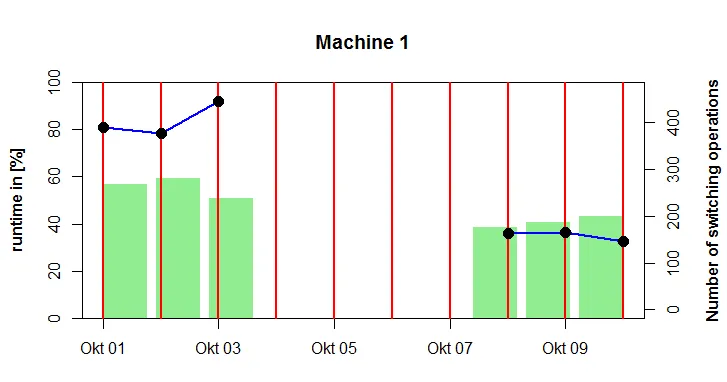
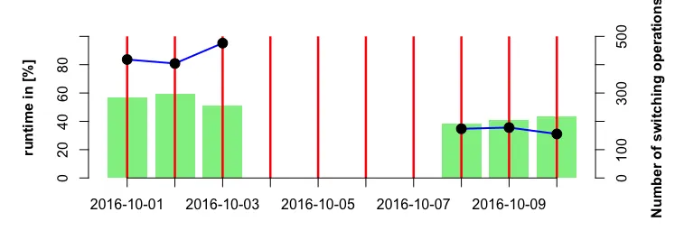
我正在为客户尝试创建一个带有两个y轴的组合条形图和折线图(带有点)。问题是,我的条形图和点没有对齐。

背景:我们有几台机器,正在测量它们的开/关次数以及每台机器运行的时间。我们想要将这两个信息结合在一个图中以节省空间,因为我们有多台机器。

数据按天或小时汇总。以下是一些示例数据:

date <- seq(as.Date("2016-10-01"), as.Date("2016-10-10"), "day")
counts <- c(390, 377, 444, NA, NA, NA, NA, 162, 166, 145)
runtime <- c(56.8, 59.4, 51.0, NA, NA, NA, NA, 38.5, 40.9, 43.4)
df <- data.frame(date = date, counts = counts, runtime = runtime)

这是我到目前为止尝试的:

par(mar = c(3,4,4,4) + 0.3)    
barplot(df$runtime, col = "palegreen2", border = "NA", ylab = "runtime in [%]", 
    ylim = c(0,100), font.lab = 2)
par(new = TRUE)
ymax <- max(df$counts, na.rm = TRUE) * 1.05
plot(df$date, df$counts, type = "n", xlab = "", ylab = "", yaxt = "n", 
    main = "Machine 1", ylim = c(0, ymax))
abline(v = date, col = "red", lwd = 2.5)
lines(df$date, df$counts, col = "blue", lwd = 2)
points(df$date, df$counts, pch = 19, cex = 1.5)
axis(4)
mtext("Number of switching operations", side = 4, line = 3, font = 2)

enter image description here

我在这里找到了关于双坐标轴的灵感: http://robjhyndman.com/hyndsight/r-graph-with-two-y-axes/

我该怎么做才能让条形图的中心与折线图的点对齐?


抱歉,似乎我在图片上做错了什么,丢失了开头的“Hello” :) - Suti
1
这个SO帖子可能会指引你朝着正确的方向前进。 - emilliman5
谢谢你提供那个有趣的链接。我尝试将箱线图保存为对象,并使用该值进行线条/点图绘制。这似乎有效。但是,我如何保留我的日期或日期/时间格式的x轴? - Suti
请查看此SO帖子,了解如何根据需要重新标记您的x轴。 - emilliman5
这真的很棘手。我现在用自己的数据和以下编辑过的代码尝试了一下: bg <- barplot(...) [...] points(bg, df$counts, pch = 19, cex = 1.5) 现在点又偏移了。也许这对于双 y 轴不起作用? - Suti
2个回答

2
您遇到的问题是在条形图之后调用第二个“plot”函数。这会导致绘图画布的移动/调整,从而导致后续点的偏移。
以下是一个快速的解决方法,它只是将点和线重新缩放到条形图上。它将条形图保存为一个对象,该对象存储条的中点的x轴位置。然后,当您使用“bp”作为x轴变量绘制abline、lines和points时,它们将正确对齐。
ymax <- max(df$counts, na.rm = TRUE) * 1.05

par(mar=c(4.1,5.1,2.1,5.1))
bp <- barplot(df$runtime, col = "palegreen2", border = "NA", ylab = "runtime in [%]", 
              ylim = c(0,100), font.lab = 2, xlim=c(0.2,12), )

barplot(df$runtime, col = "palegreen2", ylab = "runtime in [%]", border="NA",
    ylim = c(0,100), font.lab = 2)

abline(v = bp, col = "red", lwd = 2.5)
lines(bp, df$counts/ymax*100, col = "blue", lwd = 2)
points(bp, df$counts/ymax*100, pch = 19, cex = 1.5)
axis(4,at=c(0,20,40,60,80,100), labels=c("0","100","200","300","400","500"))
mtext("Number of switching operations", side = 4, line = 3, font = 2)
axis(1, at=bp, labels=df$date)

enter image description here


0

@emilliman:感谢您的耐心和建议!您的图表并不完全正确,因为第二个y轴的缩放比例不适合点的值,但是您的想法帮助我找到了解决方案!

这是我的新代码:

library(plyr)
ymax <- max(df$counts, na.rm = TRUE)
ymax_up <- round_any(ymax, 100, f = ceiling)
ylab <- ymax_up/5 * c(0:5)

par(mar = c(3,4,4,4) + 0.3)
bp <- barplot(df$runtime, col = "palegreen2", border = "NA", ylab = "runtime in [%]", 
    ylim = c(0,100), font.lab = 2, main = "Machine 1")
abline(v = bp, col = "red", lwd = 2.5)
lines(bp, 100/ymax_up * df$counts, col = "blue", lwd = 2)
points(bp, 100/ymax_up * df$counts, pch = 19, cex = 1.5)

axis(4,at=c(0,20,40,60,80,100), labels= as.character(ylab))
mtext("Number of switching operations", side = 4, line = 3, font = 2)
xlab <- as.character(df$date, format = "%b %d")
axis(1, at=bp, labels = xlab)
abline(h = c(0,100))

(http://i.imgur.com/9YtYGSD.png)

或许对于其他遇到这个问题的人有所帮助。


网页内容由stack overflow 提供, 点击上面的
可以查看英文原文,
原文链接