我该如何使用两个不同的y轴绘制图表?

141

我想在R中叠加两个散点图,使每组数据点都有自己的(不同的)y轴(即在图中位置2和4),但数据点出现在同一张图中。

使用plot命令可以实现吗?

编辑:示例代码说明了问题:

# example code for SO question
y1 <- rnorm(10, 100, 20)
y2 <- rnorm(10, 1, 1)
x <- 1:10
# in this plot y2 is plotted on what is clearly an inappropriate scale
plot(y1 ~ x, ylim = c(-1, 150))
points(y2 ~ x, pch = 2)

请提供样本数据。从美学角度来看,这通常是一个不好的主意。 - Chase
3
在特定案例中关于ggplot2的答案和讨论:https://dev59.com/V3A75IYBdhLWcg3wy8br(在SO上搜索“[r] two y-axes”或“[r] twoord.plot”)——虽然有一些其他相关的答案,但(令我惊讶的是,因为这是一个R常见问题解答)没有完全相同的东西。 - Ben Bolker
@chase - 我添加了一个问题的工作示例。感谢您对美学问题的警告。 - DQdlM
6个回答

152

更新:从R wiki获取的内容已经失效,原链接为http://rwiki.sciviews.org/doku.php?id=tips:graphics-base:2yaxes,但现在已无法访问。可以通过wayback machine查看。

同一图上绘制两种不同的y轴

请注意,在很少情况下使用同一图上的两个不同的刻度是合适的,因为这容易误导图形的观察者。可参考以下两个例子和对此问题的评论:example1example2(来自Junk Charts),以及Stephen Few的文章(其中指出:“我当然不能最终得出这样的结论:带有双刻度轴的图表从未有用过,只是在我考虑到其他更好的解决方案时,我无法想到需要它们的情况。”)。还可以参见这个漫画中的第4点...

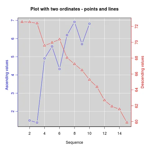
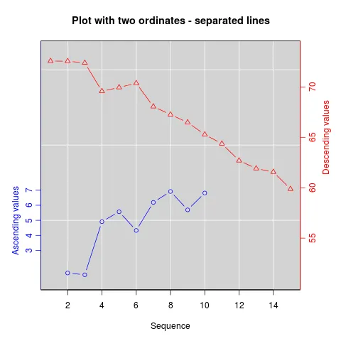
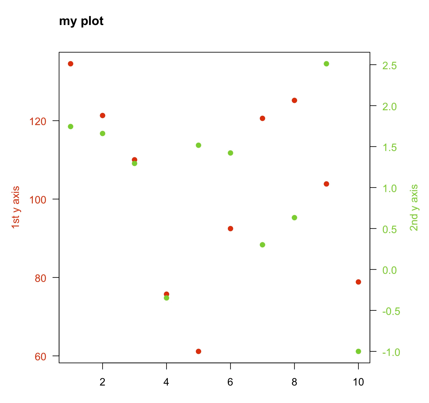
如果您仍然坚持要绘制同一图上的两种不同y轴,基本方法是先创建第一个图并设置par(new=TRUE)以防止R清除图形设备;创建第二个图时使用axes=FALSE(并将xlabylab设置为空,也可以使用ann=FALSE),再使用axis(side=4)在右侧添加新轴,使用mtext(...,side=4)在右侧添加轴标签。以下是使用一些虚构数据的示例:

set.seed(101)
x <- 1:10
y <- rnorm(10)
## second data set on a very different scale
z <- runif(10, min=1000, max=10000) 
par(mar = c(5, 4, 4, 4) + 0.3)  # Leave space for z axis
plot(x, y) # first plot
par(new = TRUE)
plot(x, z, type = "l", axes = FALSE, bty = "n", xlab = "", ylab = "")
axis(side=4, at = pretty(range(z)))
mtext("z", side=4, line=3)

plotrix包中的twoord.plot()函数和latticeExtra包中的doubleYScale()函数可以自动化这个过程。

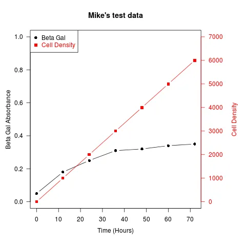
另一个例子(摘自Robert W. Baer在R邮件列表上的帖子):

## set up some fake test data
time <- seq(0,72,12)
betagal.abs <- c(0.05,0.18,0.25,0.31,0.32,0.34,0.35)
cell.density <- c(0,1000,2000,3000,4000,5000,6000)

## add extra space to right margin of plot within frame
par(mar=c(5, 4, 4, 6) + 0.1)

## Plot first set of data and draw its axis
plot(time, betagal.abs, pch=16, axes=FALSE, ylim=c(0,1), xlab="", ylab="", 
   type="b",col="black", main="Mike's test data")
axis(2, ylim=c(0,1),col="black",las=1)  ## las=1 makes horizontal labels
mtext("Beta Gal Absorbance",side=2,line=2.5)
box()

## Allow a second plot on the same graph
par(new=TRUE)

## Plot the second plot and put axis scale on right
plot(time, cell.density, pch=15,  xlab="", ylab="", ylim=c(0,7000), 
    axes=FALSE, type="b", col="red")
## a little farther out (line=4) to make room for labels
mtext("Cell Density",side=4,col="red",line=4) 
axis(4, ylim=c(0,7000), col="red",col.axis="red",las=1)

## Draw the time axis
axis(1,pretty(range(time),10))
mtext("Time (Hours)",side=1,col="black",line=2.5)  

## Add Legend
legend("topleft",legend=c("Beta Gal","Cell Density"),
  text.col=c("black","red"),pch=c(16,15),col=c("black","red"))

在此输入图片描述

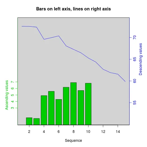
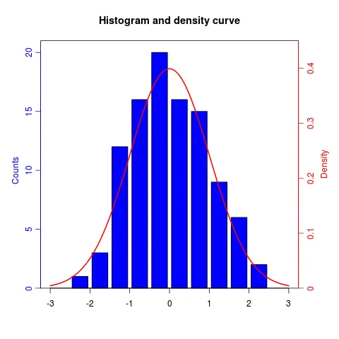
类似的方法可以用于将不同类型的图表叠加在一起,如条形图、直方图等。


这就是为什么仅提供链接的回答是一个不好的想法... wiki.r-project.org看起来已经关闭,我正在r-devel@r-project.org上询问。 - Ben Bolker
@BenBolker 您的解决方案太巧妙了!但我有一个问题。如果两边都是多行,我仍然可以使用这种方法,只需要用符号来连接即可。但当我尝试使用 line=plot 时,它会尝试连续绘制它们。您是否有什么技巧可以解决这个问题? - wthimdh
1
@BenBolker 如果时间是日期格式,例如:"2019-01-01",你会如何更改 axis(1,pretty(range(time),10)) 这一行代码? - k.dkhk

37

正如其名称所示,在plotrix包中的twoord.plot()函数使用两个纵坐标轴来绘制图形。

library(plotrix)
example(twoord.plot)

这里输入图片描述

这里输入图片描述

这里输入图片描述

这里输入图片描述

这里输入图片描述


3
谢谢您提供如此丰富的示例。我希望能看到一些包含负值的柱状图和折线图的示例,同时也希望能看到堆叠图的示例。 - Matt Bannert

6

如果您可以放弃比例/轴标签,则可以将数据重新调整为(0,1)间隔。例如,这适用于染色体上不同的"wiggle"轨迹,当您通常对轨迹之间的局部相关性感兴趣时,它们具有不同的比例(覆盖范围为千分之一,Fst 0-1)。

# rescale numeric vector into (0, 1) interval
# clip everything outside the range 
rescale <- function(vec, lims=range(vec), clip=c(0, 1)) {
  # find the coeficients of transforming linear equation
  # that maps the lims range to (0, 1)
  slope <- (1 - 0) / (lims[2] - lims[1])
  intercept <- - slope * lims[1]

  xformed <- slope * vec + intercept

  # do the clipping
  xformed[xformed < 0] <- clip[1]
  xformed[xformed > 1] <- clip[2]

  xformed
}

接着,如果你有一个包含 chrompositioncoveragefst 列的数据框,你可以这样做:

ggplot(d, aes(position)) + 
  geom_line(aes(y = rescale(fst))) + 
  geom_line(aes(y = rescale(coverage))) +
  facet_wrap(~chrom)

这样做的好处是你不仅限于两个轨道。

6

另一种类似于@BenBolker所接受的答案的替代方案是在添加第二组点时重新定义现有绘图的坐标。

这里是一个最小的例子。

数据:

x  <- 1:10
y1 <- rnorm(10, 100, 20)
y2 <- rnorm(10, 1, 1)

情节:

par(mar=c(5,5,5,5)+0.1, las=1)

plot.new()
plot.window(xlim=range(x), ylim=range(y1))
points(x, y1, col="red", pch=19)
axis(1)
axis(2, col.axis="red")
box()

plot.window(xlim=range(x), ylim=range(y2))
points(x, y2, col="limegreen", pch=19)
axis(4, col.axis="limegreen")

title("my plot", adj=0)
mtext("2nd y axis", side = 4, las=3, line=3, col="limegreen")
mtext("1st y axis", side = 2, las=3, line=3, col="red")

example


嗨,我想知道如何添加x、y标签和标题?谢谢! - Math Avengers
1
@MathAvengers 在答案中添加了。 - Karolis Koncevičius

5

一种选择是将两个图并排放置。使用facet_wrap()ggplot2提供了一个很好的选项:

dat <- data.frame(x = c(rnorm(100), rnorm(100, 10, 2))
  , y = c(rnorm(100), rlnorm(100, 9, 2))
  , index = rep(1:2, each = 100)
  )

require(ggplot2)
ggplot(dat, aes(x,y)) + 
geom_point() + 
facet_wrap(~ index, scales = "free_y")

5
我建议在 plotrix 包中使用 twoord.stackplot() 绘制具有两个纵轴的图表。
data<-read.table(text=
"e0AL fxAL e0CO fxCO e0BR fxBR anos
 51.8  5.9 50.6  6.8 51.0  6.2 1955
 54.7  5.9 55.2  6.8 53.5  6.2 1960
 57.1  6.0 57.9  6.8 55.9  6.2 1965
 59.1  5.6 60.1  6.2 57.9  5.4 1970
 61.2  5.1 61.8  5.0 59.8  4.7 1975
 63.4  4.5 64.0  4.3 61.8  4.3 1980
 65.4  3.9 66.9  3.7 63.5  3.8 1985
 67.3  3.4 68.0  3.2 65.5  3.1 1990
 69.1  3.0 68.7  3.0 67.5  2.6 1995
 70.9  2.8 70.3  2.8 69.5  2.5 2000
 72.4  2.5 71.7  2.6 71.1  2.3 2005
 73.3  2.3 72.9  2.5 72.1  1.9 2010
 74.3  2.2 73.8  2.4 73.2  1.8 2015
 75.2  2.0 74.6  2.3 74.2  1.7 2020
 76.0  2.0 75.4  2.2 75.2  1.6 2025
 76.8  1.9 76.2  2.1 76.1  1.6 2030
 77.6  1.9 76.9  2.1 77.1  1.6 2035
 78.4  1.9 77.6  2.0 77.9  1.7 2040
 79.1  1.8 78.3  1.9 78.7  1.7 2045
 79.8  1.8 79.0  1.9 79.5  1.7 2050
 80.5  1.8 79.7  1.9 80.3  1.7 2055
 81.1  1.8 80.3  1.8 80.9  1.8 2060
 81.7  1.8 80.9  1.8 81.6  1.8 2065
 82.3  1.8 81.4  1.8 82.2  1.8 2070
 82.8  1.8 82.0  1.7 82.8  1.8 2075
 83.3  1.8 82.5  1.7 83.4  1.9 2080
 83.8  1.8 83.0  1.7 83.9  1.9 2085
 84.3  1.9 83.5  1.8 84.4  1.9 2090
 84.7  1.9 83.9  1.8 84.9  1.9 2095
 85.1  1.9 84.3  1.8 85.4  1.9 2100", header=T)

require(plotrix)
twoord.stackplot(lx=data$anos, rx=data$anos, 
                 ldata=cbind(data$e0AL, data$e0BR, data$e0CO),
                 rdata=cbind(data$fxAL, data$fxBR, data$fxCO),
                 lcol=c("black","red", "blue"),
                 rcol=c("black","red", "blue"), 
                 ltype=c("l","o","b"),
                 rtype=c("l","o","b"), 
                 lylab="Años de Vida", rylab="Hijos x Mujer", 
                 xlab="Tiempo",
                 main="Mortalidad/Fecundidad:1950–2100",
                 border="grey80")
legend("bottomright", c(paste("Proy:", 
                      c("A. Latina", "Brasil", "Colombia"))), cex=1,
        col=c("black","red", "blue"), lwd=2, bty="n",  
        lty=c(1,1,2), pch=c(NA,1,1) )

网页内容由stack overflow 提供, 点击上面的
可以查看英文原文,
原文链接