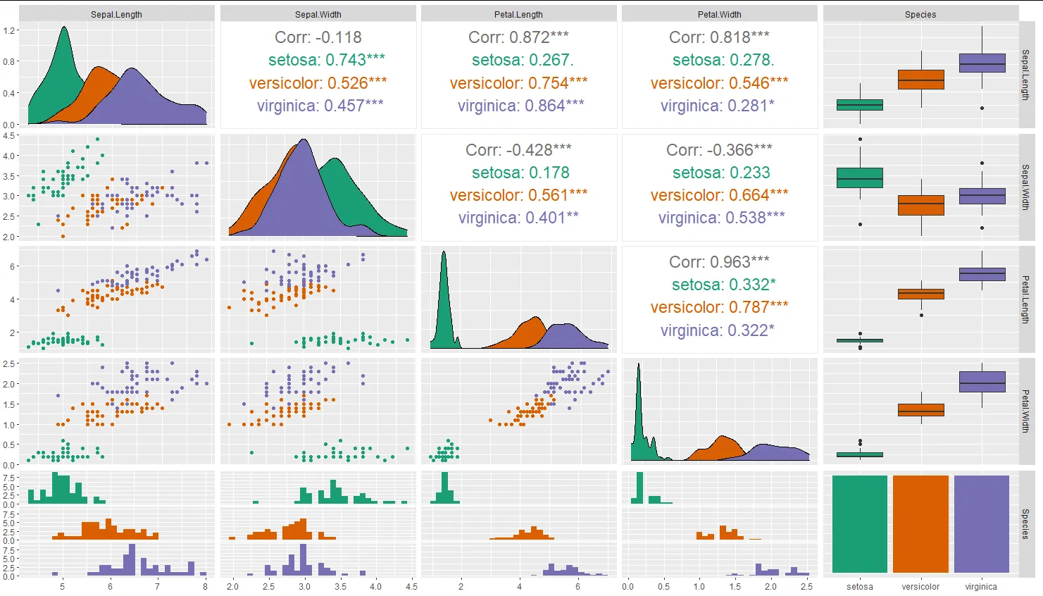
有没有一种方法可以使用ggplot更改GGally :: ggpairs的颜色调色板?

19

我想要为GGally函数中的ggpairs更改调色板。当我尝试向使用getPlot返回的ggplot添加ggplot命令时,颜色不会改变。

my_pair_plot = ggpairs(dataset, color="var1")
getPlot(my_pair_plot,2,1) + scale_fill_brewer(palette = "Set2")

尝试直接将ggplot命令放在ggpairs函数中会导致错误。

ggpairs(dataset, color="var1") + scale_fill_brewer(palette = "Set2")
4个回答

6
原来这是有可能实现的!虽然需要查找源代码,但解决方案相当简单。我们对ggpairs函数感兴趣,因此第一步就是:
ggpairs

让我们看看是否有任何aes映射可以填充或着色。确实,

combo_aes <- addAndOverwriteAes(aes_string(x = xColName, 
            y = yColName, ...), section_aes)

我们希望它能够实现所说的功能。两个重要的注意事项:
  • 颜色和填充 aes 应包含在 ggpairs 调用的省略号中。

  • 使用了 aes_string()

让我们试一下:
ggpairs(diamonds[, 1:2], colour='cut')

输入图像描述

太好了,我们快要完成了!我们需要覆盖调颜色的板。请注意,你所提出的类似内容

ggpairs(diamonds[, 1:2], colour='cut') + scale_fill_brewer(palette = "Set2")

这样做行不通,因为ggpairs对象不是ggplot,所以+符号不能直接使用。然而,可以在这里找到简单的解决方法。祝你好运!

ggplot <- function(...) ggplot2::ggplot(...) + scale_fill_brewer(palette="Set2")
ggpairs(diamonds[, 1:2], colour='cut')

enter image description here


5

更新:

GGAlly再次更新,此答案中的黑客方法不再有效。但最终有了非黑客解决方案:给出

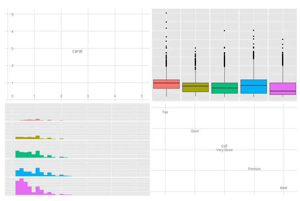
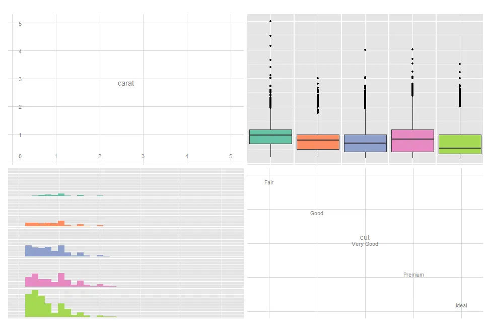
scales <- scale_colour_brewer(type = 'qual') %+% scale_fill_brewer(type = 'qual')

您可以(以希望具有未来可靠性的方式)执行以下操作:

for (row in seq_len(ps$nrow))
    for (col in seq_len(ps$ncol))
        ps[row, col] <- ps[row, col] + scales

旧方法

另一个答案中的黑客方法已经不再适用,所以我们需要使用新的方法进行黑客攻击!

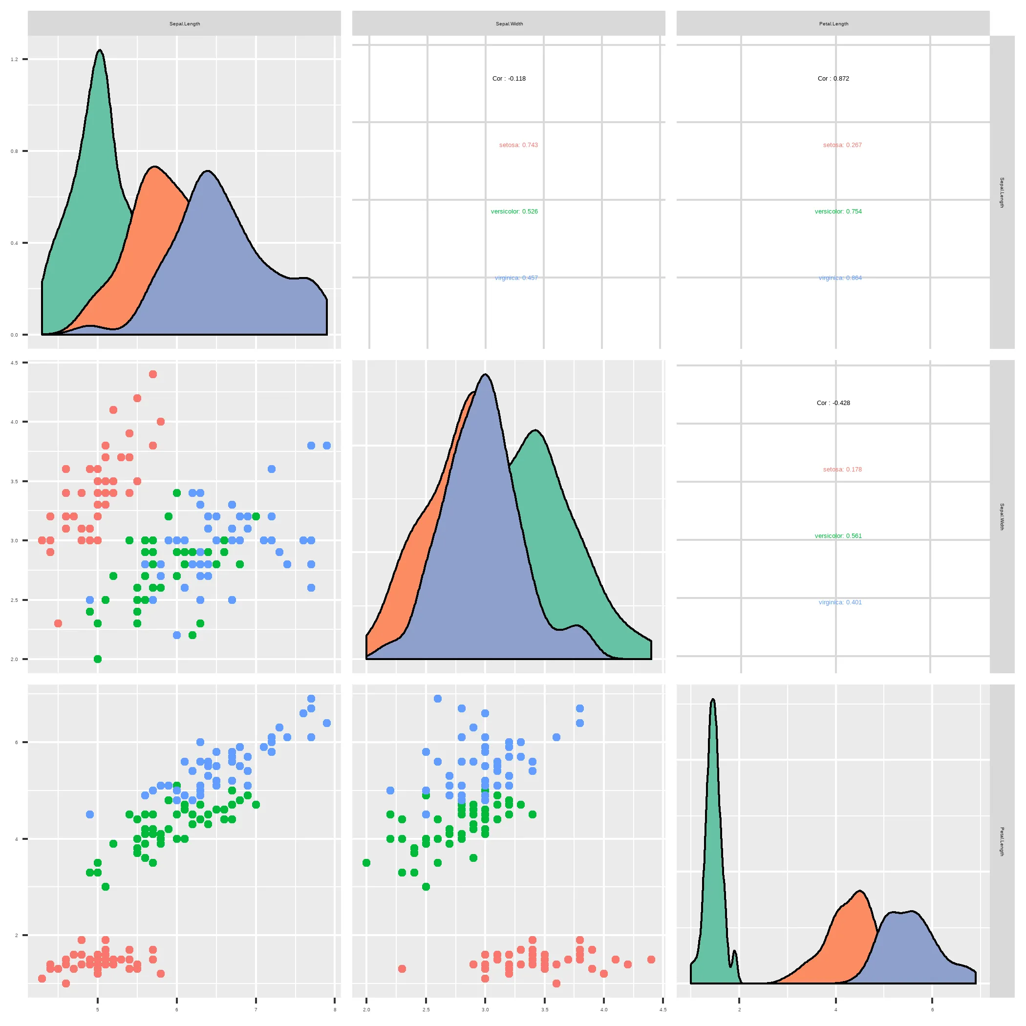
ggpairs对象的内部结构是数据集和字符串列表:

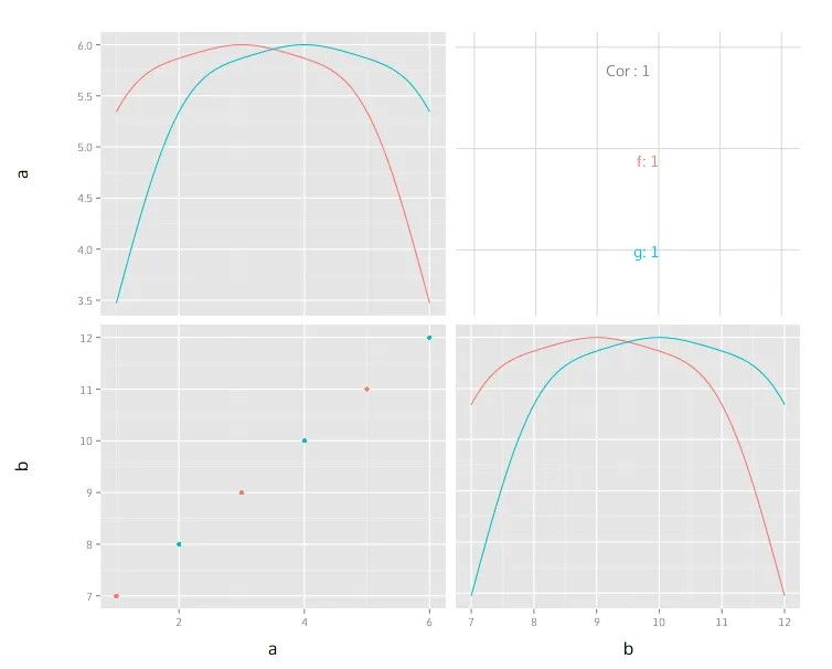
> dta <- data.frame(a=1:6, b=7:12, c=c('f', 'g'))
> ps <- ggpairs(dta, 1:2, colour = 'c')
> str(ps)
List of 10
 $ data        :'data.frame':   2 obs. of  3 variables:
  ..$ a: int [1:2] 1 2
  ..$ b: int [1:2] 3 4
  ..$ c: int [1:2] 5 6
 $ columns     : int [1:3] 1 2 3
 $ plots       :List of 9
  ..$ : chr "ggally_densityDiag(ggally_data, ggplot2::aes(x = a, colour = c))"
  ..$ : chr "ggally_cor(ggally_data, ggplot2::aes(x = b, y = a, colour = c))"

[...]

 $ gg          : NULL
 - attr(*, "class")= chr [1:2] "gg" "ggpairs"

> ps

修改前的图表

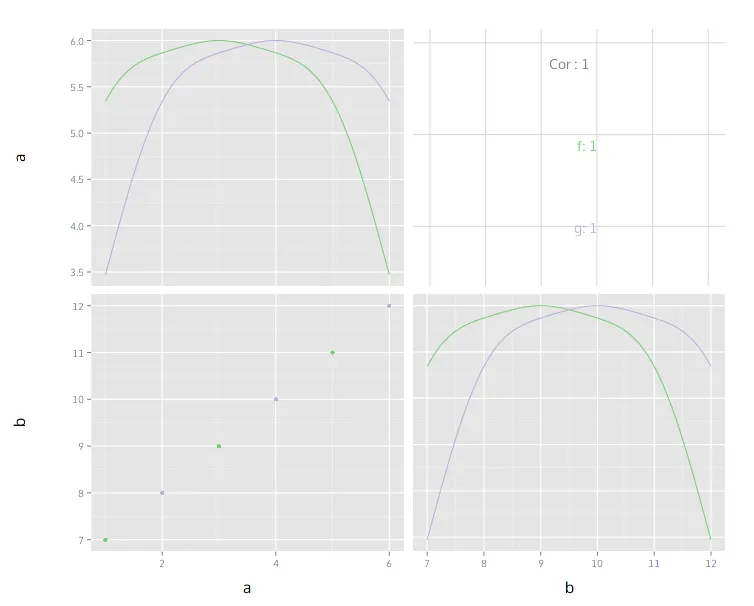
为了修改图表,需要修改图表对象中的相应字符串以包含附加命令。为此,我们使用deparse(substitute(argument))来获取包含用户传递的代码的字符串,并将其附加到每个绘图调用中:

add_to_plots <- function(pairs, modification) {
    str <- deparse(substitute(modification))
    pairs$plots <- lapply(pairs$plots, function(s) paste(s, '+', str))
    pairs
}

> add_to_plots(ps, scale_colour_brewer(type = 'qual'))

plot after


1
这个也不再起作用了。我想要在对角线上的密度图不填充,而是像这里显示的那样成为线条 - 我该怎么做?https://dev59.com/4ZLea4cB1Zd3GeqP8ecS - Make42
这会改变颜色,但是不能改变我的图形仍然被填充的事实。 - Make42
那很简单,只需覆盖填充即可。 - flying sheep
听起来很琐碎,但我做不到,因为问题仍然存在:用什么?我尝试了NULL,但那并不起作用。我不想用其他东西代替它 - 我希望它是透明的。 - Make42
你说得对。通常是使用 waiver(),但似乎不起作用。我找不到添加 aes(fill)/scale_fill_* 的位置... - flying sheep

2

我认为最不hack的改变调色板的方式是修改自己的绘图函数,因为它们返回可以自由定制的ggplot2对象。

要在对角线上更改密度,只需更改相应的函数ggally_densityDiag


modified_density = function(data, mapping, ...) {

  ggally_densityDiag(data, mapping, ...) + scale_fill_brewer(type = "qual", palette = "Set2")
}

然后,按照以下方式提供新的功能给ggparis函数调用:

ggpairs(iris, columns = 1:3,  aes(color = Species),
        diag = list(continuous = modified_density)) 

enter image description here

此外,其他绘图部分也可以使用upperlower参数。


0
将矩阵图分配给一个变量,然后使用for循环迭代每个图似乎也可以解决问题:
library(GGally)

plot.matrix <-ggpairs(iris,aes(color= Species), upper = list(continuous = wrap("cor", size=6)))

for(i in 1:5) {
  for(j in 1:5){
    plot.matrix[i,j] <- plot.matrix[i,j] +
      scale_fill_brewer(palette = "Dark2") +
      scale_color_brewer(palette = "Dark2")
  }
}

plot.matrix

这个例子改编自Schmuller(2018)的“R Projects for dummies”,第149页。

enter image description here


网页内容由stack overflow 提供, 点击上面的
可以查看英文原文,
原文链接