我有包含向量坐标和它们的特征 - 成功率 和 属性 的数据:
ex_data <- structure(list(group = c("group A", "group A", "group A", "group A",
"group A", "group A", "group C", "group C", "group C", "group C",
"group C", "group W", "group W", "group W", "group W", "group W"
), category = c(5, 4, 3, 2, 1, 6, 5, 1, 2, 3, 4, 1, 4, 5, 2,
3), success_rate = c(0.816037735849057, 0.938775510204082, 0.653061224489796,
0.985915492957746, 0.934306569343066, 1, 0.979166666666667, 0.887323943661972,
0.319587628865979, 0.721590909090909, 0.941176470588235, 0.689320388349515,
0.338028169014085, 0.396551724137931, 0.7375, 0.763948497854077
), x0 = c(24.5, 24.5, 23.7, 22.6, 28.6, 27.6, 27.2, 27.4, 15.7,
25.5, 24.2, 21.4, 17.5, 9.9, 23.6, 29), y0 = c(21.2, 27.9, 96.6,
43.9, 65.1, 71.5, 34.3, 71.2, 47.9, 88, 36, 86.9, 49.4, 41.3,
85.6, 16.7), x1 = c(35.2, 36.5, 34, 32.9, 39.4, 40.2, 35.9, 31.6,
63.1, 29.5, 35.9, 35.4, 61.4, 54, 37.3, 37.2), y1 = c(5.8, 33.6,
96.8, 70, 64.8, 96.6, 7.3, 64.9, 63.1, 89.7, 38.5, 95, 59.3,
32.2, 77.9, 12), prop = c(0.124926340601061, 0.0866234531526223,
0.0288744843842074, 0.041838538597525, 0.0807307012374779, 0.0271066588096641,
0.0365853658536585, 0.0541158536585366, 0.0739329268292683, 0.134146341463415,
0.0259146341463415, 0.0787461773700306, 0.108562691131498, 0.0443425076452599,
0.0611620795107034, 0.178134556574924)), class = c("tbl_df",
"tbl", "data.frame"), row.names = c(NA, -16L))
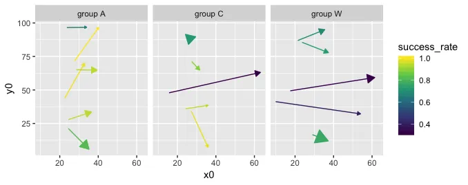
我希望为每个 组 制作矢量图,使用 prop 作为尺寸美学。不幸的是,在箭头大小美学方面,整个箭头的调整大小通常不好看:
ggplot(ex_data) +
  geom_segment(aes(x = x0, y = y0, xend = x1, yend = y1, color = success_rate, size = prop),
               arrow = arrow(length = unit(0.2, "cm"), ends = 'last', type = 'closed')) +
  facet_wrap(~group) +
  scale_color_viridis_c()
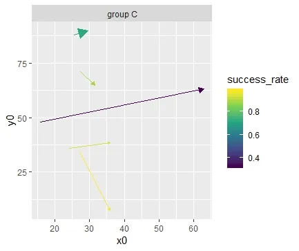
我想仅使用prop变量来控制箭头的大小。不幸的是,箭头不是geom_segment的美学元素,唯一控制它们大小的方法是提供单独的向量。这对于单个组效果很好:
ex_data %>%
  filter(group == 'group C') %>%
  ggplot() +
  geom_segment(aes(x = x0, y = y0, xend = x1, yend = y1, color = success_rate),
               arrow = arrow(length = unit(filter(ex_data, group == 'group C')$prop * 3, "cm"), ends = 'last', type = 'closed')) +
  facet_wrap(~group) +
  scale_color_viridis_c()
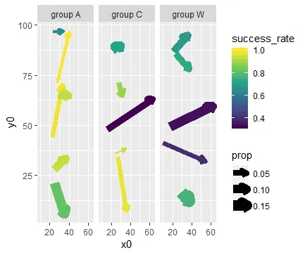
但不能使用 facet_wrap:
ggplot(ex_data) +
  geom_segment(aes(x = x0, y = y0, xend = x1, yend = y1, color = success_rate),
               arrow = arrow(length = unit(ex_data$prop * 3, "cm"), ends = 'last', type = 'closed')) +
  facet_wrap(~group) +
  scale_color_viridis_c()
你可以发现,对于C组来说,箭头的大小不再有效(例如,上方的箭头应该是最大的,但它却是最小的)。我的原始数据有很多组,创建单独的图表将非常繁琐。有没有什么解决办法呢?