ggplot2多个比例尺/图例每个美学元素,重新审视

19

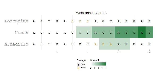
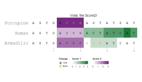
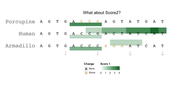
我有一个示例,想用 ggplot 来突出几个序列比对的属性。我正在使用 geom_tile,并希望为两个分数属性设置不同颜色的两组瓷砖。我只能可视化一个。

我知道每个审美特征只能有一个比例尺的限制(以及其背后的逻辑),但也许有人有办法来欺骗它,针对这种情况在一个“图”中具有不同的颜色比例尺。

也许可以通过手动添加Grobs来实现,但我不知道从哪里开始……

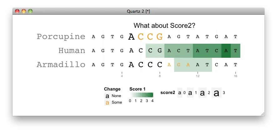
另一个问题:由于某种原因,override.aes=list(shape = "A") 无效,有什么想法吗?

还有一个问题:有没有办法根据瓷砖的大小(或反过来)按比例缩放文本?

library(ggplot2)
library(grid)

pd = data.frame(
  letters = strsplit("AGTGACCGACTATCATAGTGACCCAGAATCATAGTGACCGAGTATGAT", "")[[1]],
  species = rep(c("Human", "Armadillo", "Porcupine"), each=16),
  x       = rep(1:16, 3),
  change  = c(0,0,0,0,0,0,0,0,0,0,0,0,0,0,0,0,
              0,0,0,0,0,0,0,0,1,1,1,0,0,0,0,0,
              0,0,0,0,0,1,1,1,0,0,0,0,0,0,0,0),
  score1  = c(0,0,0,0,0,0,1,1,2,2,2,3,3,3,4,3,
              0,0,0,0,0,0,0,0,0,1,1,1,1,0,0,0,
              0,0,0,0,0,0,0,0,0,0,0,0,0,0,0,0),
  score2  = c(0,0,0,0,1,1,1,1,0,0,0,0,0,0,0,0,
              0,0,0,0,2,2,2,2,0,0,0,0,0,0,0,0,
              0,0,0,0,3,3,3,3,0,0,0,0,0,0,0,0)
)


ggplot(pd[pd$score1 != 0,], aes(x=x, y=species)) +
  coord_fixed(ratio = 1.5, xlim=c(0.5,16.5), ylim=c(0.5, 3.5)) +
  geom_tile(aes(fill=score1)) +
  scale_fill_gradient2("Score 1", limits=c(0,4),low="#762A83", mid="white", high="#1B7837", guide=guide_colorbar(title.position="top")) +
  geom_text(data=pd, aes(label=letters, color=factor(change)), size=rel(5), family="mono") +
  scale_color_manual("Change", values=c("black", "#F2A11F"), labels=c("None", "Some"), guide=guide_legend(direction="vertical", title.position="top", override.aes=list(shape = "A"))) +
  theme(panel.background=element_rect(fill="white", colour="white"),
        axis.title = element_blank(),
        axis.ticks.y = element_blank(),
        axis.text.y = element_text(family="mono", size=rel(2)),
        axis.text.x = element_text(size=rel(0.7)),
        legend.text = element_text(size=rel(0.7)),
        legend.key.size = unit(0.7, "lines"),
        legend.position = "bottom", legend.box = "horizontal") +
  ggtitle("What about Score2?")

如何添加另一个具有不同颜色比例尺的图层?

2个回答

9

我通过将两个分别生成的图形对象(grobs)结合起来,得到了一个令人满意的结果。我相信这种解决方案可以更好地泛化,以适应不同的grobs索引...

library(ggplot2)
library(grid)

pd = data.frame(
  letters = strsplit("AGTGACCGACTATCATAGTGACCCAGAATCATAGTGACCGAGTATGAT", "")[[1]],
  species = rep(c("Human", "Armadillo", "Porcupine"), each=16),
  x       = rep(1:16, 3),
  change  = c(0,0,0,0,0,0,0,0,0,0,0,0,0,0,0,0,
              0,0,0,0,0,0,0,0,1,1,1,0,0,0,0,0,
              0,0,0,0,0,1,1,1,0,0,0,0,0,0,0,0),
  score1  = c(0,0,0,0,0,0,1,1,2,2,2,3,3,3,4,3,
              0,0,0,0,0,0,0,0,0,1,1,1,1,0,0,0,
              0,0,0,0,0,0,0,0,0,0,0,0,0,0,0,0),
  score2  = c(0,0,0,0,1,1,1,1,0,0,0,0,0,0,0,0,
              0,0,0,0,2,2,2,2,0,0,0,0,0,0,0,0,
              0,0,0,0,3,3,3,3,0,0,0,0,0,0,0,0)
)


p1=ggplot(pd[pd$score1 != 0,], aes(x=x, y=species)) +
  coord_fixed(ratio = 1.5, xlim=c(0.5,16.5), ylim=c(0.5, 3.5)) +
  geom_tile(aes(fill=score1)) +
  scale_fill_gradient2("Score 1", limits=c(0,4),low="#762A83", mid="white", high="#1B7837", guide=guide_colorbar(title.position="top")) +
  geom_text(data=pd, aes(label=letters, color=factor(change)), size=rel(5), family="mono") +
  scale_color_manual("Change", values=c("black", "#F2A11F"), labels=c("None", "Some"), guide=guide_legend(direction="vertical", title.position="top", override.aes=list(shape = "A"))) +
  theme(panel.background=element_rect(fill="white", colour="white"),
        axis.title = element_blank(),
        axis.ticks.y = element_blank(),
        axis.text.y = element_text(family="mono", size=rel(2)),
        axis.text.x = element_text(size=rel(0.7)),
        legend.text = element_text(size=rel(0.7)),
        legend.key.size = unit(0.7, "lines"),
        legend.position = "bottom", legend.box = "horizontal") +
  ggtitle("Voila, the Score2!")

p2=ggplot(pd[pd$score2 != 0,], aes(x=x, y=species)) +
  coord_fixed(ratio = 1.5, xlim=c(0.5,16.5), ylim=c(0.5, 3.5)) +
  geom_tile(aes(fill=score2)) +
  scale_fill_gradient2("Score 2", limits=c(0,3),low="#1B7837", mid="white", high="#762A83", guide=guide_colorbar(title.position="top")) +
  geom_text(data=pd, aes(label=letters, color=factor(change)), size=rel(5), family="mono") +
  scale_color_manual("Change", values=c("black", "#F2A11F"), labels=c("None", "Some"), guide=guide_legend(direction="vertical", title.position="top", override.aes=list(shape = "A"))) +
  theme(panel.background=element_rect(fill="white", colour="white"),
        axis.title = element_blank(),
        axis.ticks.y = element_blank(),
        axis.text.y = element_text(family="mono", size=rel(2)),
        axis.text.x = element_text(size=rel(0.7)),
        legend.text = element_text(size=rel(0.7)),
        legend.key.size = unit(0.7, "lines"),
        legend.position = "bottom", legend.box = "horizontal") +
  ggtitle("What about Score2?")


p1g=ggplotGrob(p1)
p2g=ggplotGrob(p2)

combo.grob = p1g

combo.grob$grobs[[8]] = cbind(p1g$grobs[[8]][,1:4], 
                              p2g$grobs[[8]][,3:5], 
                              size="first")

combo.grob$grobs[[4]] = reorderGrob(
                          addGrob(p1g$grobs[[4]], 
                                  getGrob(p2g$grobs[[4]], 
                                          "geom_rect.rect", 
                                          grep=TRUE)), 
                          c(1,2,5,3,4))
grid.newpage()
grid.draw(combo.grob) 

Two scales in one plot


5
我会使用文字大小来表示分数2:
ggplot(pd[pd$score1 != 0,], aes(x=x, y=species)) +
  coord_fixed(ratio = 1.5, xlim=c(0.5,16.5), ylim=c(0.5, 3.5)) +
  geom_tile(aes(fill=score1)) +
  scale_fill_gradient2("Score 1", limits=c(0,4),low="#762A83", mid="white", high="#1B7837", guide=guide_colorbar(title.position="top")) +
  geom_text(data=pd, aes(label=letters, size = score2, color=factor(change)), family="mono") +
  scale_size_continuous(range = c(4, 8)) +
  scale_color_manual("Change", values=c("black", "#F2A11F"), labels=c("None", "Some"), guide=guide_legend(direction="vertical", title.position="top", override.aes=list(shape = "A"))) +
  theme(panel.background=element_rect(fill="white", colour="white"),
        axis.title = element_blank(),
        axis.ticks.y = element_blank(),
        axis.text.y = element_text(family="mono", size=rel(2)),
        axis.text.x = element_text(size=rel(0.7)),
        legend.text = element_text(size=rel(0.7)),
        legend.key.size = unit(0.7, "lines"),
        legend.position = "bottom", legend.box = "horizontal") +
  ggtitle("What about Score2?")

enter image description here

更新:

这里有一个快速的hack,不确定在视觉上是否容易检查...

library(ggplot2)
library(grid)
library(proto)

GeomTile2 <- proto(ggplot2:::GeomTile, {
  reparameterise <- function(., df, params) {
    df <- .$.super$reparameterise(df, params)
    if (params$ud == "u") 
      transform(df, ymin = y) 
    else 
        transform(df, ymax = (y-ymin)*0.8 + ymin, ymin = (y-ymin)*0.2 + ymin)
  }
  draw <- function(..., ud) {.$.super$draw(..., ud)}
})
geom_tile2 <- function (mapping = NULL, data = NULL, stat = "identity", position = "identity", ..., ud = "u") { 
  GeomTile2$new(mapping = mapping, data = data, stat = stat, position = position, ..., ud = ud)
}

ggplot(pd, aes(x=x, y=species)) +
  coord_fixed(ratio = 1.5, xlim=c(0.5,16.5), ylim=c(0.5, 3.5)) +
  geom_tile2(aes(fill=score1), ud = "u") +
  geom_tile2(aes(fill = score2), ud = "d") +
  scale_fill_gradient2("Score 1", limits=c(0,4),low="#762A83", mid="white", high="#1B7837", guide=guide_colorbar(title.position="top")) +
  geom_text(data=pd, aes(label=letters, color=factor(change)), size=rel(5), family="mono") +
  scale_color_manual("Change", values=c("black", "#F2A11F"), labels=c("None", "Some"), guide=guide_legend(direction="vertical", title.position="top", override.aes=list(shape = "A"))) +
  theme(panel.background=element_rect(fill="white", colour="white"),
        axis.title = element_blank(),
        axis.ticks.y = element_blank(),
        axis.text.y = element_text(family="mono", size=rel(2)),
        axis.text.x = element_text(size=rel(0.7)),
        legend.text = element_text(size=rel(0.7)),
        legend.key.size = unit(0.7, "lines"),
        legend.position = "bottom", legend.box = "horizontal") +
  ggtitle("What about Score2?")

这里输入图片描述

上半部分表示score1,下半部分表示score2。


谢谢koshke,我已经考虑过了,但这不足以代表这个属性的视觉提示。这些对齐可以有一百个或更多字符的长度,并且可以包含几十个物种,因此字母本来就很小,通常没有空间来操作它们的大小。此外,有时分数是连续变量,从一个序列到另一个序列很难区分相对数量。恐怕我需要更多“视觉”方面的东西。 - Krizbi
只是为了给出更真实的例子:这里有一个完整的对齐 - Krizbi
@Krizbi 已更新,请查收。 - kohske
嗨@kohske,感谢您的努力,但恐怕它的可视化信息不够明显。我需要在颜色上有一些补充因为这是完全不同的属性。此外,图例也能迅速告诉观察者一个图中有多少种不同的属性。所以,比例尺是关键,而不是形状。我能想到最好的方法就是利用alpha通道并将其映射到线型上,但这会带来一个缺点,即必须处理单一连续的颜色渐变。这里有个例子 - Krizbi
也许对@hadley的一个建议是考虑:从“一个aes - 一个scale”的规则中寻求妥协,就是允许只有注释几何图形具有无限组合的尺度和美学元素。然后注释就可以尽可能地“丰富多彩”,同时不会干扰实际(非常明智)的规则,并为每个注释层提供自己的尺度。这样,用户就能以更大的创造自由来注释图表,并且保持ggplot2的所有优雅特性和视觉一致性。只是一个想法... - Krizbi

网页内容由stack overflow 提供, 点击上面的
可以查看英文原文,
原文链接