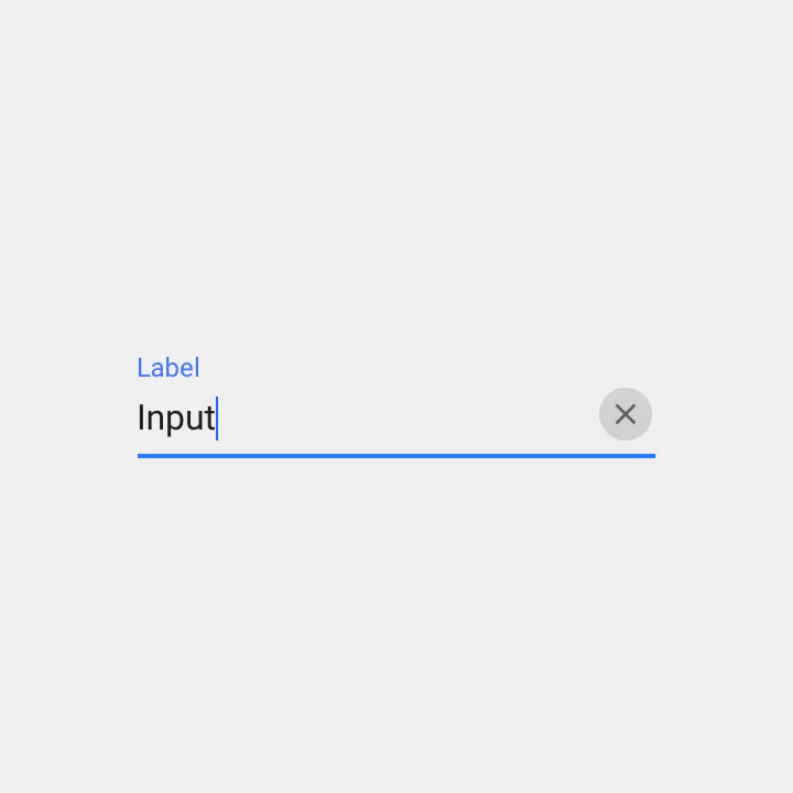
如何在TextField中添加清除按钮?就像Material设计指南中的这张图片一样:
我找到的方法是在InputDecoration的suffixIcon中设置一个清除IconButton。这是正确的方式吗?
不想使用StatefulWidget?这里有一个使用TextEditingController和StatelessWidget的示例(使用Providers推送更新)。我将控制器保存在静态字段中。
class _SearchBar extends StatelessWidget {
  static var _controller = TextEditingController();

  @override
  Widget build(BuildContext context) {
    var dictionary = Provider.of<Dictionary>(context);

    return TextField(
        controller: _controller,
        autofocus: true,
        onChanged: (text) {
          dictionary.lookupWord = text;
        },
        style: TextStyle(fontSize: 20.0),
        decoration: InputDecoration(
            border: InputBorder.none,
            hintText: 'Search',
            suffix: GestureDetector(
              onTap: () {
                dictionary.lookupWord = '';
                _controller.clear();
              },
              child: Text('x'),
            )));
  }
}
final _formKeylogin = GlobalKey<FormState>();
Form(key: _formKeylogin,
                child: Column(
                  children: [
                    Container(
                      margin: EdgeInsets.all(20.0),
                      child: TextFormField(

                        style: TextStyle(color: WHITE),
                        textInputAction: TextInputAction.next,
                        onChanged: (companyName) {
                        },

                        validator: (companyName) {
                          if (companyName.isEmpty) {
                            return 'Please enter company Name';
                          } else {
                            return null;
                          }
                        },
                      ),
而在OnTap或onPress方法中。
_formKeylogin.currentState.reset();
import 'package:flutter/material.dart';

class ClearableTexfield extends StatefulWidget {
  ClearableTexfield({
    Key key,
    this.controller,
    this.hintText = 'Enter text'
  }) : super(key: key);

  final TextEditingController controller;
  final String hintText;

  @override
  State<StatefulWidget> createState() {
    return _ClearableTextfieldState();
  }
}

class _ClearableTextfieldState extends State<ClearableTexfield> {
  bool _showClearButton = false;

  @override
  void initState() {
    super.initState();
    widget.controller.addListener(() {
      setState(() {
        _showClearButton = widget.controller.text.length > 0;
      });
    });
  }

  @override
  Widget build(BuildContext context) {
    return TextField(
      controller: widget.controller,
      decoration: InputDecoration(
        hintText: widget.hintText,
        suffixIcon: _getClearButton(),
      ),
    );
  }

  Widget _getClearButton() {
    if (!_showClearButton) {
      return null;
    }

    return IconButton(
      onPressed: () => widget.controller.clear(),
      icon: Icon(Icons.clear),
    );
  }
}
更多详细解释请参见此页面:
https://www.flutterclutter.dev/flutter/tutorials/text-field-with-clear-button/2020/104/
它还依赖于 IconButton,但有一个优点,即只有当文本字段中存在文本时才显示清除按钮。
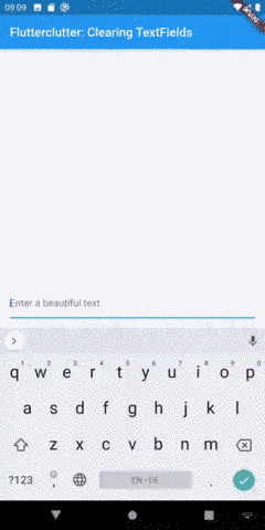
效果如下:
//Clear inputs
final _nameInputcontroller = TextEditingController();
late FocusNode focusNodeNameInput;

@override
void initState() {
 super.initState();

 //FocusNode for all inputs
 focusNodeNameInput = FocusNode();
 focusNodeNameInput.addListener(() {
  setState(() {});
 });
}

@override
void dispose() {
 // Clean up the focus node when the Form is disposed.
 focusNodeNameInput.dispose();

 super.dispose();
}
而TextFormField:
TextFormField(
 controller: _nameInputcontroller,
 focusNode: focusNodeNameInput,
 decoration: InputDecoration(
  labelText: LocaleKeys.name.tr(),
  labelStyle: TextStyle(
   color: focusNodeNameInput.hasFocus ? AppColors.MAIN_COLOR : null,
  ),
  focusedBorder: const UnderlineInputBorder(
   borderSide: BorderSide(
    color: AppColors.MAIN_COLOR,
   ),
  ),
  suffixIcon: _nameInputcontroller.text.isNotEmpty || focusNodeNameInput.hasFocus
   ? IconButton(
      onPressed: _nameInputcontroller.clear,
      icon: const Icon(
         Icons.clear,
         color: AppColors.MAIN_COLOR,
      ),
     ) : null,
   ),
  ),
这里有一个完全可重用的ClearableTextFormField,具有最大的配置能力。这个可清除文本字段的大部分代码来自于Flutter团队在内置TextFormField上的2021年4月1日的提交。 ClearableTextFormField接受与内置TextFormField相同的参数,并且工作方式类似。
import 'package:flutter/material.dart';
import 'package:flutter/services.dart';

// A [TextFormField] with a clear button
class ClearableTextFormField extends FormField<String> {
  /// Creates a [FormField] that contains a [TextField].
  ///
  /// When a [controller] is specified, [initialValue] must be null (the
  /// default). If [controller] is null, then a [TextEditingController]
  /// will be constructed automatically and its `text` will be initialized
  /// to [initialValue] or the empty string.
  ///
  /// For documentation about the various parameters, see the [TextField] class
  /// and [new TextField], the constructor.
  ClearableTextFormField({
    Key? key,
    this.controller,
    String? initialValue,
    FocusNode? focusNode,
    InputDecoration decoration = const InputDecoration(),
    TextInputType? keyboardType,
    TextCapitalization textCapitalization = TextCapitalization.none,
    TextInputAction? textInputAction,
    TextStyle? style,
    StrutStyle? strutStyle,
    TextDirection? textDirection,
    TextAlign textAlign = TextAlign.start,
    TextAlignVertical? textAlignVertical,
    bool autofocus = false,
    bool readOnly = false,
    ToolbarOptions? toolbarOptions,
    bool? showCursor,
    String obscuringCharacter = '•',
    bool obscureText = false,
    bool autocorrect = true,
    SmartDashesType? smartDashesType,
    SmartQuotesType? smartQuotesType,
    bool enableSuggestions = true,
    MaxLengthEnforcement? maxLengthEnforcement,
    int? maxLines = 1,
    int? minLines,
    bool expands = false,
    int? maxLength,
    ValueChanged<String>? onChanged,
    GestureTapCallback? onTap,
    VoidCallback? onEditingComplete,
    ValueChanged<String>? onFieldSubmitted,
    FormFieldSetter<String>? onSaved,
    FormFieldValidator<String>? validator,
    List<TextInputFormatter>? inputFormatters,
    bool? enabled,
    double cursorWidth = 2.0,
    double? cursorHeight,
    Radius? cursorRadius,
    Color? cursorColor,
    Brightness? keyboardAppearance,
    EdgeInsets scrollPadding = const EdgeInsets.all(20.0),
    bool enableInteractiveSelection = true,
    TextSelectionControls? selectionControls,
    InputCounterWidgetBuilder? buildCounter,
    ScrollPhysics? scrollPhysics,
    Iterable<String>? autofillHints,
    AutovalidateMode? autovalidateMode,
    ScrollController? scrollController,

    // Features
    this.resetIcon = const Icon(Icons.close),
  })  : assert(initialValue == null || controller == null),
        assert(obscuringCharacter.length == 1),
        assert(
          maxLengthEnforcement == null,
          'maxLengthEnforced is deprecated, use only maxLengthEnforcement',
        ),
        assert(maxLines == null || maxLines > 0),
        assert(minLines == null || minLines > 0),
        assert(
          (maxLines == null) || (minLines == null) || (maxLines >= minLines),
          "minLines can't be greater than maxLines",
        ),
        assert(
          !expands || (maxLines == null && minLines == null),
          'minLines and maxLines must be null when expands is true.',
        ),
        assert(!obscureText || maxLines == 1,
            'Obscured fields cannot be multiline.'),
        assert(maxLength == null || maxLength > 0),
        super(
          key: key,
          initialValue:
              controller != null ? controller.text : (initialValue ?? ''),
          onSaved: onSaved,
          validator: validator,
          enabled: enabled ?? true,
          autovalidateMode: autovalidateMode ?? AutovalidateMode.disabled,
          builder: (FormFieldState<String> field) {
            final _ClearableTextFormFieldState state =
                field as _ClearableTextFormFieldState;
            final InputDecoration effectiveDecoration = decoration
                .applyDefaults(Theme.of(field.context).inputDecorationTheme);
            void onChangedHandler(String value) {
              field.didChange(value);
              if (onChanged != null) onChanged(value);
            }

            return Focus(
              onFocusChange: (hasFocus) => state.setHasFocus(hasFocus),
              child: TextField(
                controller: state._effectiveController,
                focusNode: focusNode,
                decoration: effectiveDecoration.copyWith(
                  errorText: field.errorText,
                  suffixIcon:
                      ((field.value?.length ?? -1) > 0 && state.hasFocus)
                          ? IconButton(
                              icon: resetIcon,
                              onPressed: () => state.clear(),
                              color: Theme.of(state.context).hintColor,
                            )
                          : null,
                ),
                keyboardType: keyboardType,
                textInputAction: textInputAction,
                style: style,
                strutStyle: strutStyle,
                textAlign: textAlign,
                textAlignVertical: textAlignVertical,
                textDirection: textDirection,
                textCapitalization: textCapitalization,
                autofocus: autofocus,
                toolbarOptions: toolbarOptions,
                readOnly: readOnly,
                showCursor: showCursor,
                obscuringCharacter: obscuringCharacter,
                obscureText: obscureText,
                autocorrect: autocorrect,
                smartDashesType: smartDashesType ??
                    (obscureText
                        ? SmartDashesType.disabled
                        : SmartDashesType.enabled),
                smartQuotesType: smartQuotesType ??
                    (obscureText
                        ? SmartQuotesType.disabled
                        : SmartQuotesType.enabled),
                enableSuggestions: enableSuggestions,
                maxLengthEnforcement: maxLengthEnforcement,
                maxLines: maxLines,
                minLines: minLines,
                expands: expands,
                maxLength: maxLength,
                onChanged: onChangedHandler,
                onTap: onTap,
                onEditingComplete: onEditingComplete,
                onSubmitted: onFieldSubmitted,
                inputFormatters: inputFormatters,
                enabled: enabled ?? true,
                cursorWidth: cursorWidth,
                cursorHeight: cursorHeight,
                cursorRadius: cursorRadius,
                cursorColor: cursorColor,
                scrollPadding: scrollPadding,
                scrollPhysics: scrollPhysics,
                keyboardAppearance: keyboardAppearance,
                enableInteractiveSelection: enableInteractiveSelection,
                selectionControls: selectionControls,
                buildCounter: buildCounter,
                autofillHints: autofillHints,
                scrollController: scrollController,
              ),
            );
          },
        );

  /// Controls the text being edited.
  ///
  /// If null, this widget will create its own [TextEditingController] and
  /// initialize its [TextEditingController.text] with [initialValue].
  final TextEditingController? controller;
  final Icon resetIcon;

  @override
  _ClearableTextFormFieldState createState() => _ClearableTextFormFieldState();
}

class _ClearableTextFormFieldState extends FormFieldState<String> {
  TextEditingController? _controller;
  bool hasFocus = false;

  TextEditingController get _effectiveController =>
      widget.controller ?? _controller!;

  @override
  ClearableTextFormField get widget => super.widget as ClearableTextFormField;

  @override
  void initState() {
    super.initState();
    if (widget.controller == null)
      _controller = TextEditingController(text: widget.initialValue);
    else
      widget.controller!.addListener(_handleControllerChanged);
  }

  @override
  void didUpdateWidget(ClearableTextFormField oldWidget) {
    super.didUpdateWidget(oldWidget);
    if (widget.controller != oldWidget.controller) {
      oldWidget.controller?.removeListener(_handleControllerChanged);
      widget.controller?.addListener(_handleControllerChanged);

      if (oldWidget.controller != null && widget.controller == null)
        _controller =
            TextEditingController.fromValue(oldWidget.controller!.value);
      if (widget.controller != null) {
        setValue(widget.controller!.text);
        if (oldWidget.controller == null) _controller = null;
      }
    }
  }

  @override
  void dispose() {
    widget.controller?.removeListener(_handleControllerChanged);
    super.dispose();
  }

  @override
  void didChange(String? value) {
    super.didChange(value);

    if (_effectiveController.text != value)
      _effectiveController.text = value ?? '';
  }

  @override
  void reset() {
    // setState will be called in the superclass, so even though state is being
    // manipulated, no setState call is needed here.
    _effectiveController.text = widget.initialValue ?? '';
    super.reset();
  }

  void setHasFocus(bool b) => setState(() => hasFocus = b);

  void _handleControllerChanged() {
    // Suppress changes that originated from within this class.
    //
    // In the case where a controller has been passed in to this widget, we
    // register this change listener. In these cases, we'll also receive change
    // notifications for changes originating from within this class -- for
    // example, the reset() method. In such cases, the FormField value will
    // already have been set.
    if (_effectiveController.text != value)
      didChange(_effectiveController.text);
  }

  /// Invoked by the clear suffix icon to clear everything in the [FormField]
  void clear() {
    WidgetsBinding.instance!.addPostFrameCallback((_) {
      _effectiveController.clear();
      didChange(null);
    });
  }
}
请阅读Dart语言文档中关于assert语句的更多信息。
以下是内置TextFormField添加的附加代码的解释
ClearableTextFormField的可选参数resetIcon
_ClearableTextFormFieldState中的附加代码:
/// Invoked by the clear suffix icon to clear everything in the [FormField]
  void clear() {
    WidgetsBinding.instance!.addPostFrameCallback((_) {
      _effectiveController.clear();
      didChange(null);
    });
  }
addPostFrameCallback() 保证传入的函数只在 Widget 构建完成后调用(当 TextFormField 已经完全构建并渲染到屏幕上)。您可以在 this thread 中了解更多信息。
以下状态和 setState 允许您跟踪 TextField 中焦点的变化(当字段聚焦或失焦时):
bool hasFocus = false;
void setHasFocus(bool b) => setState(() => hasFocus = b);
在扩展的FormField<String>的builder方法中添加额外的代码(包括super()部分):
当字段的值为空或null时隐藏清除按钮:
suffixIcon:
((field.value?.length ?? -1) > 0 && state.hasFocus)
    ? IconButton(
        icon: resetIcon,
        onPressed: () => state.clear(),
        color: Theme.of(state.context).hintColor,
      )
    : null,
在焦点和非焦点状态下重新构建TextField以显示和隐藏清除按钮:
Focus(
  onFocusChange: (hasFocus) => state.setHasFocus(hasFocus),
  child: TextField(// more code here...),
)
class SearchField extends HookWidget {
  const SearchField({
    required this.controller,
  });

  final TextEditingController controller;

  @override
  Widget build(BuildContext context) {
    final StreamController<String> sc = useStreamController<String>();

    const OutlineInputBorder border = OutlineInputBorder(
      borderSide: BorderSide(
        width: 1,
        color: Color(0xFFD9D9D9),
      ),
    );

    return TextField(
      controller: controller,
      onChanged: sc.add,
      decoration: InputDecoration(
        prefixIcon: const Icon(Icons.search),
        hintText: 'Search',
        enabledBorder: border,
        focusedBorder: border,
        suffixIcon: StreamBuilder<String>(
          stream: sc.stream,
          initialData: '',
          builder: (BuildContext context, AsyncSnapshot<String> snapshot) {
            if (snapshot.data!.isEmpty) return const SizedBox();

            return IconButton(
              icon: const Icon(Icons.cancel),
              onPressed: () => controller.clear(),
            );
          },
        ),
      ),
    );
  }
}
IconButton(
              icon: Icon(Icons.clear_all),
              tooltip: 'Close',
              onPressed: () {
              },
            )