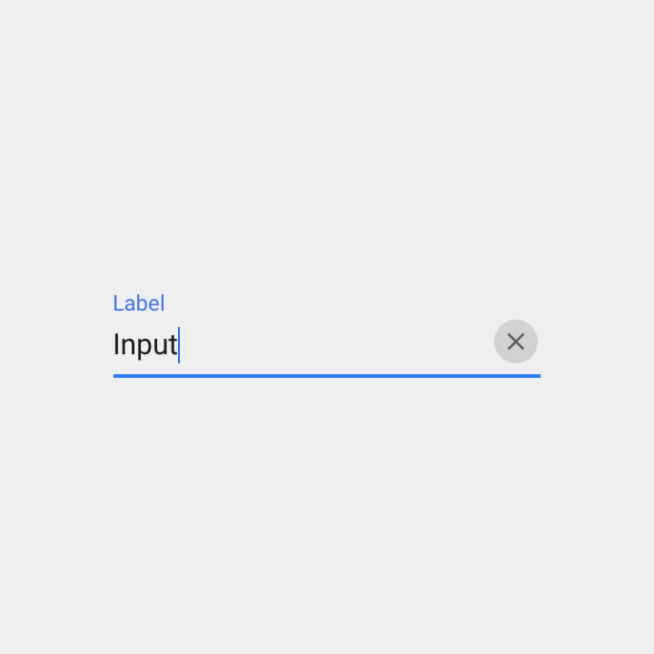
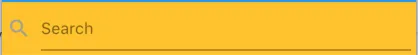
如何在TextField中添加清除按钮?就像Material设计指南中的这张图片一样:
我找到的方法是在InputDecoration的suffixIcon中设置一个清除IconButton。这是正确的方式吗?
输出:
创建一个变量
var _controller = TextEditingController();
还有你的TextField:
TextField(
  controller: _controller,
  decoration: InputDecoration(
    hintText: 'Enter a message',
    suffixIcon: IconButton(
      onPressed: _controller.clear,
      icon: Icon(Icons.clear),
    ),
  ),
)
Container(
margin: EdgeInsets.only(left: 16.0),
child: TextFormField(
controller: _username,
decoration: InputDecoration(
hintText: '请输入工号',
filled: true,
prefixIcon: Icon(
Icons.account_box,
size: 28.0,
),
suffixIcon: IconButton(
icon: Icon(Icons.remove),
onPressed: () {
debugPrint('222');
})),
),
),
icon: Icon(Icons.cancel,color: _username.text.isNotEmpty ? Colors.grey : Colors.transparent ) - Chakib TemalStatelessWidget 下无法工作。 - zionpi试试这个 -
final TextEditingController _controller = new TextEditingController();
new Stack(
alignment: const Alignment(1.0, 1.0),
children: <Widget>[
new TextField(controller: _controller,),
new FlatButton(
onPressed: () {
_controller.clear();
},
child: new Icon(Icons.clear))
]
)
这里是对@Vilokan Lab回答的进一步扩展,他的回答并没有完全解决我的问题,因为FlatButton的最小宽度为88.0,因此清除按钮并没有与TextField右对齐。
所以我自己写了一个按钮类,并使用堆栈来应用它,以下是我的流程:
按钮类:
class CircleIconButton extends StatelessWidget {
final double size;
final Function onPressed;
final IconData icon;
CircleIconButton({this.size = 30.0, this.icon = Icons.clear, this.onPressed});
@override
Widget build(BuildContext context) {
return InkWell(
onTap: this.onPressed,
child: SizedBox(
width: size,
height: size,
child: Stack(
alignment: Alignment(0.0, 0.0), // all centered
children: <Widget>[
Container(
width: size,
height: size,
decoration: BoxDecoration(
shape: BoxShape.circle, color: Colors.grey[300]),
),
Icon(
icon,
size: size * 0.6, // 60% width for icon
)
],
)));
}
}
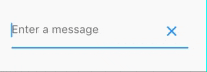
然后将InputDecoration应用到你的TextField中,如下所示:
var myTextField = TextField(
controller: _textController,
decoration: InputDecoration(
hintText: "Caption",
suffixIcon: CircleIconButton(
onPressed: () {
this.setState(() {
_textController.clear();
});
},
)),
},
);
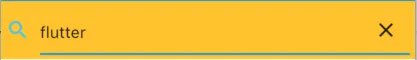
要获得这样的效果:
未高亮状态
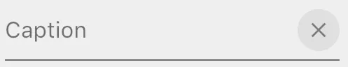
高亮/选定状态。
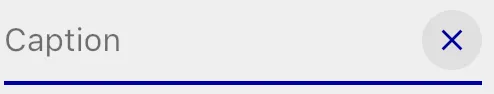
请注意,当您使用suffixIcon时,这种着色是免费的。
请注意,您还可以像这样在您的TextField中堆叠它,但是您不会获得使用suffixIcon时自动着色的效果:
var myTextFieldView = Stack(
alignment: Alignment(1.0,0.0), // right & center
children: <Widget>[
TextField(
controller: _textController,
decoration: InputDecoration(hintText: "Caption"),
),
Positioned(
child: CircleIconButton(
onPressed: () {
this.setState(() {
_textController.clear();
});
},
),
),
],
);
带图标和清除按钮的搜索文本框
import 'package:flutter/material.dart';
class SearchTextField extends StatefulWidget{
@override
State<StatefulWidget> createState() {
// TODO: implement createState
return new SearchTextFieldState();
}
}
class SearchTextFieldState extends State<SearchTextField>{
final TextEditingController _textController = new TextEditingController();
@override
Widget build(BuildContext context) {
// TODO: implement build
return new Row(children: <Widget>[
new Icon(Icons.search, color: _textController.text.length>0?Colors.lightBlueAccent:Colors.grey,),
new SizedBox(width: 10.0,),
new Expanded(child: new Stack(
alignment: const Alignment(1.0, 1.0),
children: <Widget>[
new TextField(
decoration: InputDecoration(hintText: 'Search'),
onChanged: (text){
setState(() {
print(text);
});
},
controller: _textController,),
_textController.text.length>0?new IconButton(icon: new Icon(Icons.clear), onPressed: () {
setState(() {
_textController.clear();
});
}):new Container(height: 0.0,)
]
),),
],);
}
}
TextEditingController 用于检查文本框的当前状态,我们可以根据文本框是否有内容来决定是否显示取消图标。
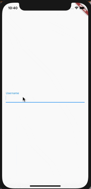
var _usernameController = TextEditingController();
@override
Widget build(BuildContext context) {
return Scaffold(
body: Padding(
padding: const EdgeInsets.all(16.0),
child: Center(
child: TextField(
controller: _usernameController,
onChanged: (text) {
setState(() {});
},
decoration: InputDecoration(
labelText: 'Username',
suffixIcon: _usernameController.text.length > 0
? IconButton(
onPressed: () {
_usernameController.clear();
setState(() {});
},
icon: Icon(Icons.cancel, color: Colors.grey))
: null),
),
),
),
);
}
输出:
TextFormField(
controller:_controller
decoration: InputDecoration(
suffixIcon: IconButton(
onPressed: (){
_controller.clear();
},
icon: Icon(
Icons.keyboard,
color: Colors.blue,
),
),
),
)
class _MyTextFieldState extends State<MyTextField> {
TextEditingController _textController;
bool _wasEmpty;
@override
void initState() {
super.initState();
_textController = TextEditingController(text: widget.initialValue);
_wasEmpty = _textController.text.isEmpty;
_textController.addListener(() {
if (_wasEmpty != _textController.text.isEmpty) {
setState(() => {_wasEmpty = _textController.text.isEmpty});
}
});
}
@override
void dispose() {
_textController.dispose();
super.dispose();
}
@override
Widget build(BuildContext context) {
return TextFormField(
controller: _textController,
decoration: InputDecoration(
labelText: widget.label,
suffixIcon: _textController.text.isNotEmpty
? Padding(
padding: const EdgeInsetsDirectional.only(start: 12.0),
child: IconButton(
iconSize: 16.0,
icon: Icon(Icons.cancel, color: Colors.grey,),
onPressed: () {
setState(() {
_textController.clear();
});
},
),
)
: null,
),);
...
TextField(
decoration: InputDecoration(
suffixIcon: IconButton(
icon: Icon(
Icons.cancel,
),
onPressed: () {
_controllerx.text = '';
}
),
)
)
要在文本框中添加图标,您必须在输入装饰内使用 suffixIcon 或 prefixIcon。
TextFormField(
autofocus: false,
obscureText: true,
decoration: InputDecoration(
labelText: 'Password',
suffixIcon: Icon(
Icons.clear,
size: 20.0,
),
border: OutlineInputBorder(
borderRadius: BorderRadius.all(Radius.circular(0.0)),
),
hintText: 'Enter Password',
contentPadding: EdgeInsets.all(10.0),
),
);
onPressed: () {
},
)," - Tahseen Quraishi
ClipOval(
  child: Material(
    color: Colors.transparent,
    child: IconButton(
      ...
    ),
  ),
)
- Jeff S.