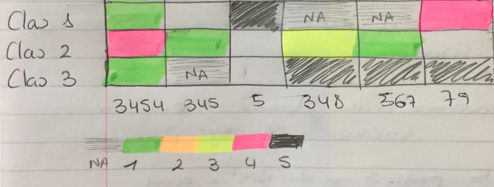
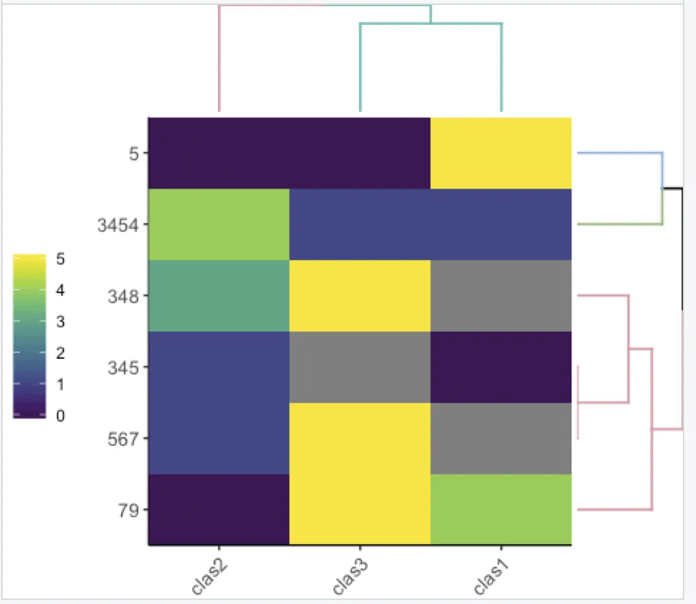
这里还有另一种选择:
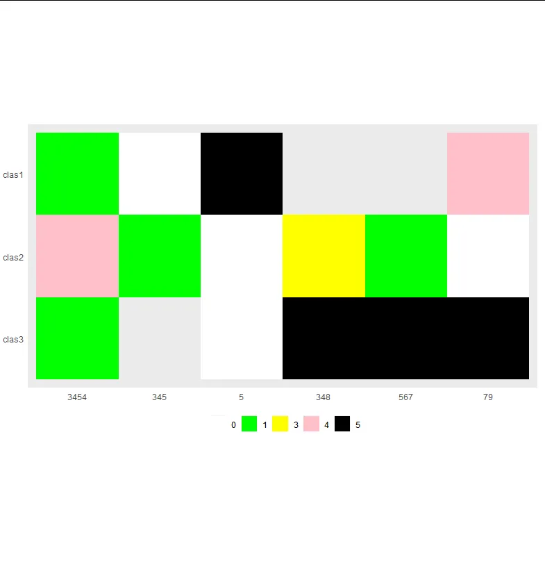
df <- data.frame(PatientID = c("3454","345","5","348","567","79"),
                 clas1 = c(1, 0, 5, NA, NA, 4),
                 clas2 = c(4, 1, 0, 3, 1, 0),
                 clas3 = c(1, NA, 0, 5, 5, 5), stringsAsFactors = F)
cols <- c("0" = "white",
"1" = "green",
"2" = "orange",
"3" = "yellow",
"4" = "pink",
"5" = "black",
"99" = "grey")
labels_legend <- c("0" = "0",
"1" = "1",
"2" = "2",
"3" = "3",
"4" = "4",
"5" = "5",
"99" = "NA")
df1 <- df %>%
pivot_longer(
cols = starts_with("clas"),
names_to = "names",
values_to = "values"
) %>%
mutate(PatientID = factor(PatientID, levels = c("3454", "345", "5", "348", "567", "79")))
ggplot(
df1,
aes(factor(PatientID), factor(names))) +
geom_tile(aes(fill= factor(values))) +
scale_fill_manual(
values = cols,
breaks = c("0", "1", "2", "3", "4", "5", "99"),
labels = labels_legend,
aesthetics = c("colour", "fill"),
drop = FALSE
) +
scale_y_discrete(limits=rev) +
coord_equal() +
theme(line = element_blank(),
title = element_blank()) +
theme(legend.direction = "horizontal", legend.position = "bottom")