在R中绘制不连续的热力图

3

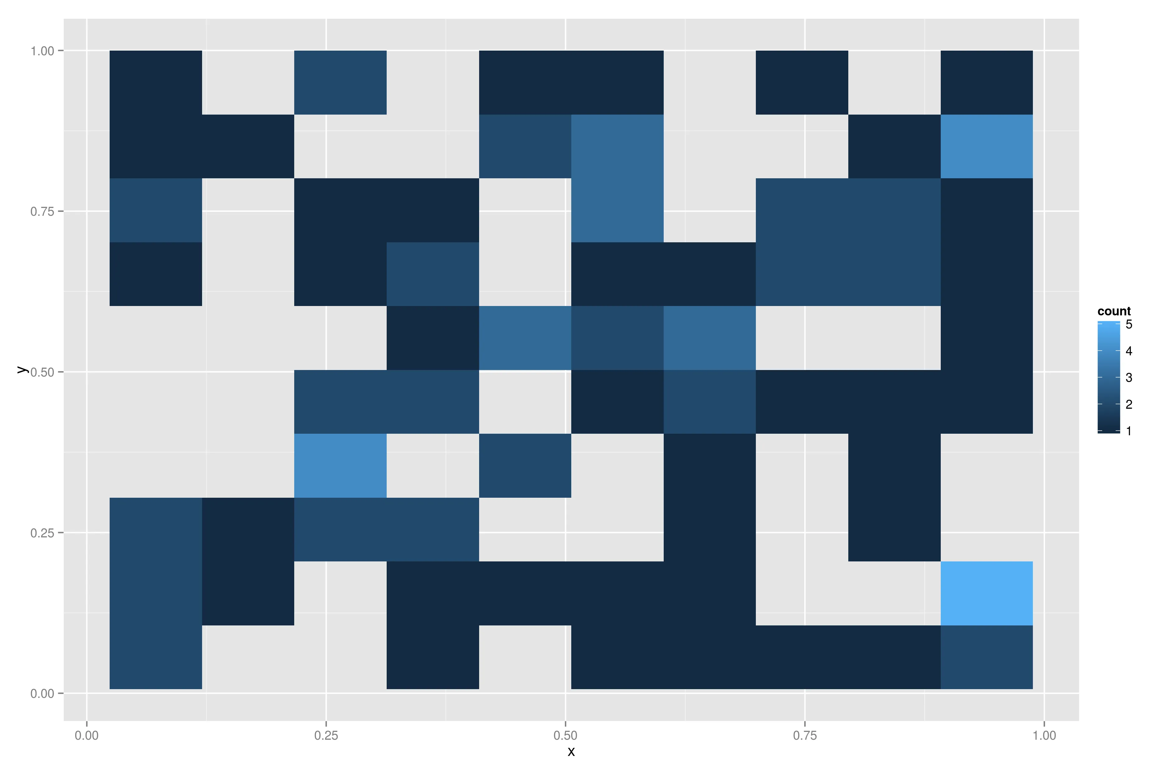
我希望在R中创建类似于以下类型的不连续热力图:

enter image description here

enter image description here

我的数据排列如下:

k_e percent time
 ..   ..     ..
 ..   ..     ..

我希望您能将k_e作为x轴,percent作为y轴,并使用time表示颜色。
我找到的所有链接都绘制了连续的矩阵http://www.r-bloggers.com/ggheat-a-ggplot2-style-heatmap-function/或进行了插值。但是我不希望出现上述情况,我想要像上面的图片一样绘制不连续的热力图。

2
如果你“既不希望前面提到的任何一个”,那么你希望什么呢?此外,如果您能提供一个可重现的示例,将会非常有帮助。reproducible example - Jaap
如果多个数据点落入同一个区间,是否应该对权重(“时间”)进行平均? - ziggystar
@ziggystar 是的,忘了提到,如何实现这一点呢? - Abhishek Bhatia
@ziggystar 好的,抱歉我没有检查你的代码,你已经提到了它。谢谢! - Abhishek Bhatia
2个回答

3
第二种是六边形图。如果你的(x,y)对是唯一的,你可以做一个x y图,如果这就是你想要的,你可以尝试使用基本的R绘图函数:
x <- runif(100)
y<-runif(100)
time<-runif(100)

pal <- colorRampPalette(c('white','black'))
#cut creates 10 breaks and classify all the values in the time vector in
#one of the breaks, each of these values is then indexed by a color in the
#pal colorRampPalette.

cols <- pal(10)[as.numeric(cut(time,breaks = 10))]

#plot(x,y) creates the plot, pch sets the symbol to use and col the color 
of the points
plot(x,y,pch=19,col = cols)

使用ggplot,您还可以尝试以下操作:

library(ggplot2)
qplot(x,y,color=time)

请问您能否为最后两行添加注释? - Abhishek Bhatia
请问您能否指定如何使用qplot设置颜色标签? - Abhishek Bhatia

1

生成数据

d <- data.frame(x=runif(100),y=runif(100),w=runif(100))

使用 ggplot2
require(ggplot2)

样本数量

以下代码生成一个不连续的热力图,其中颜色表示落入一个区间中的项目数:

ggplot(d,aes(x=x,y=y)) + stat_bin2d(bins=10)

enter image description here

平均重量

以下代码创建了一个不连续的热力图,颜色代表变量w在当前区间内所有样本的平均值。

ggplot(d,aes(x=x,y=y,z=w)) + stat_summary2d(bins=10)

enter image description here


网页内容由stack overflow 提供, 点击上面的
可以查看英文原文,
原文链接