R语言中的矩阵图表

5

我希望在r中创建这样的图表:

enter image description here

我有一个这样的矩阵:

 [1]   [2]   [3]   [4]   [5] .... [30]

[1] 0.5   0.75  1.5   0.25  2.5 .... 0.51

[1] 0.84  0.24  3.5   0.85  0.25.... 1.75

[1] 0.35  4.2   0.52  1.5   0.35.... 0.75
.
. .......................................
.
[30]0.84  1.24  0.55   1.5  0.85.... 2.75

我希望能够画出一个图表。

  • 如果值小于1——> 绿色圆圈
  • 如果值在1和2之间——> 黄色圆圈
  • 如果值大于2——> 红色圆圈

有没有在R中完成这个任务的包或方法?我该怎么做?
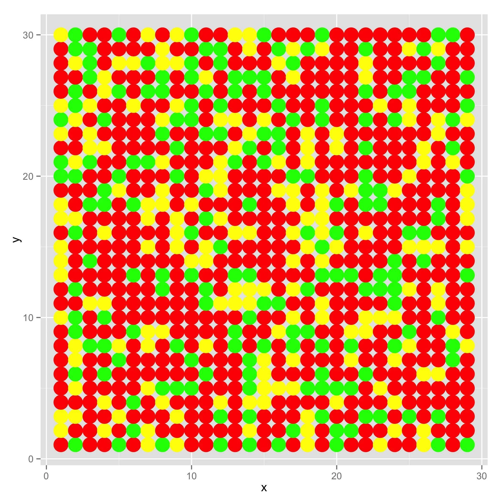
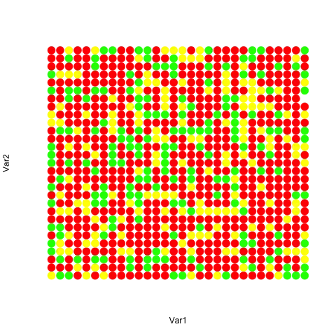
3个回答

7
要绘制图形,您需要三个数据点:
x, y, color

因此,第一步是重塑数据。
幸运的是,矩阵已经是一个向量,只需具有维度属性,因此我们只需要创建一个x,y坐标的data.frame。我们使用expand.grid来实现这个目标。
# create sample data. 
mat <- matrix(round(runif(900-30, 0, 5),2), 30)

创建(x, y)数据框。
请注意,y的序列,而x的序列。
dat <- expand.grid(y=seq(nrow(mat)), x=seq(ncol(mat)))

## add in the values from the matrix. 
dat <- data.frame(dat, value=as.vector(mat))

## Create a column with the appropriate colors based on the value.
dat$color <- cut( dat$value, 
                  breaks=c(-Inf, 1, 2, Inf), 
                  labels=c("green", "yellow", "red")
                 )


## Plotting
library(ggplot2)
ggplot(data=dat, aes(x=x, y=y)) + geom_point(color=dat$color, size=7)

sample output


谢谢您的友好回答,您能告诉我 breaks=c(-Inf, 1, 2, Inf) 是什么意思吗? - Kaja
2
@kaja,没问题。cut语句只是制作三个单独的ifelse()语句的简单方法。它将连续向量分段,每个断点内的每个值都是一组。labels参数指示如何标记每个组。 - Ricardo Saporta

3
如果您的数据是相关性的结果,那么corrplot包可能会很有用。
corrplot包是一个相关矩阵的图形显示,置信区间。它还包含一些算法来进行矩阵重新排序。此外,corrplot在细节方面表现出色,包括选择颜色、文本标签、颜色标签、布局等。
基于@RicardoSaporta样本数据的示例图。
library(corrplot)

#sample data
mat <- matrix(round(runif(900, 0, 5),2), 30)

#plot
corrplot(mat, is.corr = FALSE)

enter image description here


3
此外,您也可以仅使用基本函数image
mat <- matrix(round(runif(900-30, 0, 5),2), 30)
image(mat,
      breaks=c(min(mat),1,2,max(mat)), #image can't handle Inf but that's not a problem here
      col=c("green","yellow","red"), axes=FALSE)

在此输入图片描述

如果你更喜欢点而不是方格:

grid <- expand.grid(1:nrow(mat),1:ncol(mat)) #Same two steps as in Ricardo Sapporta answer
category <- cut(mat,c(-Inf,1,2,Inf))
plot(grid,                  #Then plot using base plot
     col=c("green","yellow","red")[category], #here is the trick
     pch=19, cex=2, axes=FALSE) #You can customize it as you wish

enter image description here


网页内容由stack overflow 提供, 点击上面的
可以查看英文原文,
原文链接