使用Seaborn在一个图中绘制多个不同的图形。

76

我试图使用seaborn重新创建《统计学习导论》一书中的以下图表。 enter image description here

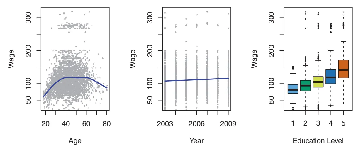
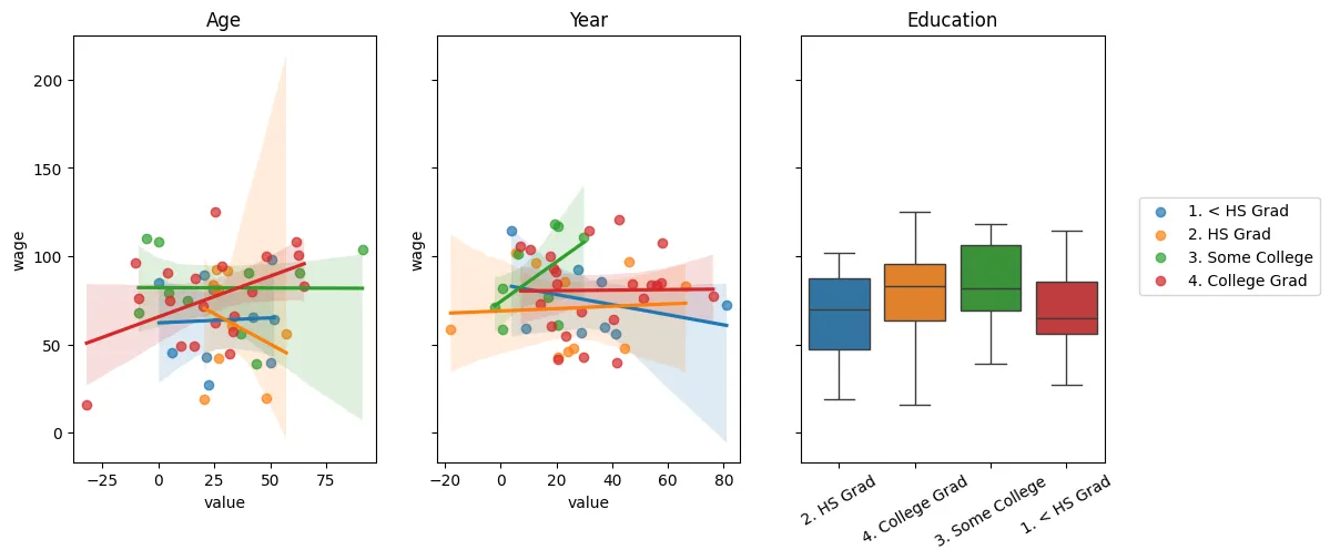
我想要使用seaborn的lmplot创建前两个图,使用boxplot创建第二个图。主要问题在于lmplot创建了一个facetgrid,根据这个回答,这迫使我hackily添加另一个matplotlib轴以绘制盒形图。我想知道是否有更简单的方法来实现这一点。下面,我必须进行相当多的手动操作才能获得所需的绘图。

seaborn_grid = sns.lmplot('value', 'wage', col='variable', hue='education', data=df_melt, sharex=False)
seaborn_grid.fig.set_figwidth(8)

left, bottom, width, height = seaborn_grid.fig.axes[0]._position.bounds
left2, bottom2, width2, height2 = seaborn_grid.fig.axes[1]._position.bounds
left_diff = left2 - left
seaborn_grid.fig.add_axes((left2 + left_diff, bottom, width, height))

sns.boxplot('education', 'wage', data=df_wage, ax = seaborn_grid.fig.axes[2])
ax2 = seaborn_grid.fig.axes[2]
ax2.set_yticklabels([])
ax2.set_xticklabels(ax2.get_xmajorticklabels(), rotation=30)
ax2.set_ylabel('')
ax2.set_xlabel('');

leg = seaborn_grid.fig.legends[0]
leg.set_bbox_to_anchor([0, .1, 1.5,1])

哪个产生了enter image description here

DataFrames的示例数据:

df_melt = {'education': {0: '1. < HS Grad',
  1: '4. College Grad',
  2: '3. Some College',
  3: '4. College Grad',
  4: '2. HS Grad'},
 'value': {0: 18, 1: 24, 2: 45, 3: 43, 4: 50},
 'variable': {0: 'age', 1: 'age', 2: 'age', 3: 'age', 4: 'age'},
 'wage': {0: 75.043154017351497,
  1: 70.476019646944508,
  2: 130.982177377461,
  3: 154.68529299562999,
  4: 75.043154017351497}}

df_wage={'education': {0: '1. < HS Grad',
  1: '4. College Grad',
  2: '3. Some College',
  3: '4. College Grad',
  4: '2. HS Grad'},
 'wage': {0: 75.043154017351497,
  1: 70.476019646944508,
  2: 130.982177377461,
  3: 154.68529299562999,
  4: 75.043154017351497}}

我认为你想要使用 PairGrid - mwaskom
2个回答

163

一种可能的方法是不使用lmplot(),而是直接使用regplot()。 使用ax=作为参数传递给regplot(),可以在指定的轴上绘制图表。

你失去了根据某个变量自动拆分数据集的能力,但如果你事先知道要生成的图表,这不应该是一个问题。

像这样:

import matplotlib.pyplot as plt
import seaborn as sns

fig, axs = plt.subplots(ncols=3)
sns.regplot(x='value', y='wage', data=df_melt, ax=axs[0])
sns.regplot(x='value', y='wage', data=df_melt, ax=axs[1])
sns.boxplot(x='education',y='wage', data=df_melt, ax=axs[2])

1
谢谢,我想我正在寻找一种更通用的解决方案,允许 facet grid 在未来包含额外的空白轴以进行附加绘图。也许使用 lmplot 无法实现这一点。 - Ted Petrou
虽然这回答了具体问题,但并没有真正帮助其他人... :/编辑:好吧,我猜它帮助了125个人。 - markemus

-1
截至seaborn 0.13.0(在此问题发布后的7年后),仍然很难在seaborn的图形级对象中添加子图,而不会干扰底层图形的位置。实际上,OP中显示的方法可能是最可读的方法。
话虽如此,正如Diziet Asahi所建议的,如果你想放弃seaborn的FacetGrids(例如lmplot,catplot等),完全使用seaborn的Axes-level方法创建一个等效的图形(例如regplot代替lmplot,scatterplot+lineplot代替relplot等),并在图形中添加更多的子图,例如boxplot,你可以通过将数据按照你要在lmplot中使用的列(作为cols参数)进行分组(并按照你要在hue参数中使用的列对子数据框进行分组),然后使用子数据框中的数据绘制图形。
作为一个例子,使用OP中的数据,我们可以创建一个在右侧添加了盒图的“有点等效”的图形,类似于lmplot。
# groupby data since `cols='variable'`
groupby_object = df_melt.groupby('variable')
# count number of groups to determine the required number of subplots
number_of_columns = groupby_object.ngroups

fig, axs = plt.subplots(1, number_of_columns+1, sharey=True)
for i, (_, g) in enumerate(groupby_object):
    # feed data from each sub-dataframe `g` to regplot
    sns.regplot(data=g, x='value', y='wage', ax=axs[i])
# plot the boxplot in the end
sns.boxplot(data=df_wage, x='education', y='wage', hue='education', ax=axs[-1])

在原始帖子中的示例使用hue=参数来通过'education'绘制不同的拟合线。为了实现这一点,我们可以再次按'education'列对子数据框进行分组,并在同一坐标轴上绘制多个教育水平的拟合线。以下是一个可行的示例:
groupby_object = df_melt.groupby('variable')
number_of_columns = groupby_object.ngroups
fig, axs = plt.subplots(1, number_of_columns+1, figsize=(12, 5), sharey=True)
for i, (_, g) in enumerate(groupby_object):
    for label, g1 in g.groupby('education'):
        label = label if i == 0 else None
        sns.regplot(data=g1, x='value', y='wage', label=label, scatter_kws={'alpha': 0.7}, ax=axs[i])
sns.boxplot(data=df_wage, x='education', y='wage', hue='education', ax=axs[-1])
axs[-1].set(ylabel='', xlabel='')
axs[-1].tick_params(axis='x', labelrotation=30)
for ax, title in zip(axs, ['Age', 'Year', 'Education']):
    ax.set_title(title)
_ = fig.legend(bbox_to_anchor=(0.92, 0.5), loc="center left")

使用以下示例数据集(由于OP的示例数据不够丰富,无法生成正确的图表),请参考以下内容:
import numpy as np
import pandas as pd
rng = np.random.default_rng(0)
edu = rng.choice(['1. < HS Grad', '4. College Grad', '3. Some College', '4. College Grad','2. HS Grad'], size=100)
wage = rng.normal(75, 25, 100)
df_melt = pd.DataFrame({'education': edu, 'value': rng.normal(30, 20, 100), 'variable': rng.choice(['age', 'year'], 100), 'wage': wage})
df_wage = pd.DataFrame({'education': edu, 'wage': wage})

上述代码绘制了以下图形:

result


网页内容由stack overflow 提供, 点击上面的
可以查看英文原文,
原文链接