在Seaborn中,使用类似“hue”的多个属性绘制图形

12

我有一个名为df的示例数据集,其中阶段时间是到达目的地所需天数:

id stage1_time stage_1_to_2_time stage_2_time stage_2_to_3_time stage3_time
a  10          30                40           30                70
b  30               
c  15          30                45     
d       

我编写了以下脚本,以获取stage1_time与CDF的散点图:

Translated text:

我编写了如下脚本,用于得到stage1_time与累积分布函数(CDF)的散点图:

import pandas as pd
import matplotlib.pyplot as plt
import numpy as np
import scipy.stats as stats

dict = {'id': id, 'stage_1_time': [10, 30, 15, None], 'stage_1_to_2_time': [30, None, 30, None], 'stage_2_time' : [40, None, 45, None],'stage_2_to_3_time' : [30, None, None, None],'stage_3_time' : [70, None, None, None]}
df = pd.DataFrame(dict)

#create eCDF function
def ecdf(df):
    n = len(df)
    x = np.sort(df)
    y = np.arange(1.0, n+1) / n
    return x, y

def generate_scatter_plot(df):

    x, y = ecdf(df)

    plt.plot(x, y, marker='.', linestyle='none') 
    plt.axvline(x.mean(), color='gray', linestyle='dashed', linewidth=2) #Add mean

    x_m = int(x.mean())
    y_m = stats.percentileofscore(df.as_matrix(), x.mean())/100.0

    plt.annotate('(%s,%s)' % (x_m,int(y_m*100)) , xy=(x_m,y_m), xytext=(10,-5), textcoords='offset points')

    percentiles= np.array([0,25,50,75,100])
    x_p = np.percentile(df, percentiles)
    y_p = percentiles/100.0

    plt.plot(x_p, y_p, marker='D', color='red', linestyle='none') # Overlay quartiles

    for x,y in zip(x_p, y_p):                                        
        plt.annotate('%s' % int(x), xy=(x,y), xytext=(10,-5), textcoords='offset points')

#Data to plot
stage1_time = df['stage_1_time'].dropna().sort_values()

#Scatter Plot
stage1_time_scatter = generate_scatter_plot(pd.DataFrame({"df" : stage1_time.as_matrix()}))
plt.title('Scatter Plot of Days to Stage1')
plt.xlabel('Days to Stage1')
plt.ylabel('Cumulative Probability')
plt.legend(('Days to Stage1', "Mean", 'Quartiles'), loc='lower right')
plt.margins(0.02)

plt.show()

输出:

在此输入图像描述

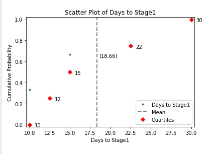
目前我已经将到达stage1的所有人花费的天数绘制成了累积概率图,但是我想要实现的是:当我绘制散点图时,该图有三种颜色:那些到达stage1并停留在那里的人,那些进入stage2的人和那些进入stage3的人。我还想在图表中显示数据的计数:stage1中的数量,stage2中的数量和stage3中的数量。

请问有人能帮我实现吗?

顺便说一下,我想将此作为基础,以便我还可以创建一个关于stage2_time的图表,其中到达stage_3的人会被突出显示为不同的颜色。

1个回答

4

您可以创建一个新的列,用它来存储最终阶段,然后使用这个新列来给您的图形上色。

import pandas as pd
import matplotlib.pyplot as plt
import numpy as np
import scipy.stats as stats
import math

dict = {'id': id, 'Progressive_time': [10, 30, 15, None],'stage_1_to_2_time': [30, None, 30, None], 'Active_time' : [40,None, 45, None],'stage_2_to_3_time' : [30, None, None,None],'Engaged_time' : [70, None, None, None]}
df = pd.DataFrame(dict)

    #create eCDF function
def ecdf(df, serie):
    n = len(df)
    df['x'] = np.sort(df[serie])
    df['y'] = np.arange(1.0, n+1) / n
    return df

def generate_scatter_plot(df,serie,nb_stage):
    df=df.dropna(subset=[serie]).sort_values(by=[serie])
    st=1
    for i in range(1,nb_stage*2,2):
        df.loc[df.iloc[:,i].notnull(),'stage']=st
        st=st+1

    df= ecdf(df, serie)
    plt.plot(df.loc[df['stage'] == 1, 'x'], df.loc[df['stage'] == 1, 'y'], marker='.', linestyle='none',c='blue') 
    plt.plot(df.loc[df['stage'] == 2, 'x'], df.loc[df['stage'] == 2, 'y'], marker='.', linestyle='none',c='red') 
    plt.plot(df.loc[df['stage'] == 3, 'x'], df.loc[df['stage'] == 3, 'y'], marker='.', linestyle='none',c='green') 
    plt.axvline(df['x'].mean(), color='gray', linestyle='dashed', linewidth=2) #Add mean


    x_m = int(df['x'].mean())
    y_m = stats.percentileofscore(df[serie], df['x'].mean())/100.0

    plt.annotate('(%s,%s)' % (x_m,int(y_m*100)) , xy=(x_m,y_m), xytext=(10,-5), textcoords='offset points')

    percentiles= np.array([0,25,50,75,100])
    x_p = np.percentile(df[serie], percentiles)
    y_p = percentiles/100.0

    plt.plot(x_p, y_p, marker='D', color='red', linestyle='none') # Overlay quartiles

    for x,y in zip(x_p, y_p):                                        
        plt.annotate('%s' % int(x), xy=(x,y), xytext=(10,-5), textcoords='offset points')

#Scatter Plot
stage1_time_scatter = generate_scatter_plot(df,'stage_1_time',3)
plt.title('Scatter Plot of Days to Stage1')
plt.xlabel('Days to Stage1')
plt.ylabel('Cumulative Probability')
plt.legend(('Progressive','Active','Engaged','Days to Stage1', "Mean", 'Quartiles'), loc='lower right')
plt.margins(0.02)

plt.show()

谢谢,这很完美!我的问题是关于“def generate_scatter_plot”的,有没有办法从定义本身中取出硬编码的“stage_3_time”和“stage_2_time”?我希望能够更广泛地应用它到其他情况中。 - user8834780
1
我修改了我的代码。现在,在 generate_scatter_plot 函数中,你可以设置多个阶段。对于图例,你可以在 generate_scatter_plot 中编辑或添加一个列表。 - Aurelia_B
1
谢谢!两个问题:1)我称之为阶段1、2、3,但实际上它们是字母定义(如Progressive、Active、Engaged)——我还能像现在这样使用代码吗?2)如果需要,是否足够通用,以便用于那些收到某封电子邮件的人,而不是那些继续到第2和第3阶段的人? - user8834780
1
你必须使用相同的数据框列结构,但名称不重要。 - Aurelia_B
谢谢,这真的很棒!请在聊天中查看问题 https://chat.stackoverflow.com/rooms/172432/discussion-between-user8834780-and-aurelia-b - user8834780

网页内容由stack overflow 提供, 点击上面的
可以查看英文原文,
原文链接