有点巧妙,但能完成任务:
代码
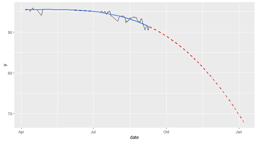
days <- as.numeric(seq.Date(max(df$date) + 1, max(df$date) + 120, by = "days"))
model <- loess(y ~ as.numeric(date), df, control = loess.control(surface = "direct"))
p <- predict(model, days)
result <- data.frame(date = as.Date(days, origin = "1970-01-01"),
y = p)
ggplot() +
geom_line(data = df, aes(date, y)) +
geom_smooth(data = df, aes(date, y), method = "loess", se = FALSE) +
geom_line(data = result, aes(date, y), linetype = "dashed", color = "red", size = 1)
数据
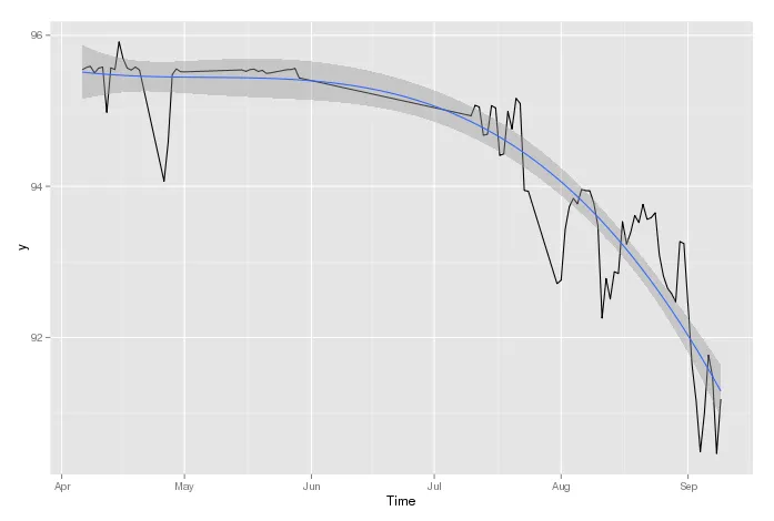
df <- structure(list(date = structure(c(16166, 16167, 16168, 16169, 16170, 16171, 16172, 16173, 16174, 16175, 16176, 16177, 16178, 16179, 16180, 16186, 16187, 16188, 16189, 16190, 16191, 16205, 16206, 16207, 16208, 16209, 16210, 16211, 16212, 16216, 16217, 16218, 16219, 16261, 16262, 16263, 16264, 16265, 16266, 16267, 16268, 16269, 16270, 16271, 16272, 16273, 16274, 16275, 16282, 16283, 16284, 16285, 16286, 16287, 16288, 16289, 16290, 16291, 16292, 16293, 16294, 16295, 16296, 16297, 16298, 16299, 16300, 16301, 16302, 16303, 16304, 16305, 16306, 16307, 16308, 16309, 16310, 16311, 16312, 16313, 16315, 16316, 16317, 16318, 16319, 16320, 16321, 16322), class = "Date"), y = c(95.543962, 95.573412, 95.589183, 95.500536, 95.563371, 95.579541, 94.979131, 95.56979, 95.545374, 95.912162, 95.687874, 95.564335, 95.538733, 95.579036, 95.539545, 94.068515, 94.584192, 95.479851, 95.554502, 95.517236, 95.514891, 95.541116, 95.52134, 95.545067, 95.551372, 95.520105, 95.535395, 95.494109, 95.501609, 95.544039, 95.545912, 95.560667, 95.435162, 94.934045, 95.072639, 95.050748, 94.676876, 94.68793, 95.068279, 95.038642, 94.408982, 94.429949, 94.990296, 94.75853, 95.1649, 95.095966, 93.945934, 93.934546, 92.71179, 92.757176, 93.429478, 93.730306, 93.840446, 93.769516, 93.958374, 93.94293, 93.940904, 93.776711, 93.474757, 92.255233, 92.779808, 92.508432, 92.869858, 92.846158, 93.533357, 93.233847, 93.392017, 93.613915, 93.520494, 93.761786, 93.562945, 93.584771, 93.650417, 93.091347, 92.813293, 92.650896, 92.577961, 92.468491, 93.269589, 93.242729, 91.626408, 91.157243, 90.486782, 90.989062, 91.766393, 91.477911, 90.463049, 91.182974)), row.names = c(NA, -88L), class = "data.frame")
ggolot外部调用lm(就像你现在展示的那样),然后使用带有“newdata”参数的predict函数,该参数具有在您可以合理地预期预测值约为70的范围内的 'x' 值。 - IRTFMg <- 1:120。然后我使用了predict(fit,newdata=g)。但是我收到了这个错误:Error in eval(predvars, data, env) : numeric 'envir' arg not of length one。另外,我想在 x 中使用日期,因为现在我必须将整数更改为日期。 - ELECas.numeric(data$y)之后的下4个月。(日期确实是整数。) - IRTFMg<-1:200并运行了predict(fit, newdata= data.frame(x=g))。从结果中可以看出,第179个指数低于70,因此我将那么多天添加到我的第一个观测值as.Date("2014-04-06") + 179。因此结果似乎是2014-10-02。我所做的是否有效(虽然不太优雅)?感谢您的帮助。如果您有更好的解决方案,请随时发布答案,我会接受它。 - ELECstat_smooth和`fullrange=TRUE。 - Tyler Rinker