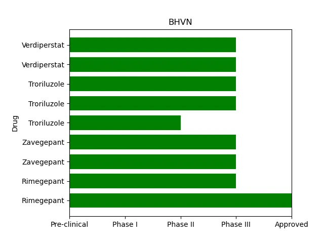
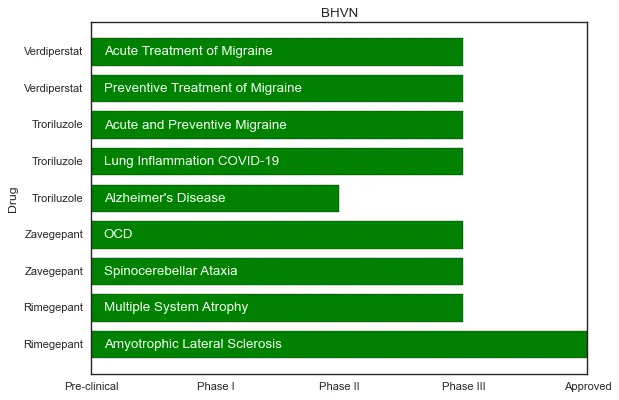
如何在Matplotlib水平条形图中的条形内部编写文本?

4

目前我的代码产生了以下效果:

enter image description here

我想在条形图中写入文字来达到以下效果:

enter image description here

目前这是我的基础代码:

我想将Disease放入条形中

import matplotlib
from matplotlib import pyplot as plt
import pandas as pd 
import numpy as np

x = [u'Rimegepant',u'Rimegepant',u'Zavegepant',u'Zavegepant',u'Troriluzole',u'Troriluzole',u'Troriluzole',u'Verdiperstat',u'Verdiperstat']

y = [4,3,3,3,2,3,3,3,3]

Disease = ['Acute Treatment of Migraine','Preventive Treatment of Migraine','Acute and Preventive Migraine','Lung Inflammation COVID-19',"Alzheimer's Disease", "OCD", "Spinocerebellar Ataxia", "Multiple System Atrophy", "Amyotrophic Lateral Sclerosis"]

fig, ax = plt.subplots()    
width = 0.75 # the width of the bars 
ind = np.arange(len(y))  # the x locations for the groups
ax.barh(ind, y, width, color="green", align='edge')
ax.set_yticks(ind+width/2)
ax.set_yticklabels(x, minor=False)
plt.xticks(np.arange(5),('Pre-clinical','Phase I','Phase II','Phase III', 'Approved'))
plt.margins(0,0.05)
plt.title('BHVN')
plt.ylabel('Drug')

plt.show()
3个回答

9
你可以通过 matplotlib 的 ax.text() 方法向 ax 添加文本。
如果你添加了:
for bar, disease in zip(ax.patches, Disease[::-1]):
    ax.text(0.1, bar.get_y()+bar.get_height()/2, disease, color = 'white', ha = 'left', va = 'center') 

在你的代码中,在 plt.show() 之前,你会得到:

enter image description here

请注意,我不得不使用 [::-1] 反转你的 Disease 列表,才能使文本以你在图片中所示的方式出现,否则 Amyotrophic Lateral Sclerosis 将位于顶部,而 Acute Treatment of Migraine 将位于底部。

函数通用形式为 plt.text(x, y, text),因此你可以看到我将 x 偏移了 0.1,并从条形图补丁获取了 y。

如果想要了解更多关于该函数的信息,你可以查看 matplotlib 文档


1
如果有人想要将文本垂直书写,类似这样的方法也可以用于垂直条形图:for each_bar in bars: plt.text(each_bar.get_x() + each_bar.get_width() / 2.0, 20, your_text_in_every_iteration, color='red', ha='center', va='center', rotation='vertical') 在此之前,您需要像这样将绘图分配给一个变量:bars = plt.bar(xlist, ylist) - Celuk

2
这将正常工作:

这将正常工作:

import matplotlib
from matplotlib import pyplot as plt
import pandas as pd
import numpy as np

x = [u'Rimegepant',u'Rimegepant',u'Zavegepant',u'Zavegepant',u'Troriluzole',u'Troriluzole',u'Troriluzole',u'Verdiperstat',u'Verdiperstat']

y = [4,3,3,3,2,3,3,3,3]

Disease = ['Acute Treatment of Migraine','Preventive Treatment of Migraine','Acute and Preventive Migraine','Lung Inflammation COVID-19',"Alzheimer's Disease", "OCD", "Spinocerebellar Ataxia", "Multiple System Atrophy", "Amyotrophic Lateral Sclerosis"]
Disease.reverse()
fig, ax = plt.subplots()
width = 0.75 # the width of the bars
ind = np.arange(len(y))  # the x locations for the groups
bar_plot = ax.barh(ind, y, width, color="green", align='edge')
ax.set_yticks(ind+width/2)
ax.set_yticklabels(x, minor=False)
plt.xticks(np.arange(5),('Pre-clinical','Phase I','Phase II','Phase III', 'Approved'))

def autolabel(bar_plot):
    for idx,rect in enumerate(bar_plot):
        ax.text(0.25, idx+.25, Disease[idx], color = 'white')
autolabel(bar_plot)

plt.margins(0,0.05)
plt.title('BHVN')
plt.ylabel('Drug')

plt.show()

0
import matplotlib
from matplotlib import pyplot as plt
import pandas as pd
import numpy as np

x =[u'Rimegepant',u'Rimegepant',u'Zavegepant',u'Zavegepant',u'Troriluzole',u'Troriluzole',u'Troriluzole',u'Verdiperstat',u'Verdiperstat']

y = [4,3,3,3,2,3,3,3,3]

Disease = ['Acute Treatment of Migraine','Preventive Treatment of Migraine','Acute and Preventive Migraine','Lung Inflammation COVID-19',"Alzheimer's Disease", "OCD", "Spinocerebellar Ataxia", "Multiple System Atrophy", "Amyotrophic Lateral Sclerosis"]

fig, ax = plt.subplots()
width = 0.75 # the width of the bars
ind = np.arange(len(y))  # the x locations for the groups

# I changed this line
p1 = ax.barh(ind,y, width, color="green", align='edge')
ax.set_yticks(ind+width/2)
ax.set_yticklabels(x, minor=False)

# I added this line
ax.bar_label(p1, Disease, label_type='center')
plt.xticks(np.arange(5),('Pre-clinical','Phase I','Phase II','Phase III', 'Approved'))
plt.margins(0,0.05)
plt.title('BHVN')
plt.ylabel('Drug')

plt.show()

您需要更改疾病列表的顺序,以便正确显示


网页内容由stack overflow 提供, 点击上面的
可以查看英文原文,
原文链接