R Circlize “检测一些间隙过大”

5
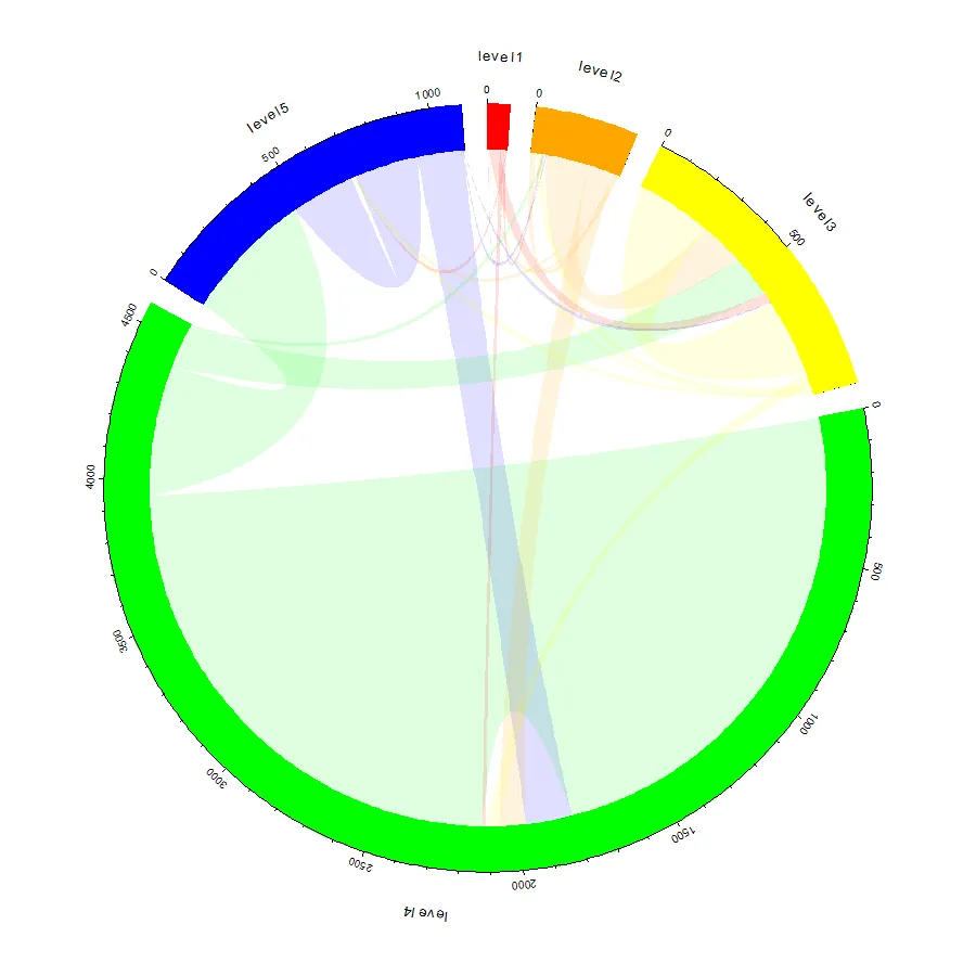
我希望能够使用我们的数据制作类似于这里发布的相似图表,但是我收到了“检测到一些间隙过大”的错误信息。您认为这可能是因为某些值与其他值相比非常小(例如1与1812)吗?我对我的数据进行了一些更改,如在矩阵2中,在1或2后添加了一些零,然后它可以工作了。有没有办法处理这种数据范围?我想使用我的真实数据(矩阵1)绘制这个漂亮的图表。非常感谢您的帮助。
library(circlize)
#matrix 1
#level0 <- c(1, 8, 39, 14, 2)
#level1 <- c(1, 19, 153, 93, 1)
#level2 <- c(2, 19, 274, 46, 13)
#level3 <- c(0, 8, 152, 1812, 465)
#level4 <- c(0, 2, 1, 164, 226)
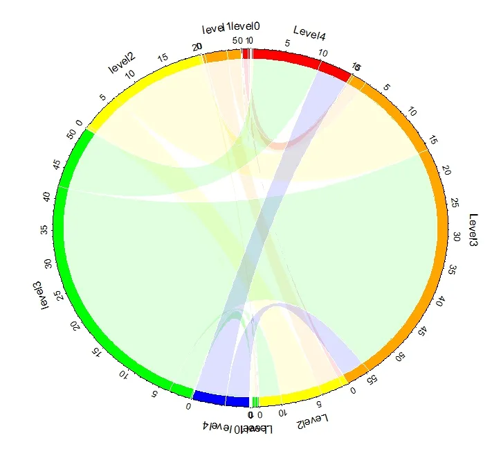
#matrix 2
#level0 <- c(100,8,39,14,200)
#level1 <- c(100,190, 153,93,100)
#level2 <- c(200,19,274,646,130)
#level3 <- c(200,800,152,1812,465)
#level4 <- c(200,200,100,164,226)

#build matrix 2
a <- list(c(100,8,39,14,200),c(100,19, 153,93,100), c(200,19,274,646,13),    c(200,8,152,1812,465),c(200,200,100,164,226))
mat <- do.call(rbind, a)
#mat = matrix(sample(1:100, 25, replace = TRUE), 5, 5)
rownames(mat) = c("level 0", "level 1", "level 2", "level 3", "level 4")
colnames(mat) = c("Level0", "Level1", "Level2", "Level3", "Level4")
rn = rownames(mat)
cn = colnames(mat)

factors = c(rn, rev(cn))
factors = factor(factors, levels = factors)
col_sum = apply(mat, 2, sum)
row_sum = apply(mat, 1, sum)
xlim = cbind(rep(0, 10), c(row_sum, col_sum))

par(mar = c(1, 1, 1, 1))
circos.par(cell.padding = c(0, 0, 0, 0), clock.wise = FALSE, track.margin=c(0,0.1),
           gap.degree = 4, start.degree =90)
circos.initialize(factors = factors, xlim = xlim
                  , sector.width = c(row_sum/sum(row_sum), col_sum/sum(col_sum)))
circos.trackPlotRegion(factors = factors, ylim = c(0, 1), bg.border = NA,
                       # bg.col = c("red", "orange", "yellow", "green", "blue", rep("grey", 5)), track.height = 0.05,
                       bg.col = c(c("red", "orange", "yellow", "green", "blue"),
                                  c("blue", "green", "yellow", "orange", "red")), track.height = 0.05,
                       panel.fun = function(x, y) {
                         sector.name = get.cell.meta.data("sector.index")
                         xlim = get.cell.meta.data("xlim")
                         circos.text(mean(xlim), 3, sector.name, adj = c(0.5, 0))
                         circos.axis(labels.cex=0.8, direction="outside", labels.away.percentage=0.5)
                         if(sector.name %in% rn) {
                           for(i in seq_len(ncol(mat))) {
                             circos.lines(rep(sum(mat[sector.name, seq_len(i)]), 2), c(0, 1),
                                          col = "white")
                           }
                         } else if(sector.name %in% cn) {
                           for(i in seq_len(nrow(mat))) {
                             circos.lines(rep(sum(mat[ seq_len(i), sector.name]), 2), c(0, 1),
                                          col = "white")
                           }
                         }
                       })
col = c("#FF000020", "#FFA50020", "#FFFF0020", "#00FF0020", "#0000FF20")
for(i in seq_len(nrow(mat))) {
  for(j in seq_len(ncol(mat))) {
    circos.link(rn[i], c(sum(mat[i, seq_len(j-1)]), sum(mat[i, seq_len(j)])),
                cn[j], c(sum(mat[seq_len(i-1), j]), sum(mat[seq_len(i), j])),
                col = col[i], border = "white")
  }
}

如果将 gap.degree 设为 0.1,您还可以从代码中获取一个绘图。 - guyabel
2个回答

8

所以我认为你的 df1 对象与我的原始代码有些不同。如果你将矩阵 mdf1 设置为如下所示...

m <- matrix(c(1, 8, 39, 14, 2, 
              1, 19, 153, 93, 1,
              2, 19, 274, 46, 13,
              0, 8, 152, 1812, 465,
              0, 2, 1, 164, 226), nrow=5, byrow=TRUE)
df1 <- data.frame(order=1:5, region=paste0("level",1:5), 
              rcol = c("red", "orange", "yellow", "green", "blue"),
              lcol = c("#FF000020", "#FFA50020", "#FFFF0020", "#00FF0020", "#0000FF20"),
              stringsAsFactors=FALSE)
df1$region <- factor(df1$region, levels=df1$region)
df1$xmin <- 0
df1$xmax <- rowSums(m)+colSums(m)
n <-nrow(df1)

dimnames(m) <- list(orig=df1$region,dest=df1$region)

您会获得以下对象...
> df1
  order region   rcol      lcol xmin xmax
1     1 level1    red #FF000020    0   68
2     2 level2 orange #FFA50020    0  323
3     3 level3 yellow #FFFF0020    0  973
4     4 level4  green #00FF0020    0 4566
5     5 level5   blue #0000FF20    0 1100
> addmargins(m)
        dest
orig     level1 level2 level3 level4 level5  Sum
  level1      1      8     39     14      2   64
  level2      1     19    153     93      1  267
  level3      2     19    274     46     13  354
  level4      0      8    152   1812    465 2437
  level5      0      2      1    164    226  393
  Sum         4     56    619   2129    707 3515

我在研究报告中详细解释了df1的用途。简而言之,df1对象包含要绘制的扇形长度信息(xminxmax),以及外部圆形矩形的颜色(rcol)和带链接的丝带颜色(lcol)。您当然可以使用相同的lcolrcol,并进行适当调整,直到获得满意的调色板/风格(例如,在lcol减少一些透明度)。

接下来,您可以使用与migest软件包演示文件非常相似的代码来获取绘图(我只更改了circos.axis轴参数和df2的子集)...

library(circlize)
library(plyr)
par(mar=rep(0,4))
circos.clear()

#basic circos graphic parameters
circos.par(cell.padding=c(0,0,0,0), track.margin=c(0,0.15), start.degree = 90, gap.degree =4)

#sector details
circos.initialize(factors = df1$region, xlim = cbind(df1$xmin, df1$xmax))

#plot sectors
circos.trackPlotRegion(ylim = c(0, 1), factors = df1$region, track.height=0.1,
 #panel.fun for each sector
 panel.fun = function(x, y) {
   #select details of current sector
   name = get.cell.meta.data("sector.index")
   i = get.cell.meta.data("sector.numeric.index")
   xlim = get.cell.meta.data("xlim")
   ylim = get.cell.meta.data("ylim")

   #plot labels
   circos.text(x=mean(xlim), y=2.2, labels=name, facing = "arc", cex=0.8)

   #plot main sector
   circos.rect(xleft=xlim[1], ybottom=ylim[1], xright=xlim[2], ytop=ylim[2], col = df1$rcol[i], border=df1$rcol[i])

   #blank in part of main sector
   #circos.rect(xleft=xlim[1], ybottom=ylim[1], xright=xlim[2]-rowSums(m)[i], ytop=ylim[1]+0.3, col = "white", border = "white")

   #white line all the way around
   #circos.rect(xleft=xlim[1], ybottom=0.3, xright=xlim[2], ytop=0.32, col = "white", border = "white")

   #plot axis
   circos.axis(labels.cex=0.6, major.at=seq(from=0,to=floor(df1$xmax)[i],by=500), 
                                 labels.away.percentage = 0.15)
})

##
##plot links
##
#add sum values to df1, marking the x-position of the first links out (sum1) and in (sum2). Updated for further links in loop below.
df1$sum1 <- colSums(m)
df1$sum2 <- numeric(n)

#create a data.frame of matrix sorted by element size, to allow largest plotted first
df2 <- cbind(as.data.frame(m),orig=rownames(m),  stringsAsFactors=FALSE)
df2 <- reshape(df2, idvar="orig", varying=list(1:n), direction="long", timevar="dest", time=rownames(m),  v.names = "m")
df2 <- arrange(df2,desc(m))

#loose non zero links
df2 <- subset(df2, m>0)

#plot links
for(k in 1:nrow(df2)){
  #i,j reference of flow matrix
  i<-match(df2$orig[k],df1$region)
  j<-match(df2$dest[k],df1$region)

  #plot link
  circos.link(sector.index1=df1$region[i], point1=c(df1$sum1[i], df1$sum1[i] + abs(m[i, j])),
          sector.index2=df1$region[j], point2=c(df1$sum2[j], df1$sum2[j] + abs(m[i, j])),
          col = df1$lcol[i])

  #update sum1 and sum2 for use when plotting the next link
  df1$sum1[i] = df1$sum1[i] + abs(m[i, j])
  df1$sum2[j] = df1$sum2[j] + abs(m[i, j])
}

这将给出如下的图形...

enter image description here

如果你想为图形添加某些方向性,则取消注释panel.fun中添加白色矩形和边框线的两行代码。


我实际上想要一个单向流,但它不允许行和列使用相同的名称。我也想复制上面的图表,但它对我不起作用。我复制并粘贴了您的代码,但它不一样。除了circos.asis和df2之外,您是否更改了其他参数?感谢您的所有帮助,Guy。 - Anthony
我认为将你的图形与之结合会更好。我们可以在每个层级内绘制它们,而不是在circos上绘制相同层级的带状图。 - Anthony
@Anthony 抱歉,我在第一个 circos.rect 参数中使用了 top 而不是 ytop。现在应该可以工作了吧?我还注释掉了白色矩形,这些矩形与彩色矩形重叠...以消除方向性。 - guyabel
1
太棒了!我刚刚复制了你的图表,看起来非常棒。再次感谢你的帮助。 - Anthony
1
@gjabel 谢谢 - 还有一件事。 显然,“facing”不能选择“arc”作为选项。 我会收到这样的错误消息:“arg”应该是“inside”,“outside”,“reverse.clockwise”,“clockwise”,“downward”,“bending”之一.....使用其中任何一个都可以。 - jalapic
显示剩余2条评论

1
太好了!这是我得到以下图表的方法: - 改变gap.degree=0.1 - 将数字转换为百分比 (mat<-mat/4700*100) - 在因子中删除rev()

enter image description here


网页内容由stack overflow 提供, 点击上面的
可以查看英文原文,
原文链接