我正在使用r库“circlize”尝试复制该网站的图表https://gjabel.wordpress.com/2014/03/28/circular-migration-flow-plots-in-r/。不幸的是,我遇到了两个问题:
首先,对于所有绘图区域(即“Mexico”,轨道“1”中的
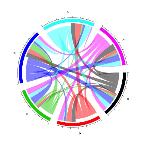
此外,在我的图中,链接与部分之间的距离非常远。因此,我尝试减少轨道边缘,这解决了问题,但现在段的名称超出了边缘,我无法将其可视化。有更好的方法来解决这个问题吗?
这是我到目前为止写的内容(几乎完全取自此网站https://github.com/null2/globalmigration)。
非常感谢您的帮助。
编辑: 我添加了脚本的第二部分,因为似乎需要解决第二个问题。
首先,对于所有绘图区域(即“Mexico”,轨道“1”中的
Note: 1 point is out of plotting region in sector 'Mexico', track '1'),我都收到了警告。我认为问题出在circos.text和circos.axis中,因为我在使用它们时同时使用了被弃用的函数direction。但是即使使用facing代替direction,问题仍然存在。所以我猜我没有理解这个警告的含义。您有什么提示可以帮助我吗?此外,在我的图中,链接与部分之间的距离非常远。因此,我尝试减少轨道边缘,这解决了问题,但现在段的名称超出了边缘,我无法将其可视化。有更好的方法来解决这个问题吗?
这是我到目前为止写的内容(几乎完全取自此网站https://github.com/null2/globalmigration)。
library("circlize")
library("plyr")
library("migest")
#load data
m<-read.table(system.file("science", "country_custom.txt", package = "migest"), skip=2, stringsAsFactors=FALSE)
#1)a data.frame to store information on each segment of the circle to be plotted
df1<-m[,1:3]
names(df1)<-c("order","rgb","region")
df1$region<-gsub("\\.", "\n", df1$region)
#2) a matrix containing the flow data (in this example only 28 countries)
m<-m[,-(1:3)]/1e05
m<-as.matrix(m)
dimnames(m)<-list(orig=df1$region,dest=df1$region)
#sort order of data.frame and matrix for plotting in circos
df1<-arrange(df1, order) #reordering a data frame by its columns
df1$region <- factor(df1$region, levels=df1$region)
m<-m[levels(df1$region),levels(df1$region)]
#define ranges of circos sectors and their colors (both of the sectors and the links)
#determine the length of segments on the outside of the plot.
df1$xmin <- 0
df1$xmax <- rowSums(m)+colSums(m) #inflows+outflows
#set the colour names for segments and flows
n<-nrow(df1)
df1 <- cbind(df1, matrix(as.numeric(unlist(strsplit(df1$rgb,","))),nrow=n, byrow=TRUE) )
names(df1)[ncol(df1)-2:0]<-c("r","g","b")
df1$rcol<-rgb(df1$r, df1$g, df1$b, max = 255)
df1$lcol<-rgb(df1$r, df1$g, df1$b, alpha=200, max = 255)
##plot sectors
windows()
par(mar=rep(0,4))
circos.clear()
#1)basic circos graphic parameters
circos.par(cell.padding=c(0,0,0,0), track.margin=c(0,0.01), start.degree = 90, gap.degree =4)
#2)sector details
circos.initialize(factors = df1$region, xlim = cbind(df1$xmin, df1$xmax))
#3)plot sectors
circos.trackPlotRegion(ylim = c(0, 1), factors = df1$region, track.height=0.1,
       panel.fun = function(x, y) {
         #select details of current sector
         name = get.cell.meta.data("sector.index")
         i = get.cell.meta.data("sector.numeric.index")
         xlim = get.cell.meta.data("xlim")
         ylim = get.cell.meta.data("ylim")

         #text direction (dd) and adjusmtents (aa)
         theta = circlize(mean(xlim), 1.3)[1, 1] %% 360
         dd <- ifelse(theta < 90 || theta > 270, "vertical_right", "vertical_left")
         aa = c(1, 0.5)
         if(theta < 90 || theta > 270)  aa =c(0, 0.5)

         #plot country labels
         circos.text(x=mean(xlim), y=1.7, labels=name, direction = dd,
         cex=0.6,adj = aa)
         #circos.text(x=mean(xlim), y=2, labels=name, facing = "bending",cex=0.6)

         #plot main sector
         circos.rect(xleft=xlim[1], ybottom=ylim[1], xright=xlim[2], ytop=ylim[2],
         col = df1$rcol[i], border=df1$rcol[i])

         #blank in part of main sector
         circos.rect(xleft=xlim[1], ybottom=ylim[1], xright=xlim[2]-rowSums(m)[i], ytop=ylim[1]+0.3,
         col = "white", border = "white")

         #white line all the way around
         circos.rect(xleft=xlim[1], ybottom=0.3, xright=xlim[2], ytop=0.32, col = "white", border = "white")

         #plot axis
         #NOTE: Ticks indicate the number of migrants in 100s.
         circos.axis(labels.cex=0.6, direction = "outside", major.at=seq(from=0,to=floor(df1$xmax)[i],by=5),
         minor.ticks=1, labels.away.percentage = 0.15)
       })
非常感谢您的帮助。
编辑: 我添加了脚本的第二部分,因为似乎需要解决第二个问题。
#plot links
#create a new dataframe containing the long form of the matrix m
#add sum values to df1, marking the x-position of the first links out (sum1) and in (sum2). Updated for further links in loop below.
df1$sum1 <- colSums(m) #outflows
df1$sum2 <- numeric(n)
#create a data.frame of the flow matrix sorted by flow size, to allow largest flow plotted first
df2<-cbind(as.data.frame(m),orig=rownames(m),  stringsAsFactors=FALSE)
#long matrix
df2<-reshape(df2, idvar="orig", varying=list(1:n), direction="long", timevar="dest", time=rownames(m),  v.names = "m")
df2<-arrange(df2,desc(m))
#keep only the largest flows to avoid clutter
df2<-subset(df2, m>quantile(m,0.925))
#plot links
for(k in 1:nrow(df2)){
require("circlize")
#i,j reference of flow matrix
#note: you are selecting the states in region1 according to the edgelist in region2
i<-match(df2$orig[k],df1$region)
j<-match(df2$dest[k],df1$region)
#plot link
#sector.index1=sender
#point1=size of the base of the link at the origin
#We set the origin segment to start at the current sum of outflows from the sender country (df1$sum1[i])
#We set the end of the segment outflow equal to the total outflows from the sender country, plus the flow from the edge we considered
circos.link(sector.index1=df1$region[i], point1=c(df1$sum1[i], df1$sum1[i] + abs(m[i, j])),
sector.index2=df1$region[j], point2=c(df1$sum2[j], df1$sum2[j] + abs(m[i, j])),
col = df1$lcol[i]) #, top.ratio==0.66, top.ratio.low==0.67)
#note: The height and thickness of the link at its mid-point is determined by the top.ratio and the top.ratio.low argument
#update sum1 and sum2 for use when plotting the next link
df1$sum1[i] = df1$sum1[i] + abs(m[i, j])
df1$sum2[j] = df1$sum2[j] + abs(m[i, j])
}
file.show(system.file("demo/cfplot_reg.R", package = "migest"))查看图形的代码。或者你已经知道了吗? - nacnudusrm(list = ls())。我已将其删除(可以将其注释掉)。 - Henrik