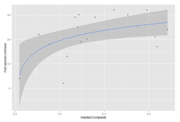
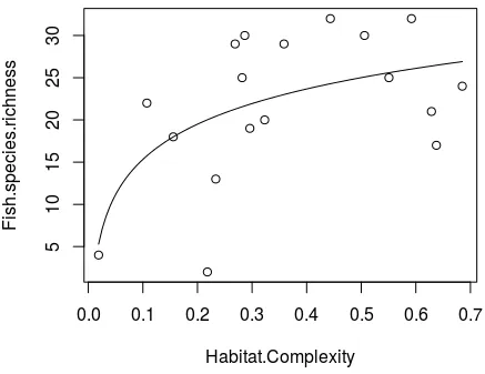
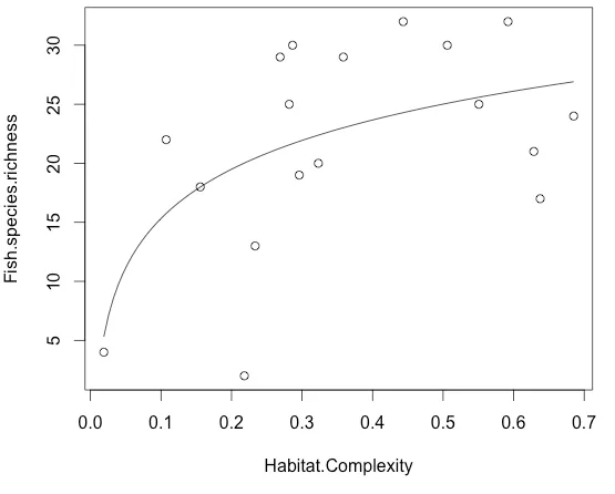
在R语言中的图表上绘制一个对数曲线。

3
我有一组数据,绘制出来呈现出曲线关系。
Fish.species.richness   Habitat.Complexity  log.habitat
17  0.6376  -0.1954858
13  0.2335  -0.6317131
30  0.2866  -0.5427238
20  0.3231  -0.4906630
22  0.1073  -0.9694003
25  0.2818  -0.5500590
2   0.2182  -0.6612448
4   0.0189  -1.7246886
19  0.2960  -0.5287083
25  0.5507  -0.2590849
29  0.2689  -0.5704900
21  0.6286  -0.2016602
18  0.1557  -0.8078509
24  0.6851  -0.1642460
30  0.5059  -0.2959353
32  0.4434  -0.3532043
29  0.3585  -0.4455108
32  0.5920  -0.2276783

当我对x轴进行记录并进行线性回归以查找截距和斜率时,我可以添加一条适合数据的线:

summary(lm(Fish.species.richness~log.habitat,data=three))

plot(three$log.habitat,
 three$Fish.species.richness,
 xlab='Log Habitat Complexity',
 ylab='Fish Species Richness')
abline(29.178,13.843)

然而,当我进行曲线回归并尝试绘制曲线时,它并不符合数据,我错在哪里了?

mod.log<-lm(Fish.species.richness~log(Habitat.Complexity),data=three)

plot(three$Habitat.Complexity,
 three$Fish.species.richness)
abline(mod.log)
3个回答

2

使用 ggplot2

ggplot(three, aes(Habitat.Complexity, Fish.species.richness))+
  geom_point(shape = 1) + stat_smooth(method = "lm", formula = y ~ log(x))

enter image description here


1

abline 只能画直线,形式为 y = a + bx。其他曲线可以使用 curve 函数添加。

plot(Fish.species.richness ~ Habitat.Complexity, three)
curve(coef(mod.log)[1] + coef(mod.log)[2]*log(x), add=TRUE)

Logarithmic curve fit


0
为了清晰和灵活地适用于其他模型类型,您可能希望使用predict函数来计算预测值沿着您的预测变量范围的值:

mod.log<-lm(Fish.species.richness~log(Habitat.Complexity), data=three)

# predict along predictor variable range
newdat <- data.frame(Habitat.Complexity=seq(min(three$Habitat.Complexity), max(three$Habitat.Complexity),,100))
newdat$Fish.species.richness <- predict(mod.log, newdat, type="response")

# plot
plot(Fish.species.richness ~ Habitat.Complexity, data=three)
lines(Fish.species.richness ~ Habitat.Complexity, data=newdat)

enter image description here


网页内容由stack overflow 提供, 点击上面的
可以查看英文原文,
原文链接