从txt文件创建2D热力图

5

我有一组2D数据(30K),保存为txt文件。

  X       Y
2.50    135.89
2.50    135.06
2.50    110.85
2.50    140.92
2.50    157.53
2.50    114.61
2.50    119.53
2.50    154.14
2.50    136.48
2.51    176.85
2.51    147.19
2.51    115.59
2.51    144.57
2.51    148.34
2.51    136.73
2.51    118.89
2.51    145.73
2.51    131.43
2.51    118.17
2.51    149.68
2.51    132.33

我用gnuplot绘制了散点图,但我想要表示为热力图或密度分布。我查看了MatPlotLib或R中的示例,它们似乎都已经从随机数据开始生成图像。
我尝试使用以下代码并出现错误:
hist,edges = histogramdd([x,y],bins,range,normed,weights)
AttributeError:箱子的维数必须等于样本x的维数。脚本终止。
是否有方法可以在gnuplot、matplotlib中打开txt文件并绘制这些数据?我的散点图如下所示: enter image description here 
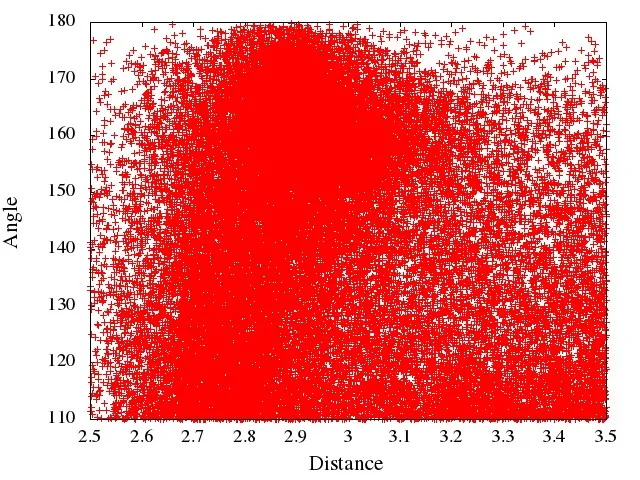
我想将此图片显示为带有颜色编码栏的等高线地图或密度图。 我的x轴范围为2.5-3.5,y轴范围为110-180,我有30k个数据点。

你不能在
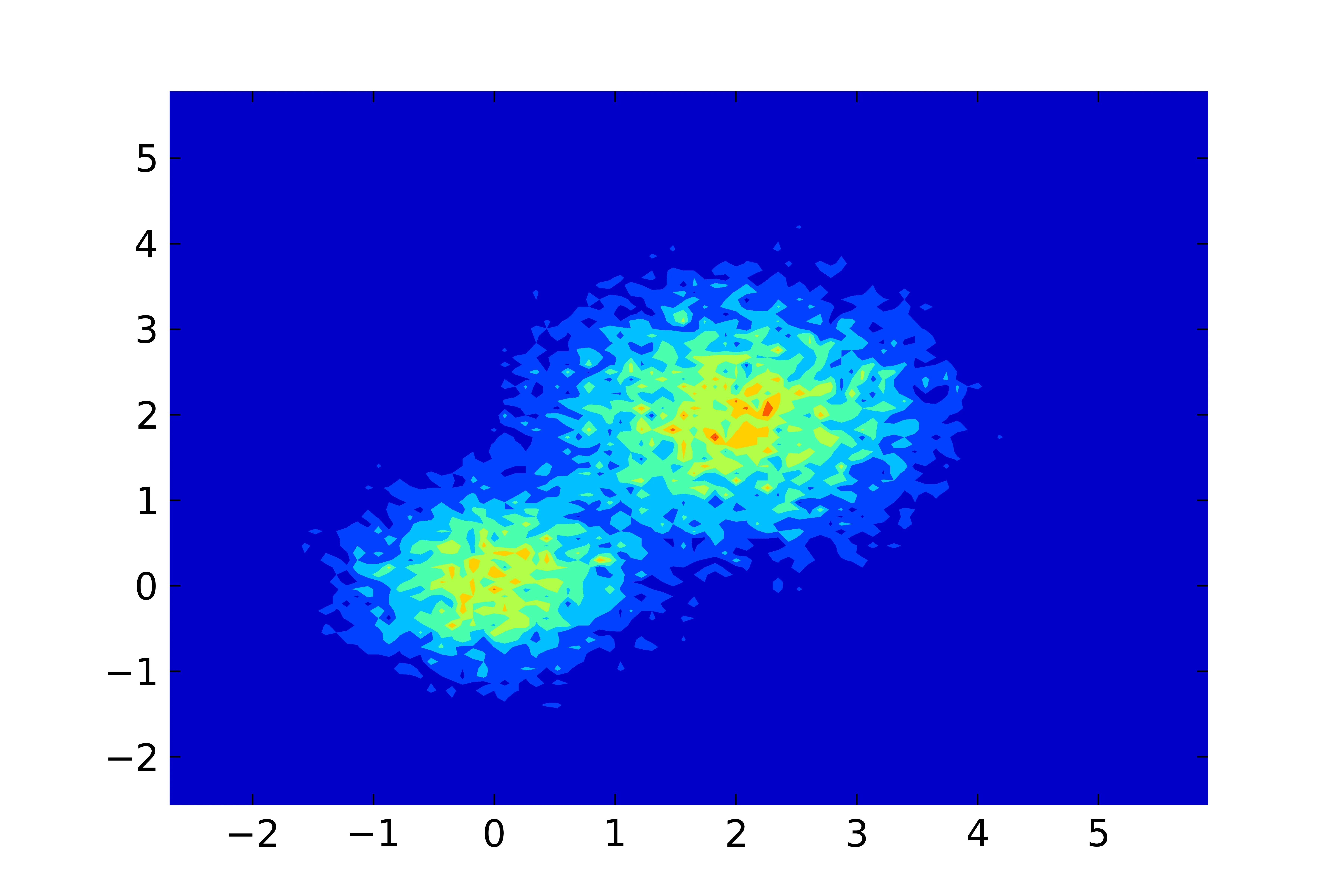
gnuplot本身中创建密度分布,只能使用smooth kdensity在1D中实现。如果你想用gnuplot绘制数据,你必须使用其他工具(例如Python)预处理数据。 - Christoph
2个回答

5

如果您愿意完全使用Python,可以在一个脚本中计算直方图并构建轮廓图:

import numpy as np
import matplotlib.pyplot as plt

# load the data
M = np.loadtxt('datafile.dat', skiprows=1)

# compute 2d histogram
bins_x = 100
bins_y = 100
H, xedges, yedges = np.histogram2d(M[:,0], M[:,1], [bins_x, bins_y])

# xedges and yedges are each length 101 -- here we average
# the left and right edges of each bin
X, Y = np.meshgrid((xedges[1:] + xedges[:-1]) / 2,
                   (yedges[1:] + yedges[:-1]) / 2)

# make the plot, using a "jet" colormap for colors
plt.contourf(X, Y, H, cmap='jet')

plt.show()  # or plt.savefig('contours.pdf')

我刚刚编写了一些由两个高斯分布组成的测试数据,并得到了以下结果:

二维直方图的轮廓图


2
以下是关于如何使用Python进行预处理并使用gnuplot绘图的方法。

变体1

第一种变体使用gnuplot的pm3d绘图风格。这样可以很好地插值直方图数据,使图像看起来更加平滑。但是对于大型数据集可能会出现问题,具体取决于输出图像格式(参见变体2)。

Python脚本process.py使用numpy.histogram2d生成直方图,输出保存为gnuplot的nonuniform matrix格式。

# process.py
from __future__ import print_function
import numpy as np
import sys

M = np.loadtxt('datafile.dat', skiprows=1)
bins_x = 100
bins_y = 100
H, xedges, yedges = np.histogram2d(M[:,0], M[:,1], [bins_x, bins_y])

# output as 'nonuniform matrix' format, see gnuplot doc.
print(bins_x, end=' ')
np.savetxt(sys.stdout, xedges, newline=' ')
print()

for i in range(0, bins_y):
    print(yedges[i], end=' ')
    np.savetxt(sys.stdout, H[:,i], newline=' ')
    print(H[-1,i])

# print the last line twice, then 'pm3d corners2color' works correctly
print(yedges[-1], end=' ')
np.savetxt(sys.stdout, H[:,-1], newline=' ')
print(H[-1,-1])

要绘制图形,只需运行以下gnuplot脚本:
reset
set terminal pngcairo
set output 'test.png'
set autoscale xfix
set autoscale yfix
set xtics out
set ytics out
set pm3d map interpolate 2,2 corners2color c1
splot '< python process.py' nonuniform matrix t ''

变体2

第二种变体使用image绘图风格,适用于大型数据集(大直方图尺寸),但不适合像100x100矩阵这样的情况:

# process2.py
from __future__ import print_function
import numpy as np
import sys

M = np.loadtxt('datafile.dat', skiprows=1)
bins_x = 100
bins_y = 200
H, xedges, yedges = np.histogram2d(M[:,0], M[:,1], [bins_x, bins_y])

# remap xedges and yedges to contain the bin center coordinates
xedges = xedges[:-1] + 0.5*(xedges[1] - xedges[0])
yedges = yedges[:-1] + 0.5*(yedges[1] - yedges[0])

# output as 'nonuniform matrix' format, see gnuplot doc.
print(bins_x, end=' ')
np.savetxt(sys.stdout, xedges, newline=' ')
print()

for i in range(0, bins_y):
    print(yedges[i], end=' ')
    np.savetxt(sys.stdout, H[:,i], newline=' ')
    print()

要绘制图形,只需运行以下gnuplot脚本:
reset
set terminal pngcairo
set output 'test2.png'
set autoscale xfix
set autoscale yfix
set xtics out
set ytics out
plot '< python process2.py' nonuniform matrix with image t ''

可能有一些地方需要改进(特别是在Python脚本中),但应该能够工作。我不会发布结果图片,因为它的数据点很少,看起来很丑 ;)


这个脚本可以运行,但是它生成的是散点图而不是密度图或二维直方图。 - lsb123
不,这个脚本生成的是密度图。你认为使用 process.py 生成的直方图为什么会变成散点图而不是直方图?轮廓图与热力图是两种完全不同的东西。你想要绘制的只有轮廓线,还是同时包括表面或其他内容?也许你应该发布一个示例图像或URL,以展示你真正想要的是什么... - Christoph
以上脚本使用Python运行。 - lsb123
抱歉,搞砸了。我第一次使用这个网站。 我编辑了我的问题。我用我的数据制作了散点图,但我想用不同的颜色显示密度图。 我正在尝试提供我的数据文件。 - lsb123
好的,你可以整理一下。无论是编辑你的答案(包括评论中的代码并删除评论),还是删除你的答案并在问题中包含图像/代码,都可以根据你的需要进行。顺便说一句:我编辑了我的答案,并添加了一个与pm3d兼容的版本,它允许直方图的插值,并更接近你期望的结果。请注意,Python脚本也有所不同并已更改。因此,请将它们保存以进行测试。我相信“变体1”会给你一个像你发布的那个的图像,但标签是正确的。 - Christoph
显示剩余2条评论

网页内容由stack overflow 提供, 点击上面的
可以查看英文原文,
原文链接