我想使用ggplot2包将两个图并排放置,即相当于执行par(mfrow=c(1,2))命令。
例如,我希望以下两个图像能够并排显示,并具有相同的比例。
x <- rnorm(100)
eps <- rnorm(100,0,.2)
qplot(x,3*x+eps)
qplot(x,2*x+eps)
我需要把它们放在同一个数据框中吗?
qplot(displ, hwy, data=mpg, facets = . ~ year) + geom_smooth()
我想使用ggplot2包将两个图并排放置,即相当于执行par(mfrow=c(1,2))命令。
例如,我希望以下两个图像能够并排显示,并具有相同的比例。
x <- rnorm(100)
eps <- rnorm(100,0,.2)
qplot(x,3*x+eps)
qplot(x,2*x+eps)
我需要把它们放在同一个数据框中吗?
qplot(displ, hwy, data=mpg, facets = . ~ year) + geom_smooth()
还可以考虑使用ggpubr包中的ggarrange函数。它有很多好处,包括在绘图之间对齐坐标轴和将常见的图例合并成一个。
简短的代码片段:
gridExtra::grid.arrange(plot1, plot2, ncol = 2)
** 更新此评论以展示如何在for循环中使用grid.arrange()来为分类变量的不同因素生成图表。
for (bin_i in levels(athlete_clean$BMI_cat)) {

plot_BMI <- athlete_clean %>% filter(BMI_cat == bin_i) %>% group_by(BMI_cat,Team) %>% summarize(count_BMI_team = n()) %>%
          mutate(percentage_cbmiT = round(count_BMI_team/sum(count_BMI_team) * 100,2)) %>%
          arrange(-count_BMI_team) %>% top_n(10,count_BMI_team) %>%
          ggplot(aes(x = reorder(Team,count_BMI_team), y = count_BMI_team, fill = Team)) +
            geom_bar(stat = "identity") +
            theme_bw() +
            # facet_wrap(~Medal) +
            labs(title = paste("Top 10 Participating Teams with \n",bin_i," BMI",sep=""), y = "Number of Athletes",
                 x = paste("Teams - ",bin_i," BMI Category", sep="")) +
            geom_text(aes(label = paste(percentage_cbmiT,"%",sep = "")),
                      size = 3, check_overlap = T,  position = position_stack(vjust = 0.7) ) +
            theme(axis.text.x = element_text(angle = 00, vjust = 0.5), plot.title = element_text(hjust = 0.5), legend.position = "none") +
            coord_flip()

plot_BMI_Medal <- athlete_clean %>%
          filter(!is.na(Medal), BMI_cat == bin_i) %>%
          group_by(BMI_cat,Team) %>%
          summarize(count_BMI_team = n()) %>%
          mutate(percentage_cbmiT = round(count_BMI_team/sum(count_BMI_team) * 100,2)) %>%
          arrange(-count_BMI_team) %>% top_n(10,count_BMI_team) %>%
          ggplot(aes(x = reorder(Team,count_BMI_team), y = count_BMI_team, fill = Team)) +
            geom_bar(stat = "identity") +
            theme_bw() +
            # facet_wrap(~Medal) +
            labs(title = paste("Top 10 Winning Teams with \n",bin_i," BMI",sep=""), y = "Number of Athletes",
                 x = paste("Teams - ",bin_i," BMI Category", sep="")) +
            geom_text(aes(label = paste(percentage_cbmiT,"%",sep = "")),
                      size = 3, check_overlap = T,  position = position_stack(vjust = 0.7) ) +
            theme(axis.text.x = element_text(angle = 00, vjust = 0.5), plot.title = element_text(hjust = 0.5), legend.position = "none") +
            coord_flip()

gridExtra::grid.arrange(plot_BMI, plot_BMI_Medal, ncol = 2)

}
for循环中看到更全面地使用grid.arrange(),请查看https://rpubs.com/Mayank7j_2020/olympic_data_2000_2016。plotAllCounts <- function (dt){
plots <- list();
for(i in 1:ncol(dt)) {
strX = names(dt)[i]
print(sprintf("%i: strX = %s", i, strX))
plots[[i]] <- ggplot(dt) + xlab(strX) +
geom_point(aes_string(strX),stat="count")
}
columnsToPlot <- floor(sqrt(ncol(dt)))
multiplot(plotlist = plots, cols = columnsToPlot)
}
dt = ggplot2::diamonds
plotAllCounts(dt)
ggplot时,通常会在循环中使用aes(get(strX)),但在上面的代码中,使用aes_string(strX)代替aes(get(strX))将不会绘制所需的图表。相反,它将绘制许多次最后一个图表。我还没有弄清原因——可能与aes和aes_string在ggplot中的调用有关。
否则,希望您会发现此函数有用。
for-loop中生成plots对象,这是在R中高度低效且不推荐的。请参阅以下优秀文章以找到更好的方法:Efficient accumulation in R、Applying a function over rows of a data frame和Row-oriented workflows in R with the tidyverse。 - Tungggplot2 v.3.0.0 版本以来已经可用。https://dev59.com/Bm445IYBdhLWcg3wcZ8N#52045613 - Tungcowplot 包提供了一种适合出版的方式,让你以一种不错的方式完成这个任务。
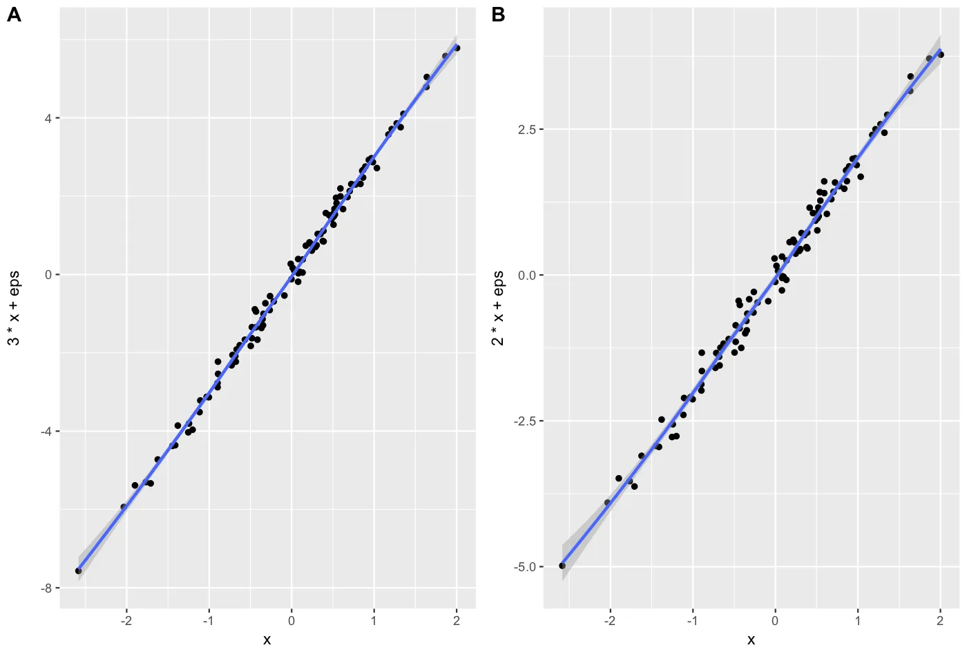
x <- rnorm(100)
eps <- rnorm(100,0,.2)
A = qplot(x,3*x+eps, geom = c("point", "smooth"))+theme_gray()
B = qplot(x,2*x+eps, geom = c("point", "smooth"))+theme_gray()
cowplot::plot_grid(A, B, labels = c("A", "B"), align = "v")