默认情况下,ggplot2生成的图形具有灰色背景。我该如何更改绘图的背景颜色?
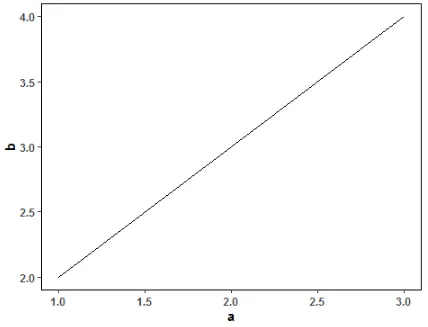
例如,以下代码生成的图形:
library(ggplot2)
myplot<-ggplot(data=data.frame(a=c(1,2,3), b=c(2,3,4)), aes(x=a, y=b)) + geom_line()
myplot
要更改面板的背景颜色,请使用以下代码:
myplot + theme(panel.background = element_rect(fill = 'green', colour = 'red'))
如果要更改图表的颜色(但不是面板的颜色),可以这样做:
myplot + theme(plot.background = element_rect(fill = 'green', colour = 'red'))
查看此处以获取更多主题细节图例、轴和主题的快速参考表。
opts 和 theme_rect,请使用以下内容:myplot + theme(panel.background = element_rect(fill='green', colour='red'))
要定义自己的自定义主题,基于theme_gray但具有一些更改和一些额外的功能,包括控制网格线颜色/大小(更多选项可供使用在ggplot2.org):
theme_jack <- function (base_size = 12, base_family = "") {
    theme_gray(base_size = base_size, base_family = base_family) %+replace%
        theme(
            axis.text = element_text(colour = "white"),
            axis.title.x = element_text(colour = "pink", size=rel(3)),
            axis.title.y = element_text(colour = "blue", angle=45),
            panel.background = element_rect(fill="green"),
            panel.grid.minor.y = element_line(size=3),
            panel.grid.major = element_line(colour = "orange"),
            plot.background = element_rect(fill="red")
    )
}
theme_set(theme_jack())
theme_update(plot.background = element_rect(fill="pink"), axis.title.x = element_text(colour = "red"))
将当前默认主题存储为对象:
theme_pink <- theme_get()
theme_pink 是一个列表,而 theme_jack 是一个函数。所以要将主题返回到 theme_jack,请使用 theme_set(theme_jack()),而要返回到 theme_pink,请使用 theme_set(theme_pink)。theme_jack 的定义中将 theme_gray 替换为 theme_bw。为了使您的自定义主题类似于 theme_bw,但关闭所有网格线(x、y、主要和次要):theme_nogrid <- function (base_size = 12, base_family = "") {
theme_bw(base_size = base_size, base_family = base_family) %+replace%
theme(
panel.grid = element_blank()
)
}
最终提供了一个更激进的主题,适用于在ggplot中绘制choropleths或其他地图,基于此处的讨论,但已更新以避免过时。这里的目标是去除灰色背景和任何可能分散地图注意力的其他特征。
theme_map <- function (base_size = 12, base_family = "") {
    theme_gray(base_size = base_size, base_family = base_family) %+replace%
        theme(
            axis.line=element_blank(),
            axis.text.x=element_blank(),
            axis.text.y=element_blank(),
            axis.ticks=element_blank(),
            axis.ticks.length=unit(0.3, "lines"),
            axis.ticks.margin=unit(0.5, "lines"),
            axis.title.x=element_blank(),
            axis.title.y=element_blank(),
            legend.background=element_rect(fill="white", colour=NA),
            legend.key=element_rect(colour="white"),
            legend.key.size=unit(1.2, "lines"),
            legend.position="right",
            legend.text=element_text(size=rel(0.8)),
            legend.title=element_text(size=rel(0.8), face="bold", hjust=0),
            panel.background=element_blank(),
            panel.border=element_blank(),
            panel.grid.major=element_blank(),
            panel.grid.minor=element_blank(),
            panel.margin=unit(0, "lines"),
            plot.background=element_blank(),
            plot.margin=unit(c(1, 1, 0.5, 0.5), "lines"),
            plot.title=element_text(size=rel(1.2)),
            strip.background=element_rect(fill="grey90", colour="grey50"),
            strip.text.x=element_text(size=rel(0.8)),
            strip.text.y=element_text(size=rel(0.8), angle=-90)
        )
}
plot.background 必须传递给 theme。其他参数是可选的。 - Racing Tadpole这里有一个自定义主题,可以将ggplot2的背景变为白色,并进行其他一些更改,适用于出版物和海报。只需添加+mytheme即可。如果您想在+mytheme之后通过+theme添加或更改选项,则它将仅替换来自+mytheme的那些选项。
library(ggplot2)
library(cowplot)
theme_set(theme_cowplot())

mytheme = list(
    theme_classic()+
        theme(panel.background = element_blank(),strip.background = element_rect(colour=NA, fill=NA),panel.border = element_rect(fill = NA, color = "black"),
              legend.title = element_blank(),legend.position="bottom", strip.text = element_text(face="bold", size=9),
              axis.text=element_text(face="bold"),axis.title = element_text(face="bold"),plot.title = element_text(face = "bold", hjust = 0.5,size=13))
)

ggplot(data=data.frame(a=c(1,2,3), b=c(2,3,4)), aes(x=a, y=b)) + mytheme + geom_line()
theme_bw的主题,它提供了白色背景和灰色网格线。我经常使用它,因为在打印时,它看起来比默认的灰色背景更好看:myplot + theme_bw()。 - ROLOggplot <- function(...) { ggplot2::ggplot(...) + theme_bw() }- ROLOopts和theme_rect(0.9.3)。因此,第二个命令的更新版本应该是:myplot + theme(plot.background = element_rect(fill='green', colour='red'))。 - Ram Narasimhan