如何在ggplot2中制作具有明显转换的颜色比例尺

9

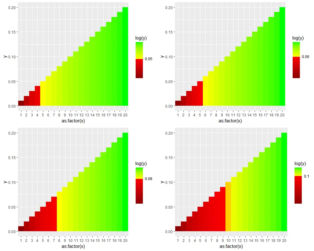
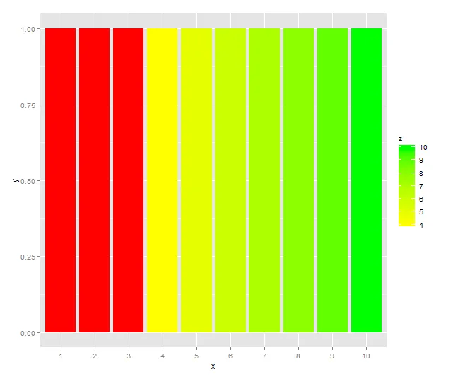
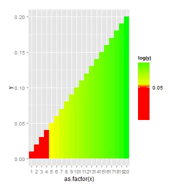
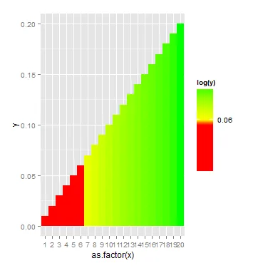
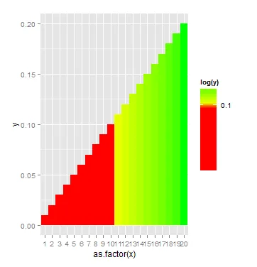
我正在尝试创建一个颜色比例尺,并在某个点处进行锐利的颜色过渡。目前我正在做的是:

test <- data.frame(x = c(1:20), y = seq(0.01, 0.2, by = 0.01))

cutoff <- 0.10

ggplot(data = test,
       aes(x = as.factor(x), y = y, fill = log(y), width = 1, binwidth = 0)) + 
 geom_bar(stat = "identity") +
 scale_fill_gradientn(colours = c("red", "red", "yellow", "green"), 
                      values = rescale(log(c(0.01, cutoff - 0.0000000000000001, cutoff, 0.2))), 
                      breaks = c(log(cutoff)), label = c(cutoff))

它正在生成我想要的图表。但是色条中断位置似乎因截断值而异。有时在值下方,有时在上方,有时在线上。以下是具有不同截断值(0.05、0.06、0.1)的一些图表:
cut off at 0.05 cut off at 0.06 cut off at 0.10
我做错了什么?或者,是否有更好的方法创建这样的颜色比例尺?
3个回答

3

你有研究过scale_colour_stepsscale_colour_stepsn吗?

使用选项n.break可以在scale_colour_stepsn中指定所需的断点数以获得更锐利的过渡。

请确保使用ggplot2 > 3.3.2版本。


我希望我能给这个点赞两次。谢谢! - beroe

2
如果您仍然对此问题感兴趣,您可以在scale_fill_gradientn()中添加guide = guide_colourbar(nbin = <一些任意大的数字>)。这将增加色条图例使用的箱数,使过渡看起来更加清晰。"最初的回答"
# illustration using nbin = 1000, & weighted colours below the cutoff
plot.cutoff <- function(cutoff){
  p <- ggplot(data = test,
              aes(x = as.factor(x), y = y, fill = log(y))) + 
    geom_col(width = 1) +
    scale_fill_gradientn(colours = c("red4", "red", "yellow", "green"), 
                         values = scales::rescale(log(c(0.01, cutoff - 0.0000000000000001, 
                                                        cutoff, 0.2))), 
                         breaks = c(log(cutoff)), 
                         label = c(cutoff),
                         guide = guide_colourbar(nbin = 1000))
  return(p)
}

cowplot::plot_grid(plot.cutoff(0.05),
                   plot.cutoff(0.06),
                   plot.cutoff(0.08),
                   plot.cutoff(0.1),
                   ncol = 2)

插图

如果你发现在非常高的分辨率下上述图像不够清晰,你也可以在guide_colourbar()中设置raster = FALSE,这将关闭插值并绘制矩形。


0

我认为使用 scale_fill_gradientn 在连续的颜色比例尺中实现精确的离散截止点略微棘手。一个快速的替代方案是使用 scale_fill_gradient,使用 limits 设置截止点,并使用 na.value 设置“越界”值的颜色。

这里有一个比你问题中稍微简单的例子:

# some data
df <- data.frame(x = factor(1:10), y = 1, z = 1:10)

# a cutoff point
lo <- 4 

ggplot(df, aes(x = x, y = y, fill = z)) + 
  geom_bar(stat = "identity") +
  scale_fill_gradient(low = "yellow", high = "green",
                      limits = c(lo, max(df$z)), na.value = "red")

enter image description here

如你所见,您在切点以下的值将不会出现在图例中,但有人可能认为包括大量红色是对“图例带宽”的浪费。您可以考虑在图标题中添加红色条形的文字描述。


您可能还希望区分低于下限和高于上限的值。例如,将“太低”的值设置为蓝色,“太高”的值设置为红色。在这里,我使用findInterval来区分低、中、高值。
# some data
set.seed(2)
df <- data.frame(x = factor(1:10), y = 1, z = sample(1:10))

# lower and upper limits
lo <- 3
hi <- 8

# create a grouping variable based on the the break points
df$grp <- findInterval(df$z, c(lo, hi), rightmost.closed = TRUE)

ggplot(df, aes(x = x, y = y, fill = z)) + 
  geom_bar(stat = "identity") +
  scale_fill_gradient(low = "yellow", high = "green", limits = c(lo, hi), na.value = "red") +
  geom_bar(data = df[df$grp == 0, ], fill = "blue", stat = "identity")

enter image description here


1
谢谢您的建议!这确实是问题中示例的一个很好的替代方案。但我看到这里有两个问题:1. 低于截止值的数值无法“加权”,例如在我的小例子中 colours = c("red4", "red", "yellow", "green");2. 我认为图例中没有说明截止值,这使得理解更加困难。 - Hengrui Jiang

网页内容由stack overflow 提供, 点击上面的
可以查看英文原文,
原文链接