为什么在Safari中使用
transform: rotateY();会导致div重叠?以下是一些截图,以更好地说明问题...
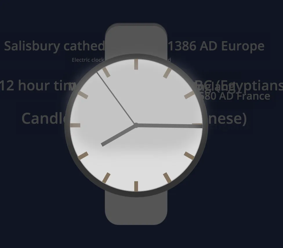
应该看起来像这样:
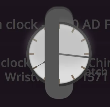
不应该看起来像这样(仅在Safari中出现):
这是非常奇怪的行为,我已经从整个代码中删除了transform:rotateY();,但是对于为什么会发生这种情况仍然感到困惑。
这是原始程序的代码片段:
window.addEventListener('load', function() {
  var percentHeight = Math.floor(window.innerHeight / 100);
  var percentWidth = Math.floor(window.innerWidth / 100);
  initializeMessages();
  var hourHand = document.getElementById('watchHourHand');
  var minuteHand = document.getElementById('watchMinuteHand');
  var secondHand = document.getElementById('watchSecondHand');
  var markers = document.getElementById('markers');
  for (var i = 0; i != 12; i++) {
    var marker = document.createElement('div');
    marker.className = 'marker';
    markers.appendChild(marker);
    markers.appendChild(marker);
  }
  window.setInterval(function() {
    //minute degrees = 6
    //second degrees = 6
    //hour degrees = 30
    var date = new Date();
    var hours = date.getHours();
    if (hours > 12) {
      hours = hours - 12;
    }
    if (hours == 0) {
      hours = 12;
    }
    var minutes = date.getMinutes();
    var seconds = date.getSeconds();
    var secondDegrees = seconds * 6;
    var minuteDegrees = minutes * 6 + seconds / 60;
    var hourDegrees = hours * 30 + minutes / 60;
    if (hourDegrees == 0) {
      //hourHand.className = 'noTransition';
      hourDegrees = 360;
    }
    hourHand.style.oTransform = 'rotate(' + hourDegrees + 'deg)';
    hourHand.style.mozTransform = 'rotate(' + hourDegrees + 'deg)';
    hourHand.style.webkitTransform = 'rotate(' + hourDegrees + 'deg)';
    hourHand.style.msTransform = 'rotate(' + hourDegrees + 'deg)';
    hourHand.style.transform = 'rotate(' + hourDegrees + 'deg)';
    if (hourDegrees == 360) {
      hourHand.style.oTransform = 'rotate(0deg)';
      hourHand.style.mozTransform = 'rotate(0deg)';
      hourHand.style.webkitTransform = 'rotate(0deg)';
      hourHand.style.msTransform = 'rotate(0deg)';
      hourHand.style.transform = 'rotate(0deg)';
      hourHand.className = 'noTransition';
    }
    if (minuteDegrees == 0) {
      //minuteHand.className = 'noTransition';
      minuteDegrees = 360;
    }
    minuteHand.style.oTransform = 'rotate(' + minuteDegrees + 'deg)';
    minuteHand.style.mozTransform = 'rotate(' + minuteDegrees + 'deg)';
    minuteHand.style.webkitTransform = 'rotate(' + minuteDegrees + 'deg)';
    minuteHand.style.msTransform = 'rotate(' + minuteDegrees + 'deg)';
    minuteHand.style.transform = 'rotate(' + minuteDegrees + 'deg)';
    if (minuteDegrees == 360) {
      minuteHand.style.oTransform = 'rotate(0deg)';
      minuteHand.style.mozTransform = 'rotate(0deg)';
      minuteHand.style.webkitTransform = 'rotate(0deg)';
      minuteHand.style.msTransform = 'rotate(0deg)';
      minuteHand.style.transform = 'rotate(0deg)';
      minuteHand.className = 'noTransition';
    }
    if (secondDegrees == 0) {
      //secondHand.className = 'noTransition';
      secondDegrees = 360;
    }
    secondHand.style.oTransform = 'rotate(' + secondDegrees + 'deg)';
    secondHand.style.webkitTransform = 'rotate(' + secondDegrees + 'deg)';
    secondHand.style.msTransform = 'rotate(' + secondDegrees + 'deg)';
    secondHand.style.mozTransform = 'rotate(' + secondDegrees + 'deg)';
    secondHand.style.transform = 'rotate(' + secondDegrees + 'deg)';
    if (secondDegrees == 360) {
      secondHand.style.oTransform = 'rotate(360deg)';
      secondHand.style.webkitTransform = 'rotate(360deg)';
      secondHand.style.msTransform = 'rotate(360deg)';
      secondHand.style.mozTransform = 'rotate(360deg)';
      secondHand.style.transform = 'rotate(360deg)';
      window.setTimeout(function() {
        secondHand.className = 'noTransition';
      }, 1000)
    }
    window.setTimeout(function() {
      secondHand.className = '';
      minuteHand.style.className = '';
      hourHand.style.className = '';
    }, 500);
  }, 1000);

  function initializeMessages() {
    var messages = ['Modern 12 hour time invented <span class="hyphen">-</span> 2000 BC (Egyptians)', 'Sundial <span class="hyphen">-</span> 1500 BC (Egyptians)', 'Candle clock <span class="hyphen">-</span> 520 AD (Chinese)', 'Salisbury cathedral clock <span class="hyphen">-</span> 1386 AD Europe', 'Pendulum clock <span class="hyphen">-</span> 1580 AD France', 'Pocket watch <span class="hyphen">-</span> 1675 AD England', 'Wristwatch <span class="hyphen">-</span> 1571 AD England', 'Electric clock <span class="hyphen">-</span> 1814 AD London England'];
    var fontSizes = [18, 28, 36, 40, 44, 48, 52];
    var messageSource = document.getElementById('messages');
    for (var i = 0; i != messages.length; i++) {
      var messageDiv = document.createElement('div');
      messageDiv.className = 'message';
      messageDiv.style.fontSize = fontSizes[Math.floor(Math.random() * fontSizes.length)] + 'px';
      messageDiv.innerHTML = messages[i];
      messageSource.appendChild(messageDiv);
    }
  }
  window.setInterval(function() {
    var messages = document.getElementsByClassName('message');
    var randomMessage = messages[Math.floor(Math.random() * messages.length)];
    randomMessage.style.display = 'block';
    randomMessage.style.opacity = '1';

    randomMessagePercentHeight = randomMessage.clientHeight / percentHeight;
    randomMessagePercentWidth = randomMessage.clientWidth / percentWidth;

    randomMessage.style.left = Math.floor(Math.random() * (100 - randomMessagePercentWidth)) + 'vw';
    randomMessage.style.top = Math.floor(Math.random() * (100 - randomMessagePercentHeight)) + 'vh';
  }, 2000);
  var messages = document.getElementsByClassName('message');
  window.setInterval(function() {
    var randomMessage = messages[Math.floor(Math.random() * messages.length)];
    randomMessage.style.opacity = '0';
  }, messages.length * 500);
  window.addEventListener('resize', function() {
    percentHeight = Math.floor(window.innerHeight / 100);
    percentWidth = Math.floor(window.innerWidth / 100);
  });
});
@import url(https://fonts.googleapis.com/css?family=Open+Sans:600);
html,
body {
margin: 0;
padding: 0;
}
@-o-keyframes pageBackground {
0% {
background-color: #091321;
}
25% {
background-color: #3C1217;
}
50% {
background-color: #16310D;
}
75% {
background-color: #3A1831;
}
}
@-moz-keyframes pageBackground {
0% {
background-color: #091321;
}
25% {
background-color: #3C1217;
}
50% {
background-color: #16310D;
}
75% {
background-color: #3A1831;
}
}
@-webkit-keyframes pageBackground {
0% {
background-color: #091321;
}
25% {
background-color: #3C1217;
}
50% {
background-color: #16310D;
}
75% {
background-color: #3A1831;
}
}
@-ms-keyframes pageBackground {
0% {
background-color: #091321;
}
25% {
background-color: #3C1217;
}
50% {
background-color: #16310D;
}
75% {
background-color: #3A1831;
}
}
@keyframes pageBackground {
0% {
background-color: #091321;
}
25% {
background-color: #3C1217;
}
50% {
background-color: #16310D;
}
75% {
background-color: #3A1831;
}
}
#projectContainer {
background-color: #091321;
position: fixed;
top: 0;
left: 0;
right: 0;
bottom: 0;
-o-animation: pageBackground 20s infinite;
-o-animation-fill-mode: forwards;
-moz-animation: pageBackground 20s infinite;
-moz-animation-fill-mode: forwards;
-moz-animation: pageBackground 20s infinite;
-webkit-animation-fill-mode: forwards;
-ms-animation: pageBackground 20s infinite;
-webkit-animation-fill-mode: forwards;
-webkit-animation: pageBackground 20s infinite;
animation-fill-mode: forwards;
}
#verticalAlign {
-o-transform: translate(0%, -50%);
-moz-transform: translate(0%, -50%);
-webkit-transform: translate(0%, -50%);
-ms-transform: translate(0%, -50%);
transform: translate(0%, -50%);
position: absolute;
top: 50%;
width: 100%;
overflow: visible;
}
#watchBeltContainer {
height: 75vh;
width: 100%;
position: absolute;
z-index: -1;
bottom: -12.5vh;
}
#watchBelt {
      width: 50%;
      margin: auto;
      height: 100%;
      background: #555;
      border-radius: 50px;
      box-shadow: 0px -10px 3px #444;
      transform: rotateY(20deg);
    }
#glass {
width: 100%;
height: 70%;
position: absolute;
background-color: #aaa;
opacity: .5;
z-index: 1000000000000000;
/*left:15%;*/
border-radius: 50%;
border-bottom-left-radius: 30%;
border-bottom-right-radius: 30%;
-webkit-filter: blur(20px);
-o-filter: blur(20px);
-moz-filter: blur(20px);
-ms-filter: blur(20px);
filter: blur(20px);
}
#watchContainer {
display: table;
margin: auto;
width: 50vh;
height: 50vh;
position: relative;
border-radius: 50%;
padding: 2vh;
/*background-color:#AB9883;*/
background-color: #333;
border: 1px solid #444;
overflow: visible;
}
#watchStructure {
width: 100%;
height: 100%;
display: table-cell;
}
#watchFace {
width: 100%;
height: 100%;
border-radius: 50%;
/*background: -ms-linear-gradient(-35deg, #444, #eee);
background: -moz-linear-gradient(-35deg, #444, #eee);
background: -webkit-linear-gradient(-35deg, #444, #eee);
background: -o-linear-gradient(-35deg, #444, #eee);
background: linear-gradient(-35deg, #444, #999);
position:relative;*/
/*background-color:#0E1021;*/
background-color: #ddd;
position: relative;
box-shadow: inset 0 0 5px #333;
}
#watchHourHand {
height: 30%;
width: 3%;
background-color: #333;
position: absolute;
left: 48.5%;
top: 20%;
-o-transform-origin: bottom center;
-moz-transform-origin: bottom center;
-webkit-transform-origin: bottom center;
-ms-transform-origin: bottom center;
transform-origin: bottom center;
}
#watchMinuteHand {
width: 3%;
height: 50%;
background-color: #333;
position: absolute;
left: 48.5%;
-o-transform-origin: bottom center;
-moz-transform-origin: bottom center;
-webkit-transform-origin: bottom center;
-ms-transform-origin: bottom center;
transform-origin: bottom center;
}
#watchSecondHand {
width: 1%;
height: 50%;
background-color: #333;
position: absolute;
left: 49%;
-o-transform-origin: bottom center;
-moz-transform-origin: bottom center;
-webkit-transform-origin: bottom center;
-ms-transform-origin: bottom center;
transform-origin: bottom center;
}
#watchHandButton {
width: 4%;
height: 4%;
background-color: #333;
border-radius: 50%;
position: absolute;
left: 48%;
top: 48%;
z-index: 100000;
}
#markers {
width: 100%;
height: 100%;
position: absolute;
}
.marker {
position: absolute;
background-color: #82715E;
}
/*marker positioning*/
.marker {
width: 3%;
height: 8%;
}
.marker:nth-child(1) {
left: 48.5%;
}
.marker:nth-child(2) {
left: 72%;
top: 6.5%;
-o-transform: rotate(30deg);
-moz-transform: rotate(30deg);
-webkit-transform: rotate(30deg);
-ms-transform: rotate(30deg);
transform: rotate(30deg);
}
.marker:nth-child(3) {
left: 88.5%;
top: 23%;
-o-transform: rotate(60deg);
-webkit-transform: rotate(60deg);
-ms-transform: rotate(60deg);
-moz-transform: rotate(60deg);
transform: rotate(60deg);
}
.marker:nth-child(4) {
left: 92%;
top: 48.5%;
width: 8%;
height: 3%;
}
.marker:nth-child(5) {
top: 69%;
left: 88.5%;
-o-transform: rotate(120deg);
-moz-transform: rotate(120deg);
-webkit-transform: rotate(120deg);
-ms-transform: rotate(120deg);
transform: rotate(120deg);
}
.marker:nth-child(6) {
top: 85.5%;
left: 72%;
-o-transform: rotate(150deg);
-moz-transform: rotate(150deg);
-webkit-transform: rotate(150deg);
-ms-transform: rotate(150deg);
transform: rotate(150deg);
}
.marker:nth-child(7) {
top: 92%;
left: 48.5%;
}
.marker:nth-child(8) {
top: 85.5%;
left: 26%;
-o-transform: rotate(30deg);
-moz-transform: rotate(30deg);
-webkit-transform: rotate(30deg);
-ms-transform: rotate(30deg);
transform: rotate(30deg);
}
.marker:nth-child(9) {
top: 69%;
left: 8.5%;
-o-transform: rotate(60deg);
-moz-transform: rotate(60deg);
-ms-transform: rotate(60deg);
-webkit-transform: rotate(60deg);
transform: rotate(60deg);
}
.marker:nth-child(10) {
top: 48.5%;
width: 8%;
height: 3%;
}
.marker:nth-child(11) {
top: 23%;
left: 8.5%;
-o-transform: rotate(120deg);
-moz-transform: rotate(120deg);
-webkit-transform: rotate(120deg);
-ms-transform: rotate(120deg);
transform: rotate(120deg);
}
.marker:nth-child(12) {
top: 6%;
left: 26%;
-o-transform: rotate(150deg);
-moz-transform: rotate(150deg);
-webkit-transform: rotate(150deg);
-ms-transform: rotate(150deg);
transform: rotate(150deg);
}
/*end marker positioning*/
.message {
font-family: 'Open Sans', sans-serif;
/*color:#555;*/
color: #444;
/*-webkit-text-stroke: 1px #555;*/
/*text-shadow:
-.5px -.5px 0 #333,
.5px -.5px 0 #333,
-.5px .5px 0 #333,
.5px .5px 0 #333;*/
/*text-shadow:-2px -2px 2px #555;*/
white-space: nowrap;
position: absolute;
-o-transition: all 10s ease, opacity 2s ease, display 0s ease;
-moz-transition: all 10s ease, opacity 2s ease, display 0s ease;
-webkit-transition: all 10s ease, opacity 2s ease, display 0s ease;
-ms-transition: all 10s ease, opacity 2s ease, display 0s ease;
transition: all 10s ease, opacity 2s ease, display 0s ease;
margin: 0;
left: 0;
top: 0;
opacity: 0;
display: none;
background-color: rgba(0, 0, 0, .05);
padding: 2%;
border-radius: 8px;
}
* {
-o-transition: all .5s ease;
-moz-transition: all .5s ease;
-webkit-transition: all .5s ease;
-ms-transition: all .5s ease;
transition: all .5s ease;
-webkit-backface-visibility: hidden;
/*overflow:hidden;*/
overflow: visible;
-webkit-touch-callout: none;
-webkit-user-select: none;
-khtml-user-select: none;
-moz-user-select: none;
-ms-user-select: none;
user-select: none;
cursor: default;
background-color: transparent;
}
.noTransition {
-o-transition: none !important;
-moz-transition: none !important;
-webkit-transition: none !important;
-ms-transition: none !important;
transition: none !important;
-o-animation-direction: reverse;
-moz-animation-direction: reverse;
-webkit-animation-direction: reverse;
-ms-animation-direction: reverse;
animation-direction: reverse;
}<div id="projectContainer">
<div id="messages"></div>
<div id="verticalAlign">
<div id="watchContainer">
<div id="watchStructure">
<div id="watchFace">
<div id="watchBeltContainer">
<div id="watchBelt"></div>
</div>
<div id="glass"></div>
<div id="markers"></div>
<div id="watchHourHand"></div>
<div id="watchMinuteHand"></div>
<div id="watchSecondHand"></div>
<div id="watchHandButton"></div>
</div>
</div>
</div>
</div>
</div>如果你使用Safari浏览器,请仔细查看#watchBelt样式(在代码块的顶部查看与#watchBelt相关的代码)。这是#watchBelt的代码:
#watchBelt {
width: 50%;
margin: auto;
height: 100%;
background: #555;
border-radius: 50px;
box-shadow: 0px -10px 3px #444;
transform: rotateY(20deg);
}
我还没有在IE或Edge中测试过这个,如果有人能告诉我在IE和/或Edge中会发生什么,我将不胜感激。谢谢 :)