HTML/CSS固定定位导致div重叠

5

我正在尝试创建两个具有固定位置的侧边横幅(左侧和右侧),以及一个居中容器用于内容。

enter image description here

问题在于当窗口最小化时,两侧横幅会覆盖中心容器。我需要一个CSS解决方案来设置视图的最小宽度为860px;此时窗口变为可滚动的,div不重叠。完美的解决方案是:

enter image description here

我使用的HTML如下:
<div class="left" style="position:fixed; height:100%; background-color:#7fb4dd; top:43px; left:0px; width:180px;">
</div>

<div class="center" style="margin:100px 180px 0 180px;">
        <div style="width:100%;">
                        <div style="width:500px; margin:0 auto;">
                        </div>
            </div>
</div>

<div class="right" style="position:fixed; height:100%; background-color:#7fb4dd; top:43px; right:0px; width:180px;">
</div>

上述代码可以防止左侧栏重叠中心容器,但是右侧栏仍存在问题。
这是代码的演示:preview

请创建一个 Fiddle。 - andi
我已经在问题底部添加了一个fiddle。 - Brute Force
在查看了您创建的fiddle之后,我强烈建议将CSS放在自己的文件中。特别是对于响应式网站来说,内联样式不是正确的选择。 - Josh Powell
3个回答

3

您需要将三个 DIV 包装在一个包装 DIV 中,并设置 min-width 以防止重叠。这可以防止其变窄超过三列。将宽度相加,将其设置为最小宽度。


@BruteForce 在 JavaScript 中,您还可以使用“if”语句根据页面来添加此内容(如果不是所有页面都需要这种样式)。 - Josh Powell
@Diodeus 我尝试了这个建议,但它并没有解决问题。右侧的div仍然覆盖中心包装器。滚动条出现了,但并没有解决右侧栏的问题。 - Brute Force
@Josh,你能否澄清一下我如何使用JavaScript? - Brute Force
我正在为您制作一个小样,请稍等一下。 - Josh Powell
@JoshPowell 这太棒了。我自己创建了一个 fiddle(http://jsfiddle.net/eFY7h/)。 - Brute Force

1
你所遇到的问题是由于position: fixed;引起的,因为该对象被从工作流中取出,其他对象无法将其推开。我已经成功地得到了一个漂亮且完全响应的布局。(让我知道它的效果如何)

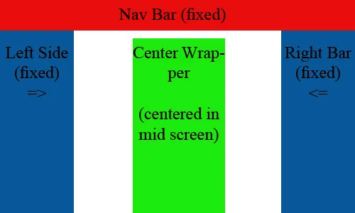
固定定位元素从正常流中删除。文档和其他元素的行为就像固定定位元素不存在一样。

固定定位元素可以重叠在其他元素上。

更新的答案以更好地满足他的需求 (JSFIDDLE,在url中删除show即可查看代码)

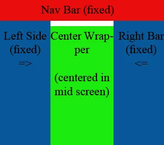
好的,我在这里使用css media queries来更改布局。

这是html:

<div class="wrap">
    <nav></nav>
    <div class="content"></div>
    <section class="lSide"></section>
    <section class="rSide"></section>
</div>

现在是媒体查询,
@media only screen and (max-width: 680px) {
  .content {
    width: 90%;
        margin-bottom: 10px;
  }
  .lSide, .rSide {
      position: relative;
      width: 90%;
      height: 100px;
      margin: 10px auto;
      bottom: 0;
  }
}

不要忘记将此添加到您的HTML文件的中, headhtml文件相关。
<meta name="viewport" content="width=device-width, initial-scale=1.0, user-scalable=0;">

旧回答

CSS(JSFIDDLE,删除show以查看代码

html, body {
    width: 100%;
    height: 100%;
    padding: 0;
    margin: 0;
    background: tan;
}

.wrap.active {
    min-width: 750px;
}

nav {
    position: fixed;
    top: 0;
    left: 0;
    width: 100%;
    height: 20%;
    background: brown;
    z-index: 101;
}

.lSide {
    background: #3b3b3b;
    position: fixed;
    left: 0;
    top: 20%;
    width: 200px;
    height: 80%;
}

.content {
    width: 300px;
    height: 600px;
    background: #c1c1c1;
    margin: 0 auto;
    position: relative;
    z-index: 100;
    top: 20%;
}

.rSide {
    background: #3b3b3b;
    position: fixed;
    right: 0;
    top: 20%;
    width: 200px;
    height: 80%;
}

.rSide.active {
    display: none;
}

JS,(已更新)

$(window).resize(function() {
    if ($(window).width() < '750') {
        $('.wrap, .rSide').addClass('active');
    }
    else {
        $('.wrap, .rSide').removeClass('active');  
    }
});

我有一个解决方案,参考css旁边的fiddle,在屏幕尺寸太小时移除右侧。


你做得很好。正如你所说,右侧横幅更难控制。如果您能解决问题或提出任何建议,我将不胜感激。 - Brute Force
好的建议。 我在移动设备上测试时,发现了重叠问题。 - Brute Force
啊,如果这是为移动设备设计的话,我强烈建议你了解一下“媒体查询”。http://css-tricks.com/css-media-queries/ - Josh Powell
@BruteForce,请查看我的更新答案,这是最适合你的选择。 - Josh Powell

1

这里有一个纯HTML/CSS的解决方案,告诉我它是否正是你所需要的。

<html>
<head>
<style type="text/css">

body{
margin:0;
padding:0;
line-height: 1.5em;
}

b{font-size: 110%;}
em{color: red;}

#topsection{
background: #EAEAEA;
height: 90px; /*Height of top section*/
}

#topsection h1{
margin: 0;
padding-top: 15px;
}

#contentwrapper{
float: left;
width: 100%;
}

#contentcolumn{
margin: 0 200px 0 230px; /*Margins for content column. Should be "0 RightColumnWidth 0 LeftColumnWidth*/

background-color : red;
width : 400px;
margin-left : auto;
margin-right : auto;
}

#leftcolumn{
float: left;
width: 200px; /*Width of left column*/
margin-left: -100%;
background: #C8FC98;
}

#rightcolumn{
float: left;
width: 200px; /*Width of right column*/
margin-left: -200px; /*Set left marginto -(RightColumnWidth)*/
background: #FDE95E;
}

#footer{
clear: left;
width: 100%;
background: black;
color: #FFF;
text-align: center;
padding: 4px 0;
}

.innertube{

margin: 10px; /*Margins for inner DIV inside each column (to provide padding)*/
margin-top: 0;


height : 700px;
}


.innertubetop{
margin: 10px; /*Margins for inner DIV inside each column (to provide padding)*/
margin-top: 0;
}

</style>


</head>
<body>
<div id="maincontainer" style = "min-width : 800px;"> <!-- this will be sum of width of all three columns-->

<div id="topsection"><div class="innertubetop"><h1>Hello iam navigation bar</h1></div></div>

<div id="contentwrapper">
<div id="contentcolumn">
<div class="innertube"><b>Center Column </b></div>
</div>
</div>

<div id="leftcolumn">
<div class="innertube"><b>Left Column: <em>200px</em></b></div>

</div>

<div id="rightcolumn">
<div class="innertube"><b>Right Column: <em>200px</em></b></div>
</div>


</div>
</body>
</html>

网页内容由stack overflow 提供, 点击上面的
可以查看英文原文,
原文链接