Seaborn相同大小的联合绘图

3

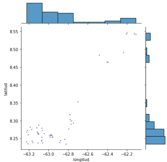
我正在使用basemap进行联合绘图,问题在于当我添加basemap时,主绘图与边际绘图的大小不同。我尝试了不同的参数,但没有成功。有人有什么想法吗?

import seaborn as sns
import matplotlib.pyplot as plt
import contextily as ctx
import pandas as pd

##exaplme of the data
coords={'longitud':[-62.2037376443, -62.1263309099, -62.1111660957, -62.2094232682, -62.2373117384, -62.4837603464,
 -62.4030570833, -62.3975699059, -62.7017114116, -62.7830883096, -62.7786038141, -62.7683234105, -62.7490101452,
 -62.7709656745, -63.1002199219, -63.1890252191, -63.1183018549, -63.069960016, -62.7957745659, -63.1715687622,
 -63.2156105034, -63.0634381954, -63.2243260588, -63.1153871895, -63.1068292891, -63.103945266, -63.046202785,
 -63.1002257551, -63.2076065143, -62.9766391316, -62.9639256604, -62.9911452446, -62.9819984159, -62.9693649898,
 -63.066770885, -62.9867441519, -62.9566360192, -62.962616287, -62.835080907, -63.0704805194, -62.8796906301,
 -63.0725050601, -63.2224345145, -63.1609069526, -63.0614466072, -62.8847887504, -63.1093652381, -62.822694115,
 -63.211982035, -63.1689040153],
'latitud':[8.54644405234, 8.54344899107, 8.54223724187, 8.54290207992, 8.49122679072, 8.48386575122, 8.46450360179,
 8.46404720757, 8.35310083084, 8.31701565261, 8.30258604829, 8.29974870902, 8.29281679496, 8.28939264064, 8.28785272804,
 8.28221439317, 8.27978694565, 8.27864159366, 8.27634987807, 8.27619269053, 8.27236343925, 8.27258932351, 8.26833993531,
 8.267530064, 8.26446669791, 8.26266392333, 8.2641092051, 8.26208837315, 8.26034269744, 8.26123972942, 8.25789799656,
 8.25825378832, 8.25833002805, 8.25914612933, 8.2540499893, 8.25347956867, 8.2540932736, 8.25405171513, 8.2478564527,
 8.24561857662, 8.2440865055, 8.24256528837, 8.24089278, 8.23877286416, 8.23782626443, 8.23865421655, 8.23733824299,
 8.23477115627, 8.23552604027, 8.24327920905]}
df = pd.DataFrame(coords)
OSM_C = 'http://c.tile.openstreetmap.org/{z}/{x}/{y}.png'
joint_axes = sns.jointplot(
x='longitud', y='latitud', data=df, ec="r", s=5)
ctx.add_basemap(joint_axes.ax_joint,crs=4326,attribution=False,url=OSM_C)
adjust(hspace=0, wspace=0)
#plt.tight_layout()
plt.show()

enter image description here

enter image description here


共享轴与等比例缩放不兼容。如何绘制非正方形Seaborn jointplot建议更改
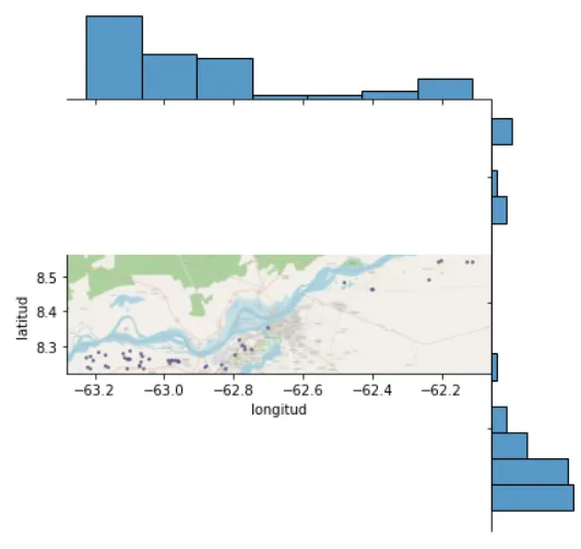
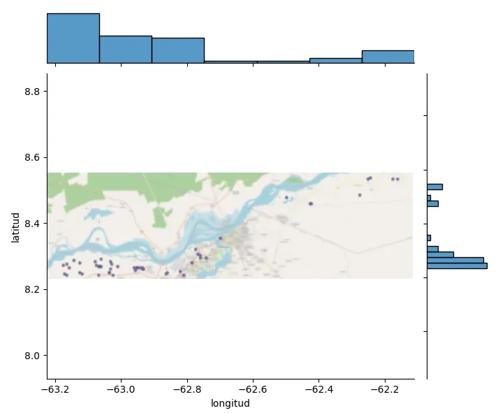
joint_axes.fig.fig_height(...)以使周围的图具有与地图相同的纵横比。或通过joint_axes.fig.subplots_adjust(bottom=0.3, top=0.7)在顶部和底部添加更多空白。如果您不介意(某些)变形,可以设置joint_axes.ax_joint.set_aspect('auto') - JohanC
joint_axes.ax_joint.set_aspect('auto') 运行良好,变形并不明显。谢谢。 - Luis Medina
1个回答

1
以下是一个方法:
  • 去掉在y方向上共享的轴,以便能够将宽高比改为 'datalim'
  • 将宽高比设置为 'equal', 'datalim'
  • 将边缘图的y数据限制设置为与联合图相同;这似乎需要重新绘制
下面的代码展示了这个想法(使用imshow,因为我没有安装contextily):
import matplotlib.pyplot as plt
import seaborn as sns
import pandas as pd
import numpy as np

coords = {'longitud' : [-62.2037376443, -62.1263309099, -62.1111660957, -62.2094232682, -62.2373117384, -62.4837603464, -62.4030570833, -62.3975699059, -62.7017114116, -62.7830883096, -62.7786038141, -62.7683234105, -62.7490101452, -62.7709656745, -63.1002199219, -63.1890252191, -63.1183018549, -63.069960016, -62.7957745659, -63.1715687622, -63.2156105034, -63.0634381954, -63.2243260588, -63.1153871895, -63.1068292891, -63.103945266, -63.046202785, -63.1002257551, -63.2076065143, -62.9766391316, -62.9639256604, -62.9911452446, -62.9819984159, -62.9693649898, -63.066770885, -62.9867441519, -62.9566360192, -62.962616287, -62.835080907, -63.0704805194, -62.8796906301, -63.0725050601, -63.2224345145, -63.1609069526, -63.0614466072, -62.8847887504, -63.1093652381, -62.822694115, -63.211982035, -63.1689040153],
          'latitud' : [8.54644405234, 8.54344899107, 8.54223724187, 8.54290207992, 8.49122679072, 8.48386575122, 8.46450360179, 8.46404720757, 8.35310083084, 8.31701565261, 8.30258604829, 8.29974870902, 8.29281679496, 8.28939264064, 8.28785272804, 8.28221439317, 8.27978694565, 8.27864159366, 8.27634987807, 8.27619269053, 8.27236343925, 8.27258932351, 8.26833993531, 8.267530064, 8.26446669791, 8.26266392333, 8.2641092051, 8.26208837315, 8.26034269744, 8.26123972942, 8.25789799656, 8.25825378832, 8.25833002805, 8.25914612933, 8.2540499893, 8.25347956867, 8.2540932736, 8.25405171513, 8.2478564527, 8.24561857662, 8.2440865055, 8.24256528837, 8.24089278, 8.23877286416, 8.23782626443, 8.23865421655, 8.23733824299, 8.23477115627, 8.23552604027, 8.24327920905]}
df = pd.DataFrame(coords)
g = sns.jointplot(data=df, x='longitud', y='latitud')
ctx.add_basemap(g.ax_joint,crs=4326,attribution=False,url=OSM_C)
# g.ax_joint.imshow(np.random.rand(20, 10), cmap='spring', interpolation='bicubic',
#                   extent=[df['longitud'].min(), df['longitud'].max(), df['latitud'].min(), df['latitud'].max()])
for axes in g.ax_joint.get_shared_y_axes():
    for ax in axes:
        g.ax_joint.get_shared_y_axes().remove(ax)
g.ax_joint.set_aspect('equal', 'datalim')
g.fig.canvas.draw()
g.ax_marg_y.set_ylim(g.ax_joint.get_ylim())
plt.show()

sns.jointplot with equal axes

您仍然可以将此方法与更改图形的宽度或高度,或在顶部或底部添加更多空白配合使用。


你的代码显示了很好的结果,我添加了这个 ctx.add_basemap(g.ax_joint,crs=4326,attribution=False,url=OSM_C) 并删除了插值行。如果你愿意,你可以用这个编辑答案,然后我会接受它。谢谢。 - Luis Medina

网页内容由stack overflow 提供, 点击上面的
可以查看英文原文,
原文链接