我合并了两个图表,现在想要添加第二个y轴,但是每次将yaxis = "y2"加入代码后,我的柱状图就消失了。
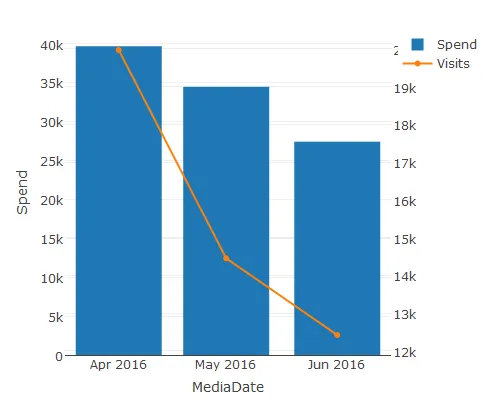
>    MediaDate     Spend Search_Visits Other_Visits MediaDate2
> 2016-04-01 $39654.36         19970         2899   Apr 2016
> 2016-05-01 $34446.28         14460         2658   May 2016
> 2016-06-01 $27402.36         12419         2608   Jun 2016
我的原始代码如下:
p <- plot_ly(x= w$MediaDate2,y=w$Search_Visits,name = "Paid Search",
type = "bar")
p2 <- add_trace(p, x=w$MediaDate2, y=w$Other_Visits,name = "Other Traffic",
type = "bar")
spend_visits <- layout(p2, barmode = "stack")
spendvisits2 <- spend_visits %>% add_trace(data=w, x=MediaDate2,  y=round(Spend,0), fill="tonexty", mode="lines",
                       text=w$MediaDate2, hoverinfo='name+y+text', name="Spend")
当我添加yaxis="y2"时,只有面积图保留:
`spendvisits2 <- spend_visits %>% add_trace(data=w, x=MediaDate2,     y=round(Spend,0), yxis="y2" fill="tonexty", mode="lines",
                       text=w$MediaDate2, hoverinfo='name+y+text',  name="Spend")`
任何建议都将非常有帮助。谢谢。