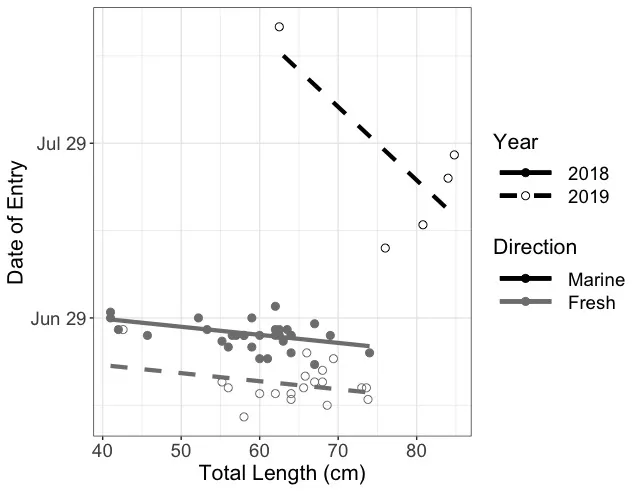
我用R语言创建了下面的图来可视化我所运行模型的原始数据和预测结果。预测结果用线条表示,原始数据用圆点表示。2018年的数据用实心线条或空心圆圈表示,而2019年的数据则用虚线或实心圆圈表示。黑色表示海水鱼数据,灰色表示淡水鱼数据。目前,图例有点让人摸不着头脑。我希望做两件事情:
图例中关于方向的符号,我想用相应颜色的矩形代替。
我想将年份符号分开,格式如下:
实心线(空格)2018(空格)实心圆
虚线(空格)2019(空格)空心圆
这是我的数据:
structure(list(Year = structure(c(1L, 1L, 1L, 1L, 1L, 1L, 1L,
1L, 1L, 1L, 1L, 1L, 1L, 1L, 1L, 1L, 1L, 2L, 2L, 2L, 2L, 2L, 2L,
2L, 2L, 2L, 2L, 2L, 2L, 2L, 2L, 1L, 2L, 1L, 2L, 1L, 2L, 1L, 1L,
2L, 1L, 2L, 1L, 2L, 2L, 1L, 1L, 1L, 2L, 1L, 2L, 1L, 1L, 2L, 1L
), .Label = c("2018", "2019"), class = "factor"), Yday = c(176L,
178L, 178L, 182L, 178L, 180L, 177L, 180L, 174L, 180L, 177L, 181L,
175L, 178L, 177L, 177L, 178L, 178L, 192L, 204L, 166L, 168L, 168L,
174L, 173L, 169L, 165L, 168L, 196L, 208L, 171L, 177L, 163L, 175L,
168L, 177L, 230L, 177L, 174L, 166L, 179L, 169L, 177L, 167L, 167L,
173L, 177L, 177L, 170L, 177L, 167L, 173L, 176L, 169L, 172L),
    TL = c(63, 62.5, 63.5, 62, 62, 41, 58, 59, 74, 52.2, 45.7,
    41, 59, 53.3, 56.5, 57, 42, 42.6, 76, 84, 73.8, 73.6, 73,
    66, 69.4, 68, 68.6, 65.6, 80.8, 84.8, 68, 58, 58, 56, 56,
    62.5, 62.5, 69, 64, 64, 67, 67, 64, 64, 60, 60, 64, 60, 65.8,
    62, 62, 61, 55.2, 55.2, 67), Direction = structure(c(2L,
    2L, 2L, 2L, 2L, 2L, 2L, 2L, 2L, 2L, 2L, 2L, 2L, 2L, 2L, 2L,
    2L, 2L, 1L, 1L, 2L, 2L, 2L, 2L, 2L, 2L, 2L, 2L, 1L, 1L, 2L,
    2L, 2L, 2L, 2L, 2L, 1L, 2L, 2L, 2L, 2L, 2L, 2L, 2L, 2L, 2L,
    2L, 2L, 2L, 2L, 2L, 2L, 2L, 2L, 2L), .Label = c("Marine",
    "River"), class = "factor")), class = "data.frame", row.names = c(1L,
2L, 3L, 4L, 5L, 6L, 7L, 8L, 9L, 10L, 11L, 12L, 13L, 14L, 15L,
16L, 17L, 18L, 19L, 20L, 21L, 22L, 23L, 24L, 25L, 26L, 27L, 28L,
29L, 30L, 31L, 32L, 33L, 34L, 35L, 36L, 37L, 38L, 39L, 40L, 41L,
42L, 43L, 44L, 45L, 46L, 47L, 48L, 49L, 50L, 51L, 52L, 53L, 54L,
56L))
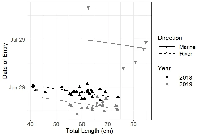
这里是当前的图表和第二个数据集:
Firsts.modelRand <- lmer(Yday~Year+Direction*TL + (1|Transmitter), data = firsts2WOFD,
                         REML = T, na.action = 'na.fail')
Firstdats <- expand.grid(TL = seq(min(firsts2WOFD$TL),max(firsts2WOFD$TL), by = 1),
                         Year = unique(firsts2WOFD$Year), Direction = unique(firsts2WOFD$Direction))

Firstdats$pred <- predict(Firsts.modelRand, Firstdats, re.form = ~0, type = 'response')


First.plot <- ggplot(data = firsts2WOFD, aes(x = TL, y = Yday, color = Direction, shape = Year, linetype = Year))+geom_point(size = 2.5) + theme_bw()+
  geom_line(data = subset(Firstdats, Year == 2018 & Direction == 'River' & TL < 75), aes(x = TL, y = pred), size = 1.5)+
  geom_line(data = subset(Firstdats, Year == 2019 & Direction == 'River' & TL < 75), aes(x = TL, y = pred), size = 1.5)+
  geom_line(data = subset(Firstdats, Year == 2019 & Direction == 'Marine' & TL > 62), aes(x = TL, y = pred), size = 1.5)
First.plot <- First.plot + scale_color_manual(values = c("black", 'grey50'), labels = c("Marine", 'Fresh'))+scale_linetype_manual(values = c(1,2))+
  scale_shape_manual(values = c(19,21))
First.plot <- First.plot+ theme(axis.title = element_text(size = 16), axis.text = element_text(size = 14),
                                legend.title = element_text(size = 16), legend.text = element_text(size = 14), legend.key.width = unit(1.7, 'cm'))
First.plot <- First.plot+ xlab("Total Length (cm)")+ ylab("Date of Entry")+scale_y_continuous(breaks = c(180,210,240), labels = c("Jun 29", 'Jul 29', 'Aug 28'))
First.plot
firsts2WOFD和Firstdats。但是你在问题中只提供了一个数据集。 - Sathish