我想通过R plotly生成一个带有独立图例的图形,同时保持颜色比例尺。
这是我目前的代码:
library(plotly)

X <- data.frame(xcoord = 1:6,
                ycoord = 1:6,
                score  = 1:6,
                gender = c("M", "M", "M", "F", "F", "F"),
                age = c("young", "old", "old", "old", "young", "young"))

plot_ly(data = X, x = ~xcoord, y = ~ycoord, split = ~interaction(age, gender),
        type = "scatter", mode = "markers",
        marker = list(color = ~score,
                      colorbar = list(len = .5, y = .3)))
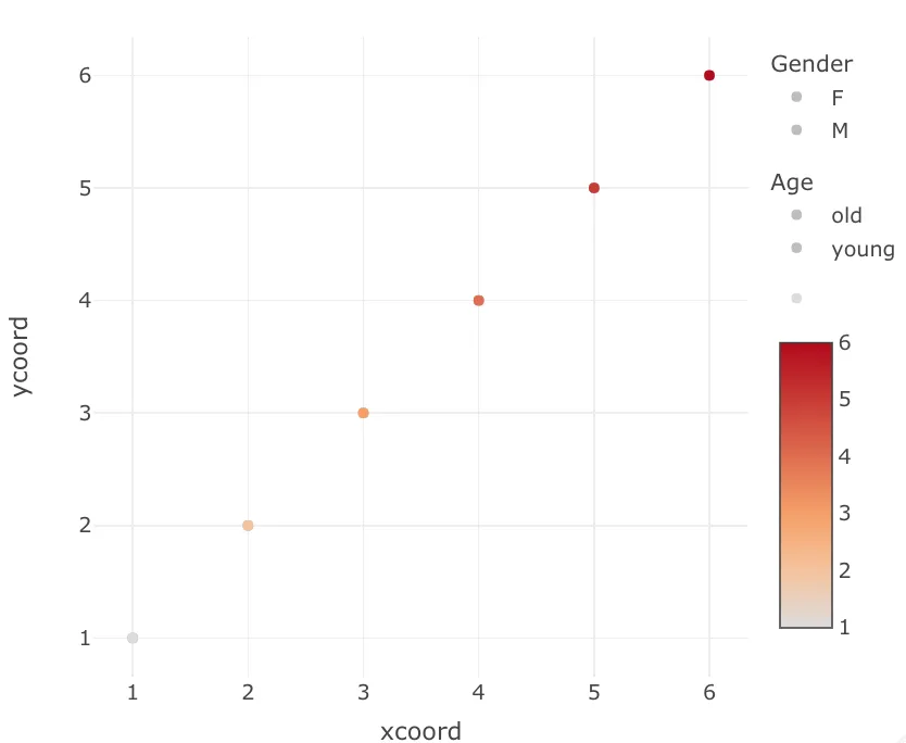
这是结果:
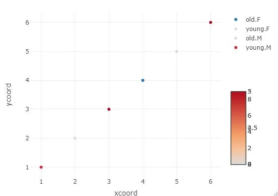 如您所见,色条混乱且两个类别相互交织。
我需要为
age(young vs old)和gender(M vs F)分别设置图例,可以独立于彼此点击。这将是预期结果: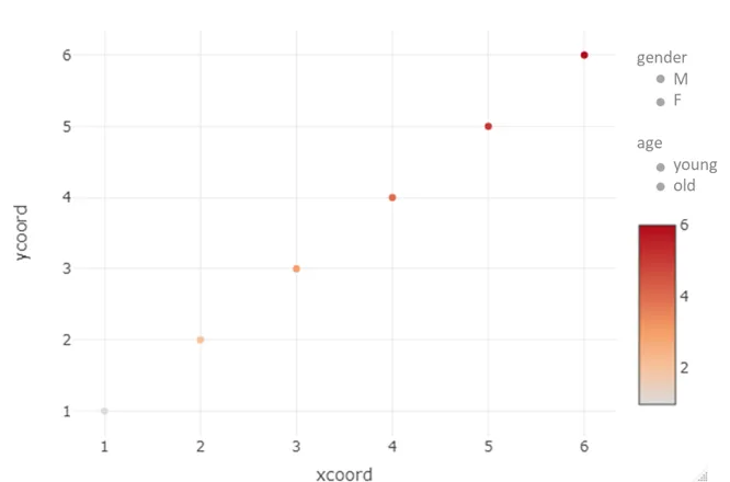
编辑1
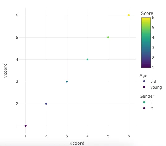
这是使用
ggplot2获得的等效结果:gg <- ggplot(X, aes(x = xcoord, y = ycoord)) +
geom_point(aes(color = score, shape = gender, alpha = age), size = 5) +
scale_shape_manual(values = c("M" = 19, "F" = 19)) +
scale_alpha_manual(values = c("young" = 1, "old" = 1))
ggplotly(gg)
在ggplot中它能正确地显示,但应用ggplotly()后会出现问题。
请注意,我更倾向于使用本地的plotly图表解决方案,而不是像其他帖子中提出的事后的ggplotly()修复方法。
编辑 2
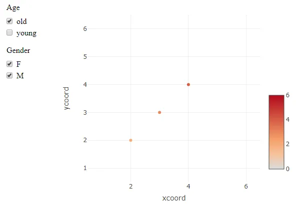
尽管当前答案已经将两个图例(age和gender)分开,但它们并不可操作。例如,如果您单击young级别,整个age图例将被切换打开/关闭。这里的目标是使每个图例的每个子级别可以独立地切换,通过单击图例级别,点将相应地显示/隐藏。
layout中设置一个共同的coloraxis;虽然这在热力图示例中有效,但是plot_ly抛出了一个警告,说明此属性不适用于散点[图]对象。 - user18309711