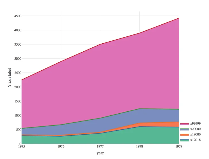
elw <- structure(list(year = 1975:1979, x10006 = c(0L, 0L, 0L, 0L, 0L),
   x12018 = c(285.4309, 265.1403, 369.1682, 604.1203, 587.2926
), x19000 = c(26.48335, 36.45504, 37.28563, 126.8903, 182.8447
), x20000 = c(229.9651, 369.8476, 496.058, 504.2717, 445.3687
), x99999 = c(1707.498, 2223.986, 2599.086, 2661.213, 3207.065
)), .Names = c("year", "x10006", "x12018", "x19000", "x20000",
"x99999"), row.names = c(NA, -5L), class = "data.frame")

elw_stack <- structure(list(year = 1975:1979, x10006 = c(0L, 0L, 0L, 0L, 0L),
    x12018 = c(285L, 265L, 369L, 604L, 587L),
    x19000 = c(312L, 302L, 406L, 731L, 770L),
    x20000 = c(542L, 671L, 903L, 1235L, 1216L),
    x99999 = c(2249L, 2895L, 3502L, 3896L, 4423L)),
    .Names = c("year", "x10006", "x12018", "x19000", "x20000", "x99999"),
    row.names = c(NA, -5L), class = "data.frame")
利用上述数据,我使用以下代码在 R 中生成了一个 Plotly 图表:
install.packages("plotly")
library(plotly)

plot_ly(data = elw_stack, x = ~year, y = ~x10006, fill="tonexty", mode="lines",
        text = round(elw$x10006, 0), hoverinfo='x+text+name', name="x10006") %>%
  add_trace(y=~x12018, mode="lines", type = "scatter", text = round(elw$x12018,0),
            hoverinfo='x+text+name', name="x12018") %>%
  add_trace(y=~x19000, mode="lines", text=round(elw$x19000,0),
            hoverinfo='x+text+name', name="x19000") %>%
  add_trace(y=~x20000, mode="lines", text=round(elw$x20000,0),
            hoverinfo='x+text+name', name="x20000") %>%
  add_trace(y=~x99999, mode="lines", text=round(elw$x99999,0),
            hoverinfo='x+text+name', name="x99999") %>%
  layout(yaxis=list(title="Y axis label"))
我仍然在努力做三件事情:
- 将填充颜色更改为我选择的特定RGB代码颜色。(我尝试了plotly命令
fillcolor,但不确定我是否正确实现了它。) - 更改所有文本的字体样式(具体来说是Gotham Narrow)。
- 将图例下移,使其不位于图表顶部。