可能有一种简单的方法来实现这个,但我不确定是什么。我试图使图例中的文本与旁边的颜色框匹配。我已经尝试了很长时间,没有找到一种使用element_text函数将多个颜色添加到图例中的方法。我没有问题让每个标签都是相同的颜色,但是否有一种方法可以使每个图例标签具有不同的颜色?
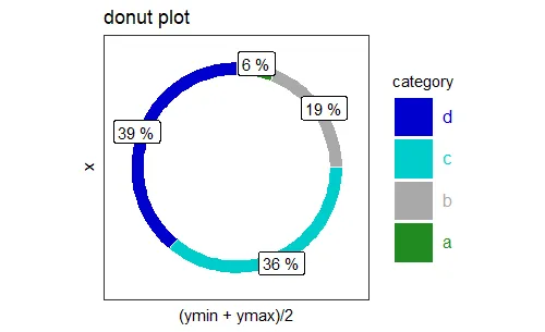
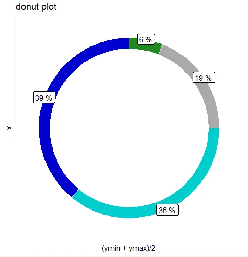
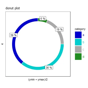
data<-data.frame(count=c(39,36,19,6), category=c("a","b","c","d"))
data$fraction = data$count / sum(data$count)
data = data[order(data$fraction), ]
data$ymax = cumsum(data$fraction)
data$ymin = c(0, head(data$ymax, n=-1))

#~~~~~~~~~~~~~~~~~~~~~~~~~~~~~~~~~~~~~~~~~~~~~~~~~~~~~~~~~~~~~~~~~~~~~
#Create Plot
fill <- c("blue3","cyan3","darkgrey","forestgreen")

library(ggplot2)

p1 = ggplot(data, aes(fill=category, ymax=ymax, ymin=ymin, xmax=4, xmin=3.5)) +
 geom_rect(colour="White") +
 coord_polar(theta="y") +
 scale_fill_manual(values=fill)+
 theme_bw()+
 geom_label(aes(label=paste(data$fraction*100,"%"),x=4,y=
 (ymin+ymax)/2),inherit.aes = F)+
 theme(panel.grid=element_blank())+
 theme(axis.ticks=element_blank()) +
 xlim(c(0, 4)) +
 theme(axis.text=element_blank()) +
 theme(legend.text=element_text(color=fill,size=12))+
 theme(legend.key.size=unit(2,'lines'))+
 theme(legend.key=element_rect(size=5))+
 labs(title="donut plot")


 print(p1)