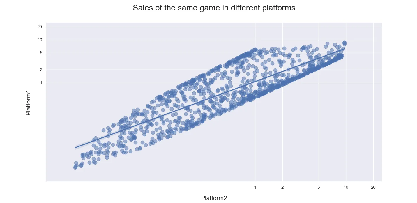
Seaborn的
regplot可以创建一个线性空间中的线(
y ~ x),或者(使用
logx=True)形式为
y ~ log(x)的线性回归。您的问题要求进行形式为
log(y) ~ log(x)的线性回归。
这可以通过使用输入数据的log来调用regplot来实现。
然而,这将更改显示log数据轴而不是数据本身的数据轴。通过特殊的刻度格式化程序(取值的幂),这些刻度值可以再次转换为原始数据格式。
请注意,为了使其正常工作,set_xticks()和set_xlim()的调用都需要将其值转换为对数空间。需要删除对set_xscale('log')的调用。
下面的代码还
更改了大多数
plt.调用为
ax.调用,并将
ax作为参数添加到
sns.regplot(..., ax=ax)中。
import pandas as pd
import numpy as np
import seaborn as sns
import matplotlib.pyplot as plt

sns.set()
p1 = 10 ** np.random.uniform(-2, 1, 1000)
p2 = 10 ** np.random.uniform(-2, 1, 1000)
duplicates = pd.DataFrame({'Platform1': 0.6 * p1 + 0.4 * p2, 'Platform2': 0.1 * p1 + 0.9 * p2})

fig, ax = plt.subplots(figsize=(10, 8))

data = duplicates[['Platform2', 'Platform1']].dropna(thresh=2)
sns.regplot(x=np.log10(data['Platform2']), y=np.log10(data['Platform1']),
            scatter_kws={'s': 80, 'alpha': 0.5}, ax=ax)
ax.set_ylabel('Platform1', labelpad=15, fontsize=15)
ax.set_xlabel('Platform2', labelpad=15, fontsize=15)
ax.set_title('Sales of the same game in different platforms', pad=30, size=20)

ticks = np.log10(np.array([1, 2, 5, 10, 20]))
ax.set_xticks(ticks)
ax.set_yticks(ticks)
formatter = lambda x, pos: f'{10 ** x:g}'
ax.get_xaxis().set_major_formatter(formatter)
ax.get_yaxis().set_major_formatter(formatter)
lims = np.log10(np.array([0.005, 25.]))
ax.set_xlim(lims)
ax.set_ylim(lims)

plt.show()
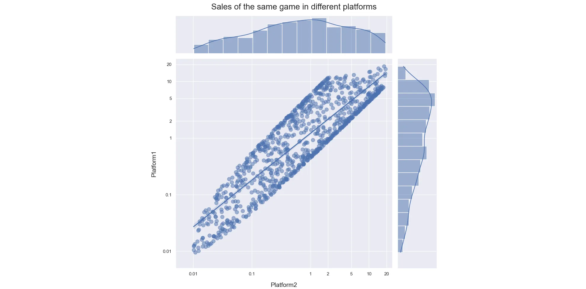
要创建一个类似于R中示例的
jointplot(设置图形大小,请使用
sns.jointplot(...., height=...),图形将始终是正方形):
import pandas as pd
import numpy as np
import seaborn as sns
import matplotlib.pyplot as plt

sns.set()
p1 = 10 ** np.random.uniform(-2.1, 1.3, 1000)
p2 = 10 ** np.random.uniform(-2.1, 1.3, 1000)
duplicates = pd.DataFrame({'Platform1': 0.6 * p1 + 0.4 * p2, 'Platform2': 0.1 * p1 + 0.9 * p2})

data = duplicates[['Platform2', 'Platform1']].dropna(thresh=2)
g = sns.jointplot(x=np.log10(data['Platform2']), y=np.log10(data['Platform1']),
                  scatter_kws={'s': 80, 'alpha': 0.5}, kind='reg', height=10)

ax = g.ax_joint
ax.set_ylabel('Platform1', labelpad=15, fontsize=15)
ax.set_xlabel('Platform2', labelpad=15, fontsize=15)

g.fig.suptitle('Sales of the same game in different platforms', size=20)

ticks = np.log10(np.array([.01, .1, 1, 2, 5, 10, 20]))
ax.set_xticks(ticks)
ax.set_yticks(ticks)
formatter = lambda x, pos: f'{10 ** x:g}'
ax.get_xaxis().set_major_formatter(formatter)
ax.get_yaxis().set_major_formatter(formatter)
lims = np.log10(np.array([0.005, 25.]))
ax.set_xlim(lims)
ax.set_ylim(lims)
plt.tight_layout()
plt.show()