fig = plt.figure();
ax=plt.gca()
ax.scatter(x,y,c="blue",alpha=0.95,edgecolors='none')
ax.set_yscale('log')
ax.set_xscale('log')

(Pdb) print x,y
    [29, 36, 8, 32, 11, 60, 16, 242, 36, 115, 5, 102, 3, 16, 71, 0, 0, 21, 347, 19, 12, 162, 11, 224, 20, 1, 14, 6, 3, 346, 73, 51, 42, 37, 251, 21, 100, 11, 53, 118, 82, 113, 21, 0, 42, 42, 105, 9, 96, 93, 39, 66, 66, 33, 354, 16, 602]
     [310000, 150000, 70000, 30000, 50000, 150000, 2000, 12000, 2500, 10000, 12000, 500, 3000, 25000, 400, 2000, 15000, 30000, 150000, 4500, 1500, 10000, 60000, 50000, 15000, 30000, 3500, 4730, 3000, 30000, 70000, 15000, 80000, 85000, 2200]
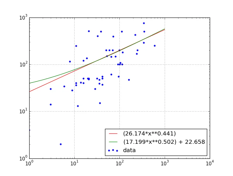
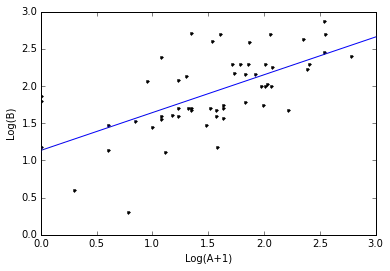
我应该如何在这个图上绘制一个线性回归线?当然,它应该使用对数值。
x=np.array(x)
y=np.array(y)
fig = plt.figure()
ax=plt.gca()
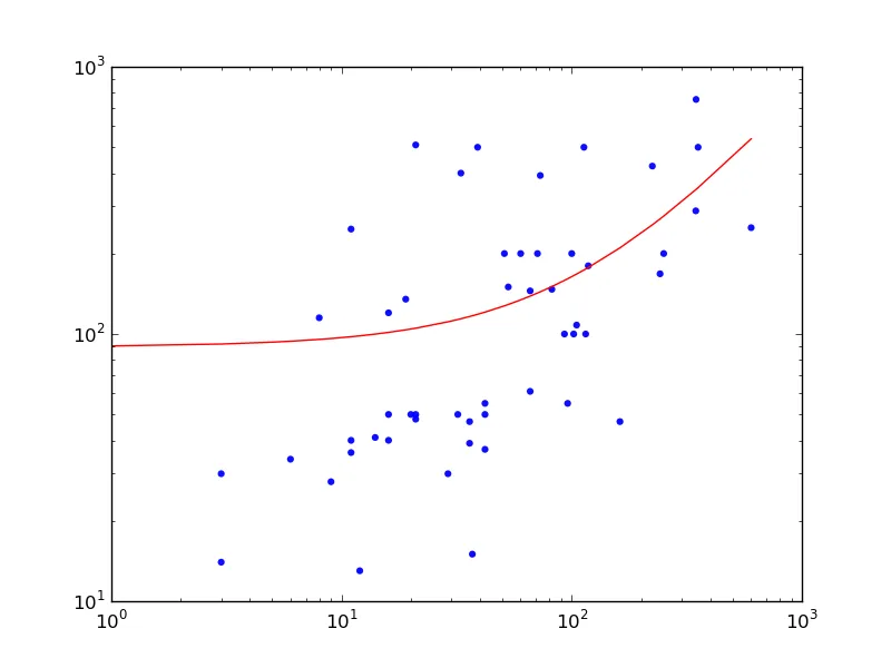
fit = np.polyfit(x, y, deg=1)
ax.plot(x, fit[0] *x + fit[1], color='red') # add reg line
ax.scatter(x,y,c="blue",alpha=0.95,edgecolors='none')
ax.set_yscale('symlog')
ax.set_xscale('symlog')
pdb.set_trace()
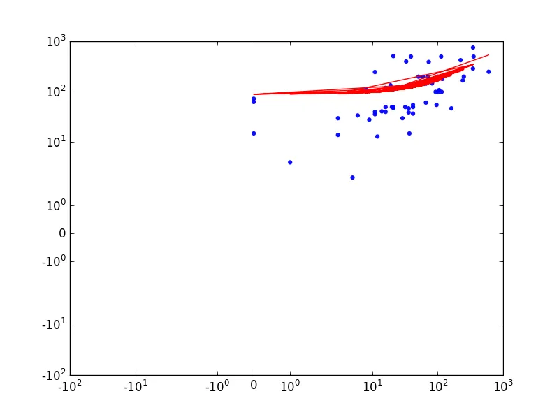
结果:
由于存在多条曲线和空白区域,结果不正确。
数据:
(Pdb) x
array([  29.,   36.,    8.,   32.,   11.,   60.,   16.,  242.,   36.,
        115.,    5.,  102.,    3.,   16.,   71.,    0.,    0.,   21.,
        347.,   19.,   12.,  162.,   11.,  224.,   20.,    1.,   14.,
          6.,    3.,  346.,   73.,   51.,   42.,   37.,  251.,   21.,
        100.,   11.,   53.,  118.,   82.,  113.,   21.,    0.,   42.,
         42.,  105.,    9.,   96.,   93.,   39.,   66.,   66.,   33.,
        354.,   16.,  602.])
(Pdb) y
array([ 30,  47, 115,  50,  40, 200, 120, 168,  39, 100,   2, 100,  14,
        50, 200,  63,  15, 510, 755, 135,  13,  47,  36, 425,  50,   4,
        41,  34,  30, 289, 392, 200,  37,  15, 200,  50, 200, 247, 150,
       180, 147, 500,  48,  73,  50,  55, 108,  28,  55, 100, 500,  61,
       145, 400, 500,  40, 250])
(Pdb)