我希望grid.arrange的行为与ggplot2的facet_grid类似:我只想在最左边的图中显示y轴,并且仍然希望网格中的所有图形具有相同的大小和纵横比。 我知道如何隐藏不在最左列的所有图形的y轴,但这会导致图形被拉伸以填充与带标签的图形相同的y空间。以下是我的代码的可重现示例:
library(gridExtra)

data <- data.frame(yi = rnorm(100),
                   x1 = rnorm(100),
                   x2 = rnorm(100),
                   x3 = rnorm(100),
                   x4 = rnorm(100),
                   x5 = rnorm(100),
                   vi = rnorm(100, sd = .2))


data$x2 <- cut(data$x2, breaks = 2, labels = c("Low", "High"))
data$x3 <- cut(data$x3, breaks = 2, labels = c("Small", "Big"))

# Plot
select_vars <- names(data)[-which(names(data) %in% c("yi", "vi"))]
numeric_vars <-
  which(sapply(data[select_vars], class) %in% c("numeric", "integer"))

data$vi <- data$vi - min(data$vi) / (max(data$vi)-min(data$vi))

weights <- 1 / data$vi

n_grobs <- length(select_vars)
flr_n <- floor(sqrt(n_grobs))
cei_n <- ceiling(sqrt(n_grobs))
if((flr_n*cei_n) < n_grobs){
  flr_n <- flr_n + 1
}

plotdat <-
  data.frame(weights = weights / sum(weights), data[c(names(data)[which(names(data) %in% c("yi"))], select_vars)])

plots <- lapply(1:length(select_vars), function(x){
  current_variable <- select_vars[x]
  p <-
    ggplot(data.frame(plotdat[, c("yi", "weights", current_variable)], Variable = current_variable),
           aes_string(
             x = current_variable,
             y = "yi",
             size = "weights",
             weight = "weights"
           )) +
    facet_wrap("Variable") +
    theme_bw() +
    theme(legend.position = "none") +
    theme(axis.title.x = element_blank(),
          axis.title.y = element_blank())

  if(current_variable %in% select_vars[numeric_vars]){
    p <- p + geom_smooth(color = "darkblue", linetype = 2, method = "lm")
  } else {
    p <- p + geom_boxplot(outlier.shape = NA)
  }

  if(current_variable %in% select_vars[numeric_vars]){
    p <- p + geom_point(alpha = .2)
  } else {
    p <- p + geom_jitter(width = .2, alpha = .2)
  }
  p
})

grid.arrange(arrangeGrob(grobs = plots, ncol = cei_n, nrow = flr_n, as.table = TRUE, left = textGrob("yi", rot = 90, vjust = 1)))
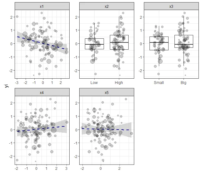
这导致了下面的图形:
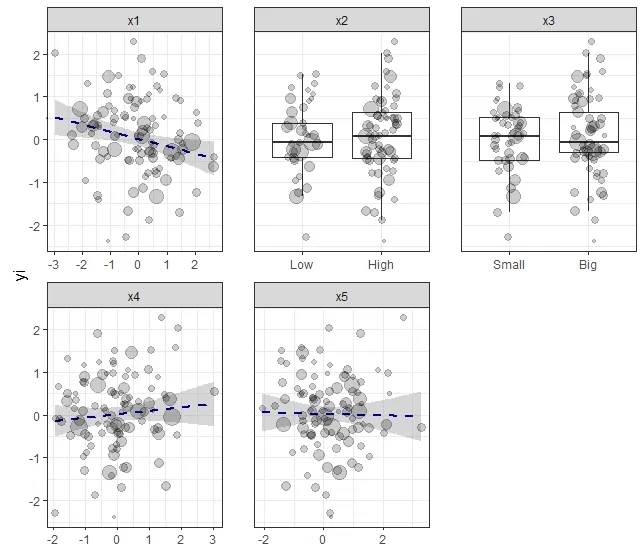
然而,我想获得更接近这样的效果:
编辑:最好使用ggplot2已经导入的包,比如grid和gtable,这样我的程序就不需要用户安装额外的包。
非常感谢您对此事的建议!